
玉珏图

玉珏图的简介
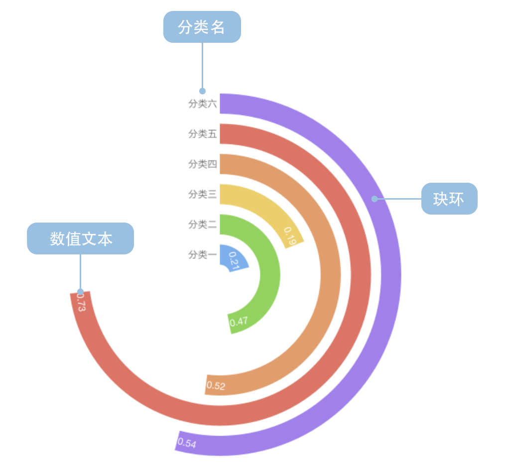
玉珏图(又名环形柱状图),是柱状图关于笛卡尔坐标系转换到极坐标系的仿射变换。其意义和用法与柱状图类似。
玉珏图有半径反馈效应。由于玉珏图中是用角度表示每个珏环数值的大小,角度是决定性因素。所以,哪怕外侧(半径大的)珏环的数值小于内侧(半径小的)珏环,外侧的每个珏环会相对的比里面的珏环更长。这会造成视觉上的误解。
而且因为我们的视觉系统更善于比较直线,所以笛卡尔坐标系更适合于比较各个分类的数值比较。所以玉珏图从实用的角度去看,其更多的是一种审美上的需求。
英文名:Radial Bar Chart
玉珏图的构成
| 图表类型 | 玉珏图 |
|---|---|
| 适合的数据 | 列表:一个分类数据字段、一个连续数据字段 |
| 功能 | 以审美的方式展示分类数据的数值大小对比 |
| 数据与图形的映射 | 分类数据字段映射到环形位置 连续数据字段映射到弧长(角度) 可以用颜色区分不同分类 |
| 适合的数据条数 | 不超过 15 条数据 |
一个完整的玉珏图包含以下构成元素:
- 珏环:角度表示数值
- 文本:数值、分类名
玉珏图的应用场景
适合的场景
例子 1: 展示分类数据的对比(需要排序)
下图反映了美国民众对不同领域中的中美问题关注程度。
| 问题 | 关注人数比例 |
|---|---|
| 台海关系 | 0.21 |
| 中国持续增长的军事力量 | 0.47 |
| 中国对全球环境的影响 | 0.49 |
| 美国对中国的贸易逆差 | 0.52 |
| 中国的人权政策 | 0.53 |
| 来自中国的网络攻击 | 0.54 |
| 中国带走了美国的就业岗位 | 0.60 |
| 中国持有美国巨额国债 | 0.67 |
import { Chart } from '@antv/g2';

const chart = new Chart({
  container: 'container',
  theme: 'classic',
  width: 1000,
  height: 700,
});

chart.options({
  type: 'interval',
  data: [
    { question: '台海关系', percent: 0.21, odd: 0 },
    { question: '中国持续增长的军事力量', percent: 0.47, odd: 1 },
    { question: '中国对全球环境的影响', percent: 0.49, odd: 0 },
    { question: '美国对中国的贸易逆差', percent: 0.52, odd: 1 },
    { question: '中国的人权政策', percent: 0.53, odd: 0 },
    { question: '来自中国的网络攻击', percent: 0.54, odd: 1 },
    { question: '中国带走了美国的就业岗位', percent: 0.6, odd: 0 },
    { question: '中国持有美国巨额国债', percent: 0.67, odd: 1 },
  ],
  coordinate: { type: 'radial', innerRadius: 0.2 },
  encode: {
    x: 'question',
    y: 'percent',
    color: 'odd',
  },
  scale: {
    color: {
      range: ['rgb(211,0,57)', 'rgb(224,74,116)'],
    },
    y: { domain: [0, 1] },
  },
  style: {
    radiusTopLeft: 4,
    radiusTopRight: 4,
  },
  label: {
    text: 'percent',
    position: 'inside',
    style: {
      fontWeight: 'bold',
      fill: 'white',
    },
  },
  axis: {
    x: {
      label: {
        autoRotate: true,
        autoEllipsis: true,
        style: {
          fontSize: 10,
        },
      },
    },
    y: {
      label: false,
      grid: false,
    },
  },
  interaction: [
    {
      type: 'elementHighlight',
      background: true,
    },
  ],
});

chart.render();
例子 2: 展示各国数据对比
下图反映了各国人民认为气候变化是严重问题的比例。
import { Chart } from '@antv/g2';

const chart = new Chart({
  container: 'container',
  theme: 'classic',
  width: 1200,
  height: 800,
});

chart.options({
  type: 'interval',
  data: [
    { country: '中国', percent: 0.18, condition: '特殊' },
    { country: '俄罗斯', percent: 0.33, condition: '一般' },
    { country: '英国', percent: 0.41, condition: '一般' },
    { country: '美国', percent: 0.45, condition: '一般' },
    { country: '韩国', percent: 0.48, condition: '一般' },
    { country: '加拿大', percent: 0.51, condition: '一般' },
    { country: '德国', percent: 0.55, condition: '一般' },
    { country: '越南', percent: 0.69, condition: '一般' },
    { country: '巴西', percent: 0.86, condition: '一般' },
  ],
  coordinate: {
    type: 'radial',
    innerRadius: 0.3,
    startAngle: -Math.PI,
    endAngle: -0.25 * Math.PI,
  },
  encode: {
    x: 'country',
    y: 'percent',
    color: 'condition',
  },
  scale: {
    color: {
      range: ['#2370AE', '#A34265', '#505051'],
    },
  },
  style: {
    radiusTopLeft: 2,
    radiusTopRight: 2,
  },
  label: {
    text: 'percent',
    position: 'inside',
    style: {
      fontWeight: 'bold',
      fill: 'white',
      fontSize: 10,
    },
  },
  axis: {
    x: {
      label: {
        autoRotate: true,
        autoEllipsis: true,
        style: {
          fontSize: 12,
        },
      },
    },
    y: {
      label: false,
      grid: false,
    },
  },
  interaction: [
    {
      type: 'elementHighlight',
      background: true,
    },
  ],
});

chart.render();
不适合的场景
例子 1: 未排序的数据会产生误导
简介中提到玉珏图具有半径反馈效应。视觉上半径越大的珏环会看起来更大,半径小的则小。造成玉珏图的误用。所以,我们认为玉珏图使用时必须进行排序。
下面展示错误和正确的对比:
错误示例(未排序):
import { Chart } from '@antv/g2';

const chart = new Chart({
  container: 'container',
  theme: 'classic',
  width: 1000,
  height: 700,
});

chart.options({
  type: 'interval',
  data: [
    { country: '巴西', percent: 0.86, condition: '一般' },
    { country: '越南', percent: 0.69, condition: '一般' },
    { country: '德国', percent: 0.55, condition: '一般' },
    { country: '加拿大', percent: 0.51, condition: '一般' },
    { country: '韩国', percent: 0.48, condition: '一般' },
    { country: '美国', percent: 0.45, condition: '一般' },
    { country: '英国', percent: 0.41, condition: '一般' },
    { country: '俄罗斯', percent: 0.33, condition: '一般' },
    { country: '中国', percent: 0.18, condition: '特殊' },
  ],
  coordinate: {
    type: 'radial',
    innerRadius: 0.2,
    startAngle: -Math.PI,
    endAngle: -0.25 * Math.PI,
  },
  encode: {
    x: 'country',
    y: 'percent',
    color: 'condition',
  },
  scale: {
    color: {
      range: ['#2370AE', '#A34265', '#505051'],
    },
  },
  style: {
    radiusTopLeft: 2,
    radiusTopRight: 2,
  },
  axis: {
    x: {
      label: {
        autoRotate: true,
        autoEllipsis: true,
        style: {
          fontSize: 10,
        },
      },
    },
    y: {
      label: false,
      grid: false,
    },
  },
  interaction: [
    {
      type: 'elementHighlight',
      background: true,
    },
  ],
});

chart.render();
在上面的错误示例中,由于数据未排序,外圈的巴西(0.86)会在视觉上显得比内圈的中国(0.18)大很多,但这种视觉差异会被半径效应进一步放大,造成误导。
玉珏图的扩展
分组玉珏图
可以通过颜色或分组来展示多维度的数据对比:
import { Chart } from '@antv/g2';

const chart = new Chart({
  container: 'container',
  theme: 'classic',
  width: 1000,
  height: 700,
});

chart.options({
  type: 'interval',
  data: [
    { category: 'A类产品', value: 85, quarter: 'Q1' },
    { category: 'B类产品', value: 75, quarter: 'Q1' },
    { category: 'C类产品', value: 65, quarter: 'Q1' },
    { category: 'D类产品', value: 55, quarter: 'Q1' },
    { category: 'E类产品', value: 45, quarter: 'Q1' },
  ],
  coordinate: { type: 'radial', innerRadius: 0.2 },
  encode: {
    x: 'category',
    y: 'value',
    color: 'category',
  },
  scale: {
    y: { domain: [0, 100] },
  },
  style: {
    radiusTopLeft: 8,
    radiusTopRight: 8,
  },
  label: {
    text: 'value',
    position: 'inside',
    style: {
      fontWeight: 'bold',
      fill: 'white',
    },
  },
  axis: {
    x: {
      label: {
        autoRotate: true,
        autoEllipsis: true,
        style: {
          fontSize: 10,
        },
      },
    },
    y: {
      label: false,
      grid: false,
    },
  },
  interaction: [
    {
      type: 'elementHighlight',
      background: true,
    },
  ],
});

chart.render();
玉珏图与其他图表的对比
玉珏图和柱状图
- 玉珏图:使用极坐标系,通过弧长表示数值,更具视觉美感,但存在半径反馈效应,数据对比准确性较低
- 柱状图:使用直角坐标系,通过矩形长度表示数值,数据对比更准确直观
玉珏图和饼图
- 玉珏图:展示各分类的绝对数值大小
- 饼图:展示各分类在总体中的占比关系
玉珏图和雷达图
- 玉珏图:专注于单一维度数值的分类对比
- 雷达图:展示多维度指标的综合表现


