茎叶图

茎叶图的简介
茎叶图是一种用于显示数据分布的可视化图表,它既能保留原始数据信息,又能直观地展示数据的分布形状。茎叶图通过将数据分解为“茎”(高位数字)和“叶”(低位数字)的形式来组织和显示数据。
茎叶图有别于直方图,茎叶图保留了每个数据点的具体数值,而直方图只显示数据落在各区间内的频次。茎叶图特别适合小到中等规模的数据集,能够同时显示数据的分布形状、集中趋势和具体数值。
当需要比较两组数据的分布时,可以使用背靠背的双向茎叶图,这样能够清晰地对比两组数据的分布特征。
英文名:Stem-and-Leaf Plot, Stem-and-Leaf Diagram
茎叶图的构成
单向茎叶图

| 图表类型 | 单向茎叶图 |
|---|---|
| 适合的数据 | 列表:一组连续数值数据 |
| 功能 | 显示数据分布形状,保留原始数据信息 |
| 数据与图形的映射 | 数值的高位数字作为茎(垂直排列) 数值的低位数字作为叶(水平排列) 每一行代表相同茎值的所有数据 |
| 适合的数据条数 | 20-100 条数据,数据过多时建议使用其他可视化方式 |
双向茎叶图
| 图表类型 | 双向茎叶图 |
|---|---|
| 适合的数据 | 列表:两组连续数值数据 |
| 功能 | 对比两组数据的分布形状和特征 |
| 数据与图形的映射 | 共用茎(中间垂直排列) 左侧组数据的叶向左排列 右侧组数据的叶向右排列 通过颜色区分不同的数据组 |
| 适合的数据条数 | 每组 20-50 条数据 |
组成元素:
- 茎(Stem):数据的高位数字,垂直排列在图的中心
- 叶(Leaf):数据的低位数字,水平排列在茎的两侧
- 分隔线:分隔左右两组数据的垂直线
- 标题/图例:标识不同数据组的含义
- 数据排序:叶通常按从小到大排列
茎叶图的应用场景
适合的场景
1. 基础单向茎叶图 - 展示单组数据分布
单向茎叶图适合展示一组数据的分布情况,能够清晰地显示数据的集中趋势和分布形状。
例子:学生考试成绩分布
下图展示了一个班级学生的数学成绩分布:
| 学生成绩 |
|---|
| 65, 67, 69, 71, 72, 73, 74, 75, 76, 78, 79, 81, 82, 83, 85, 87, 89, 92, 93, 95 |
import { Chart } from '@antv/g2';

const chart = new Chart({
  container: 'container',
  autoFit: true,
});

// 单组数据
const rawData = [
  65, 67, 69, 71, 72, 73, 74, 75, 76, 78, 79, 81, 82, 83, 85, 87, 89, 92, 93, 95,
];

// 处理单向茎叶图数据
function processSingleStemLeaf(data) {
  const stemMap = new Map();

  data.forEach((score) => {
    const stem = Math.floor(score / 10);
    const leaf = score % 10;
    if (!stemMap.has(stem)) {
      stemMap.set(stem, []);
    }
    stemMap.get(stem).push(leaf);
  });

  // 排序叶
  Array.from(stemMap.values()).forEach((leaves) => {
    leaves.sort((a, b) => a - b);
  });

  const stems = Array.from(stemMap.keys()).sort((a, b) => b - a); // 从大到小排列
  const chartData = [];

  stems.forEach((stem, index) => {
    const yPos = index;
    const leaves = stemMap.get(stem);

    // 添加茎
    chartData.push({
      x: 0.4,
      y: yPos,
      text: `${stem}`,
      type: 'stem',
      fill: '#333',
      fontSize: 18,
      fontWeight: 'bold',
    });

    // 添加叶
    leaves.forEach((leaf, i) => {
      chartData.push({
        x: 0.47 + i * 0.04,
        y: yPos,
        text: `${leaf}`,
        type: 'leaf',
        fill: '#1890ff',
        fontSize: 14,
        fontWeight: 'normal',
      });
    });
  });

  return { chartData, maxY: stems.length };
}

const { chartData, maxY } = processSingleStemLeaf(rawData);

chart.options({
  type: 'view',
  data: chartData,
  children: [
    {
      type: 'text',
      encode: {
        x: 'x',
        y: 'y',
        text: 'text',
        fill: 'fill',
        fontSize: 'fontSize',
        fontWeight: 'fontWeight',
      },
      style: {
        textAlign: 'center',
        textBaseline: 'middle',
      },
    },
    // 使用 lineX 方法添加分割线
    {
      type: 'lineX',
      data: [0.45],
      style: {
        lineWidth: 1,
        stroke: '#333',
        strokeOpacity: 0.6,
      },
    },
  ],
  scale: {
    x: { domain: [0, 1], nice: false },
    y: { domain: [-0.5, maxY - 0.5], nice: false },
  },
  axis: false,
});

chart.render();
说明:
- 茎表示成绩的十位数(6, 7, 8, 9)
- 叶表示成绩的个位数,按升序排列
- 从图中可以看出成绩主要集中在 70-80 分区间
2. 双向茎叶图 - 比较两组数据分布
双向茎叶图特别适合比较两组数据的分布差异,能够直观地展示两组数据的相对位置和分布特征。
例子:比较两个班级的考试成绩分布
下图展示了 A 班和 B 班学生考试成绩的对比分布:
| 数据组 | 成绩范围 |
|---|---|
| A 班 | 45-78 |
| B 班 | 43-82 |
import { Chart } from '@antv/g2';

const chart = new Chart({
  container: 'container',
  autoFit: true,
});

const rawData = {
  left: [
    45, 47, 48, 52, 53, 55, 56, 57, 59, 62, 63, 64, 65, 66, 67, 68, 69, 71, 72,
    73, 74, 75, 76, 77, 78,
  ],
  right: [
    43, 44, 46, 51, 54, 55, 58, 59, 61, 62, 63, 64, 65, 66, 67, 68, 72, 73, 74,
    75, 76, 77, 79, 82,
  ],
};

// 处理双向茎叶图数据
function processDualStemLeaf(data) {
  const stemMap = new Map();

  ['left', 'right'].forEach((side) => {
    data[side].forEach((score) => {
      const stem = Math.floor(score / 10);
      const leaf = score % 10;
      if (!stemMap.has(stem)) {
        stemMap.set(stem, { left: [], right: [] });
      }
      stemMap.get(stem)[side].push(leaf);
    });
  });

  // 排序
  Array.from(stemMap.values()).forEach((group) => {
    group.left.sort((a, b) => b - a); // 左侧降序
    group.right.sort((a, b) => a - b); // 右侧升序
  });

  const stems = Array.from(stemMap.keys()).sort((a, b) => b - a); // 茎从大到小
  const chartData = [];

  stems.forEach((stem, index) => {
    const yPos = index;
    const { left, right } = stemMap.get(stem);

    // 添加茎
    chartData.push({
      x: 0.5,
      y: yPos,
      text: `${stem}`,
      type: 'stem',
      fill: '#333',
      fontSize: 18,
      fontWeight: 'bold',
    });

    // 添加左侧叶(A班)
    left.forEach((leaf, i) => {
      chartData.push({
        x: 0.45 - (i + 1) * 0.035,
        y: yPos,
        text: `${leaf}`,
        type: 'leaf-left',
        fill: '#1f77b4',
        fontSize: 14,
        fontWeight: 'normal',
      });
    });

    // 添加右侧叶(B班)
    right.forEach((leaf, i) => {
      chartData.push({
        x: 0.55 + i * 0.035,
        y: yPos,
        text: `${leaf}`,
        type: 'leaf-right',
        fill: '#ff7f0e',
        fontSize: 14,
        fontWeight: 'normal',
      });
    });
  });

  // 添加标题
  chartData.push({
    x: 0.35,
    y: stems.length,
    text: 'A班',
    type: 'title',
    fill: '#1f77b4',
    fontSize: 16,
    fontWeight: 'bold',
  });

  chartData.push({
    x: 0.65,
    y: stems.length,
    text: 'B班',
    type: 'title',
    fill: '#ff7f0e',
    fontSize: 16,
    fontWeight: 'bold',
  });

  return { chartData, maxY: stems.length + 1 };
}

const { chartData, maxY } = processDualStemLeaf(rawData);

chart.options({
  type: 'view',
  data: chartData,
  children: [
    {
      type: 'text',
      encode: {
        x: 'x',
        y: 'y',
        text: 'text',
        fill: 'fill',
        fontSize: 'fontSize',
        fontWeight: 'fontWeight',
      },
      style: {
        textAlign: 'center',
        textBaseline: 'middle',
      },
    },
    {
      type: 'lineX',
      data: [{ x: 0.47 }, { x: 0.53 }],
      encode: {
        x: 'x',
      },
      style: {
        lineWidth: 2,
        stroke: '#000',
        strokeOpacity: 0.8,
      },
    },
  ],
  scale: {
    x: { domain: [0, 1], nice: false },
    y: { domain: [-0.5, maxY - 0.5], nice: false },
  },
  axis: false,
});

chart.render();
说明:
- 茎表示成绩的十位数,共用显示在中间
- 左侧叶表示 A 班学生成绩的个位数,按降序排列
- 右侧叶表示 B 班学生成绩的个位数,按升序排列
- 通过颜色区分两个班级的数据
- 可以清晰地比较两个班级的成绩分布差异
3. 分组茎叶图 - 展示多个类别数据
当需要比较多个类别的数据分布时,可以使用分组茎叶图。
例子:不同年龄段的身高分布
下图展示了青少年、成年人、老年人三个年龄段的身高分布:
import { Chart } from '@antv/g2';

const chart = new Chart({
  container: 'container',
  autoFit: true,
});

const ageGroupData = {
  青少年: [155, 158, 160, 162, 165, 167, 168, 170, 172, 175],
  成年人: [160, 163, 165, 168, 170, 172, 175, 177, 180, 182, 185],
  老年人: [150, 155, 158, 160, 162, 165, 167, 168, 170, 172],
};

// 处理分组茎叶图数据
function processGroupedStemLeaf(data) {
  const groups = Object.keys(data);
  const colors = ['#1f77b4', '#ff7f0e', '#2ca02c'];
  const chartData = [];
  let currentY = 0;

  groups.forEach((group, groupIndex) => {
    const groupData = data[group];
    const stemMap = new Map();

    // 添加组标题
    chartData.push({
      x: 0.1,
      y: currentY,
      text: group,
      type: 'group-title',
      fill: colors[groupIndex],
      fontSize: 16,
      fontWeight: 'bold',
    });
    currentY += 0.5;

    // 处理数据
    groupData.forEach((height) => {
      const stem = Math.floor(height / 10);
      const leaf = height % 10;
      if (!stemMap.has(stem)) {
        stemMap.set(stem, []);
      }
      stemMap.get(stem).push(leaf);
    });

    // 排序叶
    Array.from(stemMap.values()).forEach((leaves) => {
      leaves.sort((a, b) => a - b);
    });

    const stems = Array.from(stemMap.keys()).sort((a, b) => a - b);

    stems.forEach((stem) => {
      const leaves = stemMap.get(stem);

      // 添加茎
      chartData.push({
        x: 0.2,
        y: currentY,
        text: `${stem}`,
        type: 'stem',
        fill: '#333',
        fontSize: 14,
        fontWeight: 'bold',
      });

      // 添加叶
      leaves.forEach((leaf, i) => {
        chartData.push({
          x: 0.27 + i * 0.03,
          y: currentY,
          text: `${leaf}`,
          type: 'leaf',
          fill: colors[groupIndex],
          fontSize: 12,
          fontWeight: 'normal',
        });
      });

      currentY += 1;
    });

    currentY += 0.5; // 组间间距
  });

  return { chartData, maxY: currentY };
}

const { chartData, maxY } = processGroupedStemLeaf(ageGroupData);

chart.options({
  type: 'view',
  data: chartData,
  children: [
    {
      type: 'text',
      encode: {
        x: 'x',
        y: 'y',
        text: 'text',
        fill: 'fill',
        fontSize: 'fontSize',
        fontWeight: 'fontWeight',
      },
      style: {
        textAlign: 'left',
        textBaseline: 'middle',
      },
    },
    // 使用 lineX 方法添加分割线
    {
      type: 'lineX',
      data: [0.25],
      style: {
        lineWidth: 1,
        stroke: '#333',
        strokeOpacity: 0.6,
      },
    },
  ],
  scale: {
    x: { domain: [0, 1], nice: false },
    y: { domain: [0, maxY], nice: false },
  },
  axis: false,
});

chart.render();
说明:
- 将数据按年龄段分组显示
- 每组使用不同颜色进行区分
- 可以清晰地比较不同年龄段的身高分布特征
- 适合展示多个类别数据的分布对比
不适合的场景
例子 1: 数据量过大的情况
当数据量超过 100 个时,茎叶图会变得过于拥挤,难以阅读。此时建议使用直方图或箱线图。
例子 2: 数据范围过大的情况
当数据跨度很大(比如从 1 到 10000)时,茎的数量会过多,导致图表冗长。建议先对数据进行适当的分组或变换。
例子 3: 需要精确数值比较的场景
虽然茎叶图保留了原始数据,但当需要进行精确的数值计算和比较时,表格形式可能更合适。
茎叶图与其他图表的对比
茎叶图和直方图
- 茎叶图:保留每个数据点的具体数值,既显示分布形状又保持数据完整性,但仅适用于小到中等规模的数据集
- 直方图:通过分组区间展示数据分布,能处理大量数据,但会丢失原始数据的具体数值信息
茎叶图和箱线图
- 茎叶图:展示完整的数据分布形状和每个数据点,便于识别数据模式和异常值的具体位置
- 箱线图:通过五数概括(最小值、Q1、中位数、Q3、最大值)展示数据分布的统计特征,更加简洁但信息有限
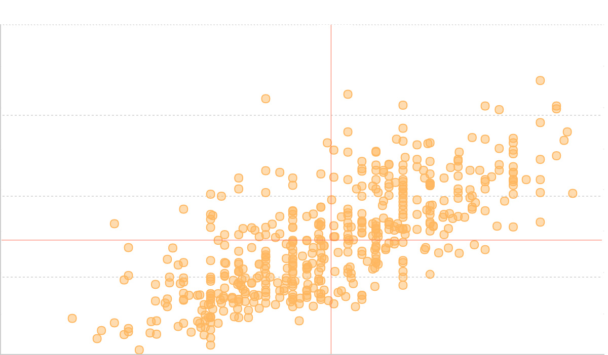
茎叶图和散点图
- 茎叶图:专注于单一变量的分布展示,通过茎叶结构有序排列数据
- 散点图:展示两个变量之间的关系和相关性,更适合探索变量间的关联模式