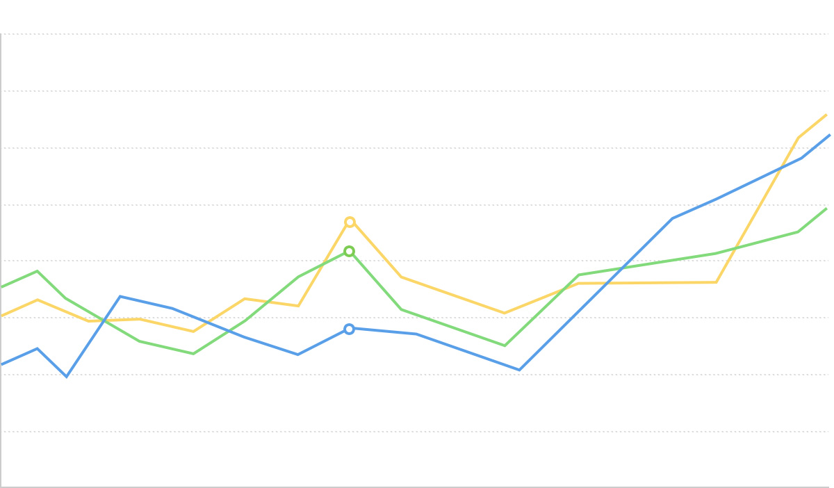
平行坐标系

平行坐标系的简介
平行坐标系,是一种含有多个垂直平行坐标轴的统计图表。每个垂直坐标轴表示一个字段,每个字段又用刻度来标明范围。这样,一个多维的数据可以很容易的在每一条轴上找到“落点”,从而连接起来,形成一条折线。随着数据增多,折线堆叠,分析者则有可能从中发现特性和规律,比如发现数据之间的聚类关系。
尽管表面上类似折线图,但平行坐标系并不表示趋势,各个坐标轴之间也没有因果关系。因此,使用平行坐标系时,如何确定轴的顺序,是可以人为决定的。一般来说,顺序会影响阅读的感知和判断。两根坐标轴隔得越近,人们对二者的对比就感知的越强烈。因此,要得出最合适、美观的排序方式,往往需要经过多次的试验和比较。反过来讲,尝试不同的排布方式,也可能有助于得出更多的结论。
此外,平行坐标系的每个坐标轴,很可能有不同的数据范围,这一点很容易造成读者误解。作图时,最好显著的标明每一根轴上的最小值、最大值。
英文名:Parallel Coordinates
平行坐标系的构成
垂直平行坐标系

| 图表类型 | 垂直平行坐标系 |
|---|---|
| 适合的数据 | 表格:多个连续数据字段,可选一个分类数据字段用于颜色编码 |
| 功能 | 分析多个变量之间的关系,识别数据模式和聚类 |
| 数据与图形的映射 | 每个数据维度映射到一个垂直坐标轴 数据记录映射到连接各轴的折线 可选分类字段映射到线条颜色 |
| 适合的数据条数 | 适中数据量(建议不超过 1000 条记录,过多时建议使用透明度或筛选) |
水平平行坐标系

| 图表类型 | 水平平行坐标系 |
|---|---|
| 适合的数据 | 表格:多个连续数据字段,可选一个分类数据字段用于颜色编码 |
| 功能 | 分析多个变量之间的关系,适合维度名称较长的情况 |
| 数据与图形的映射 | 每个数据维度映射到一个水平坐标轴 数据记录映射到连接各轴的折线 |
| 适合的数据条数 | 适中数据量,比垂直布局能容纳更多的维度标签 |
平行坐标系的应用场景
适合的场景
例子 1: 多维数据关系分析
下图展示了汽车数据集中多个性能指标之间的关系,包括燃油经济性、气缸数、排量、马力、重量等。
import { Chart } from '@antv/g2';

const axis = {
  zIndex: 1,
  titlePosition: 'right',
  line: true,
  labelStroke: '#fff',
  labelLineWidth: 5,
  labelFontSize: 10,
  labelStrokeLineJoin: 'round',
  titleStroke: '#fff',
  titleFontSize: 10,
  titleLineWidth: 5,
  titleStrokeLineJoin: 'round',
  titleTransform: 'translate(-50%, 0) rotate(-90)',
  lineStroke: 'black',
  tickStroke: 'black',
  lineLineWidth: 1,
};

const chart = new Chart({
  container: 'container',
  theme: 'classic',
});

chart.options({
  type: 'line',
  autoFit: true,
  data: {
    type: 'fetch',
    value: 'https://assets.antv.antgroup.com/g2/cars3.json',
  },
  coordinate: { type: 'parallel' },
  encode: {
    position: [
      'economy (mpg)',
      'cylinders',
      'displacement (cc)',
      'power (hp)',
      'weight (lb)',
      '0-60 mph (s)',
      'year',
    ],
    color: 'weight (lb)',
  },
  style: {
    lineWidth: 1.5,
    strokeOpacity: 0.4,
  },
  scale: {
    color: {
      palette: 'brBG',
      offset: (t) => 1 - t,
    },
  },
  legend: {
    color: { length: 400, layout: { justifyContent: 'center' } },
  },
  axis: {
    position: axis,
    position1: axis,
    position2: axis,
    position3: axis,
    position4: axis,
    position5: axis,
    position6: axis,
    position7: axis,
  },
  interaction: {
    tooltip: { series: false },
  },
});

chart.render();
说明:
- 每条线代表一辆汽车的多个性能指标
- 线条颜色根据汽车重量进行编码,便于识别重量相关的模式
- 可以观察到重量与燃油经济性、加速性能等指标的关系
例子 2: 数据聚类识别
通过平行坐标系可以识别具有相似模式的数据群组。
import { Chart } from '@antv/g2';

const chart = new Chart({
  container: 'container',
  theme: 'classic',
});
const axis = {
  zIndex: 1,
  titlePosition: 'right',
  line: true,
  labelStroke: '#fff',
  labelLineWidth: 5,
  labelFontSize: 10,
  labelStrokeLineJoin: 'round',
  titleStroke: '#fff',
  titleFontSize: 10,
  titleLineWidth: 5,
  titleStrokeLineJoin: 'round',
  titleTransform: 'translate(-50%, 0) rotate(-90)',
  lineStroke: 'black',
  tickStroke: 'black',
  lineLineWidth: 1,
};

chart.options({
  type: 'line',
  autoFit: true,
  data: [
    { A: 10, B: 30, C: 20, D: 60, group: '组1' },
    { A: 12, B: 32, C: 22, D: 58, group: '组1' },
    { A: 8, B: 28, C: 18, D: 62, group: '组1' },
    { A: 50, B: 20, C: 80, D: 30, group: '组2' },
    { A: 52, B: 18, C: 82, D: 28, group: '组2' },
    { A: 48, B: 22, C: 78, D: 32, group: '组2' },
    { A: 80, B: 60, C: 40, D: 10, group: '组3' },
    { A: 82, B: 58, C: 42, D: 12, group: '组3' },
    { A: 78, B: 62, C: 38, D: 8, group: '组3' },
  ],
  coordinate: { type: 'parallel' },
  encode: {
    position: ['A', 'B', 'C', 'D'],
    color: 'group',
  },
  style: {
    lineWidth: 3,
    strokeOpacity: 0.8,
  },
  scale: {
    color: {
      palette: 'category10',
    },
  },
  axis: {
    position: axis,
    position1: axis,
    position2: axis,
    position3: axis,
  },
  legend: {
    color: { position: 'bottom' },
  },
  interaction: {
    tooltip: { series: false },
  },
});

chart.render();
不适合的场景
例子 1: 维度过少
当只有 2-3 个维度时,使用散点图或其他图表类型会更直观。
// 不推荐:只有两个维度使用平行坐标系
import { Chart } from '@antv/g2';

const chart = new Chart({
  container: 'container',
  theme: 'classic',
});

chart.options({
  type: 'line',
  autoFit: true,
  data: [
    { x: 10, y: 30, category: 'A' },
    { x: 20, y: 20, category: 'B' },
    { x: 30, y: 40, category: 'C' },
    { x: 40, y: 35, category: 'D' },
    { x: 50, y: 25, category: 'E' },
  ],
  coordinate: { type: 'parallel' },
  encode: {
    position: ['x', 'y'],
    color: 'category',
  },
  style: {
    lineWidth: 2,
    strokeOpacity: 0.8,
  },
  axis: {
    position: { zIndex: 1 },
    position1: { zIndex: 1 },
  },
});

chart.render();
对于二维数据,散点图更适合:
// 推荐:二维数据使用散点图
import { Chart } from '@antv/g2';

const chart = new Chart({
  container: 'container',
  theme: 'classic',
  inset: 20,
});

chart.options({
  type: 'point',
  autoFit: true,
  data: [
    { x: 10, y: 30, category: 'A' },
    { x: 20, y: 20, category: 'B' },
    { x: 30, y: 40, category: 'C' },
    { x: 40, y: 35, category: 'D' },
    { x: 50, y: 25, category: 'E' },
  ],
  encode: {
    x: 'x',
    y: 'y',
    color: 'category',
    size: 20,
  },
  scale: {
    color: {
      palette: 'category10',
    },
  },
  legend: {
    color: { position: 'bottom' },
  },
});

chart.render();
例子 2: 数据量过大导致视觉混乱
当数据记录过多时,线条会严重重叠,影响可读性。
import { Chart } from '@antv/g2';

// 生成大量数据模拟过多记录的情况
const generateData = (count) => {
  const data = [];
  for (let i = 0; i < count; i++) {
    data.push({
      A: Math.random() * 100,
      B: Math.random() * 100,
      C: Math.random() * 100,
      D: Math.random() * 100,
      id: i,
    });
  }
  return data;
};

const chart = new Chart({
  container: 'container',
  theme: 'classic',
});

chart.options({
  type: 'line',
  autoFit: true,
  data: generateData(500), // 大量数据
  coordinate: { type: 'parallel' },
  encode: {
    position: ['A', 'B', 'C', 'D'],
  },
  style: {
    lineWidth: 1,
    strokeOpacity: 0.1, // 即使降低透明度仍然混乱
    stroke: '#1890ff',
  },
  axis: {
    position: { zIndex: 1 },
    position1: { zIndex: 1 },
    position2: { zIndex: 1 },
    position3: { zIndex: 1 },
  },
});

chart.render();
平行坐标系的拓展
改变线的形状
import { Chart } from '@antv/g2';

const axis = {
  zIndex: 1,
  line: true,
  labelStroke: '#fff',
  labelLineWidth: 5,
  labelFontSize: 10,
  labelStrokeLineJoin: 'round',
  titleStroke: '#fff',
  titleFontSize: 10,
  titleLineWidth: 5,
  titleStrokeLineJoin: 'round',
  lineStroke: 'black',
  tickStroke: 'black',
  lineLineWidth: 1,
};

const chart = new Chart({
  container: 'container',
  theme: 'classic',
});

chart.options({
  type: 'line',
  autoFit: true,
  data: {
    type: 'fetch',
    value: 'https://assets.antv.antgroup.com/g2/cars3.json',
  },
  coordinate: {
    type: 'parallel',
    transform: [{ type: 'transpose' }],
  },
  encode: {
    position: [
      'economy (mpg)',
      'cylinders',
      'displacement (cc)',
      'power (hp)',
      'weight (lb)',
    ],
    color: 'weight (lb)',
    shape: 'smooth',
  },
  style: {
    lineWidth: 1.5,
    strokeOpacity: 0.4,
  },
  scale: {
    color: {
      palette: 'brBG',
      offset: (t) => 1 - t,
    },
  },
  legend: {
    color: { length: 400, layout: { justifyContent: 'center' } },
  },
  axis: {
    position: axis,
    position1: axis,
    position2: axis,
    position3: axis,
    position4: axis,
  },
  interaction: {
    tooltip: { series: false },
  },
});

chart.render();
带交互的平行坐标系
添加轴刷选和高亮功能,增强数据探索能力:
import { Chart } from '@antv/g2';

const axis = {
  zIndex: 1,
  titlePosition: 'right',
  line: true,
  labelStroke: '#fff',
  labelLineWidth: 5,
  labelFontSize: 10,
  labelStrokeLineJoin: 'round',
  titleStroke: '#fff',
  titleFontSize: 10,
  titleLineWidth: 5,
  titleStrokeLineJoin: 'round',
  titleTransform: 'translate(-50%, 0) rotate(-90)',
  lineStroke: 'black',
  tickStroke: 'black',
  lineLineWidth: 1,
};

const chart = new Chart({
  container: 'container',
  theme: 'classic',
});

chart.options({
  type: 'line',
  autoFit: true,
  data: {
    type: 'fetch',
    value: 'https://assets.antv.antgroup.com/g2/cars3.json',
  },
  coordinate: { type: 'parallel' },
  encode: {
    position: [
      'economy (mpg)',
      'cylinders',
      'displacement (cc)',
      'power (hp)',
      'weight (lb)',
    ],
    color: 'cylinders',
  },
  scale: {
    color: {
      palette: 'brBG',
      offset: (t) => 1 - t,
    },
  },
  style: {
    lineWidth: 1.5,
    strokeOpacity: 0.6,
  },
  legend: {
    color: { position: 'bottom' },
  },
  axis: {
    position: axis,
    position1: axis,
    position2: axis,
    position3: axis,
    position4: axis,
  },
  interaction: {
    tooltip: { series: false },
    brushAxisHighlight: {
      maskFill: '#d8d0c0',
      maskOpacity: 0.3,
    },
  },
  state: {
    active: { lineWidth: 3, strokeOpacity: 1 },
    inactive: { stroke: '#ccc', opacity: 0.3 },
  },
});

chart.render();
世界五百强企业时间序列分析
受Fathom Information Design启发,这个例子展示了如何使用平行坐标系来分析大规模企业数据的时间变化。通过展示排名、收入和利润三个维度,可以观察企业在不同年份的表现轨迹和相互关系。
import { Chart } from '@antv/g2';

// 使用真实的财富500强数据
const realFortuneData = async () => {
  // 2022年财富500强数据(来源:GitHub jc22dora/2022Fortune500)
  const fortune2022 = [
    {
      company: 'Walmart',
      ranking: 1,
      revenue: 572754,
      profit: 13673,
      industry: '零售',
      year: 2022,
    },
    {
      company: 'Amazon',
      ranking: 2,
      revenue: 469822,
      profit: 33364,
      industry: '科技',
      year: 2022,
    },
    {
      company: 'Apple',
      ranking: 3,
      revenue: 365817,
      profit: 94680,
      industry: '科技',
      year: 2022,
    },
    {
      company: 'CVS Health',
      ranking: 4,
      revenue: 292111,
      profit: 7910,
      industry: '医疗',
      year: 2022,
    },
    {
      company: 'UnitedHealth Group',
      ranking: 5,
      revenue: 287597,
      profit: 17285,
      industry: '医疗',
      year: 2022,
    },
    {
      company: 'Exxon Mobil',
      ranking: 6,
      revenue: 285640,
      profit: 23040,
      industry: '能源',
      year: 2022,
    },
    {
      company: 'Berkshire Hathaway',
      ranking: 7,
      revenue: 276094,
      profit: 89795,
      industry: '金融',
      year: 2022,
    },
    {
      company: 'Alphabet',
      ranking: 8,
      revenue: 257637,
      profit: 76033,
      industry: '科技',
      year: 2022,
    },
    {
      company: 'McKesson',
      ranking: 9,
      revenue: 238228,
      profit: 5234,
      industry: '医疗',
      year: 2022,
    },
    {
      company: 'AmerisourceBergen',
      ranking: 10,
      revenue: 213989,
      profit: 1551,
      industry: '医疗',
      year: 2022,
    },
    {
      company: 'Costco Wholesale',
      ranking: 11,
      revenue: 195929,
      profit: 5007,
      industry: '零售',
      year: 2022,
    },
    {
      company: 'Cigna',
      ranking: 12,
      revenue: 174087,
      profit: 5408,
      industry: '医疗',
      year: 2022,
    },
    {
      company: 'AT&T',
      ranking: 13,
      revenue: 168864,
      profit: -11899,
      industry: '科技',
      year: 2022,
    },
    {
      company: 'Microsoft',
      ranking: 14,
      revenue: 168088,
      profit: 61271,
      industry: '科技',
      year: 2022,
    },
    {
      company: 'Cardinal Health',
      ranking: 15,
      revenue: 162467,
      profit: 987,
      industry: '医疗',
      year: 2022,
    },
    {
      company: 'Chevron',
      ranking: 16,
      revenue: 155607,
      profit: 15625,
      industry: '能源',
      year: 2022,
    },
    {
      company: 'Home Depot',
      ranking: 17,
      revenue: 151157,
      profit: 17105,
      industry: '零售',
      year: 2022,
    },
    {
      company: 'Walgreens Boots Alliance',
      ranking: 18,
      revenue: 132703,
      profit: -3003,
      industry: '医疗',
      year: 2022,
    },
    {
      company: 'Marathon Petroleum',
      ranking: 19,
      revenue: 128050,
      profit: 11267,
      industry: '能源',
      year: 2022,
    },
    {
      company: 'Anthem',
      ranking: 20,
      revenue: 118414,
      profit: 6104,
      industry: '医疗',
      year: 2022,
    },
    {
      company: 'Tesla',
      ranking: 65,
      revenue: 53823,
      profit: 5519,
      industry: '科技',
      year: 2022,
    },
    {
      company: 'Meta Platforms',
      ranking: 27,
      revenue: 117929,
      profit: 39370,
      industry: '科技',
      year: 2022,
    },
    {
      company: 'Netflix',
      ranking: 115,
      revenue: 29698,
      profit: 4492,
      industry: '科技',
      year: 2022,
    },
    {
      company: 'NVIDIA',
      ranking: 134,
      revenue: 26974,
      profit: 9752,
      industry: '科技',
      year: 2022,
    },
    {
      company: 'Adobe',
      ranking: 235,
      revenue: 15785,
      profit: 5788,
      industry: '科技',
      year: 2022,
    },
  ];

  // 模拟2019-2021年数据(基于2022年数据进行合理变化)
  const generateHistoricalData = (baseData, year) => {
    return baseData.map((item) => {
      const yearFactor =
        year === 2020 ? 0.85 : year === 2021 ? 0.95 : year === 2019 ? 0.9 : 1;
      const growthVariation = (Math.random() - 0.5) * 0.2; // ±10%的随机变化

      return {
        ...item,
        year,
        revenue: Math.round(item.revenue * yearFactor * (1 + growthVariation)),
        profit: Math.round(
          item.profit * yearFactor * (1 + growthVariation * 1.5),
        ), // 利润波动更大
        ranking: Math.max(
          1,
          Math.min(500, item.ranking + Math.floor((Math.random() - 0.5) * 6)),
        ), // 排名小幅波动
      };
    });
  };

  // 生成多年数据
  const allYearsData = [
    ...generateHistoricalData(fortune2022, 2019),
    ...generateHistoricalData(fortune2022, 2020),
    ...generateHistoricalData(fortune2022, 2021),
    ...fortune2022,
    ...generateHistoricalData(fortune2022, 2023), // 预测2023年
  ];

  return allYearsData;
};

// 获取数据并渲染图表
realFortuneData().then((fortuneData) => {
  const chart = new Chart({
    container: 'container',
    theme: 'classic',
    marginTop: 200,
    marginLeft: 50,
    marginRight: 50,
    height: 600,
    width: 800,
  });

  const axisConfig = {
    zIndex: 1,
    titlePosition: 'right',
    line: true,
    lineStroke: '#2c3e50',
    lineLineWidth: 2,
    labelStroke: '#fff',
    labelLineWidth: 4,
    labelFontSize: 11,
    labelStrokeLineJoin: 'round',
    titleStroke: '#fff',
    titleFontSize: 13,
    titleLineWidth: 5,
    titleStrokeLineJoin: 'round',
    titleTransform: 'translate(-50%, 0) rotate(-90)',
    tickStroke: '#7f8c8d',
    tickLineWidth: 1,
    grid: true,
    gridStroke: '#ecf0f1',
    gridStrokeOpacity: 0.5,
  };

  chart.options({
    type: 'line',
    data: fortuneData.filter((d) => d.year === 2022), // 默认显示2022年数据
    coordinate: { type: 'parallel' },
    encode: {
      position: ['ranking', 'revenue', 'profit'],
      color: 'industry',
      key: 'company',
    },
    style: {
      lineWidth: 2.5,
      strokeOpacity: 0.8,
      cursor: 'pointer',
    },
    scale: {
      position: {
        range: [0, 1],
        nice: true,
      },
      position1: {
        nice: true,
      },
      position2: {
        nice: true,
      },
      color: {
        type: 'ordinal',
        domain: ['科技', '零售', '医疗', '金融', '能源'],
        range: ['#3498db', '#e74c3c', '#2ecc71', '#f39c12', '#9b59b6'],
      },
    },
    legend: {
      color: {
        position: 'top',
        title: '行业分类',
        titleFontSize: 14,
      },
    },
    axis: {
      position: {
        ...axisConfig,
        title: '财富500强排名',
        labelFormatter: (d) => `#${Math.round(d)}`,
      },
      position1: {
        ...axisConfig,
        title: '营业收入 (百万美元)',
        labelFormatter: (d) => `$${(d / 1000).toFixed(0)}B`,
      },
      position2: {
        ...axisConfig,
        title: '净利润 (百万美元)',
        labelFormatter: (d) =>
          d >= 0
            ? `$${(d / 1000).toFixed(1)}B`
            : `-$${Math.abs(d / 1000).toFixed(1)}B`,
      },
    },
    tooltip: {
      title: (d) => `${d.company} (${d.year}年)`,
      items: [
        {
          field: 'ranking',
          name: '财富500强排名',
          valueFormatter: (d) => `第 ${d} 位`,
        },
        {
          field: 'revenue',
          name: '营业收入',
          valueFormatter: (d) => `$${(d / 1000).toFixed(1)} 十亿美元`,
        },
        {
          field: 'profit',
          name: '净利润',
          valueFormatter: (d) =>
            d >= 0
              ? `$${(d / 1000).toFixed(1)} 十亿美元`
              : `-$${Math.abs(d / 1000).toFixed(1)} 十亿美元`,
        },
        { field: 'industry', name: '行业' },
      ],
    },
    interaction: {
      tooltip: {
        series: false,
      },
      brushAxisHighlight: {
        maskFill: 'rgba(52, 152, 219, 0.15)',
        maskOpacity: 0.6,
      },
    },
    state: {
      active: {
        lineWidth: 4,
        strokeOpacity: 1,
        shadowColor: '#2c3e50',
        shadowBlur: 8,
      },
      inactive: {
        stroke: '#bdc3c7',
        strokeOpacity: 0.2,
      },
    },
  });

  chart.render();

  // 添加年份切换控制
  setTimeout(() => {
    const container = document.getElementById('container');
    const controlPanel = document.createElement('div');
    controlPanel.style.cssText = `
      position: absolute;
      top: 10px;
      left: 10px;
      background: rgba(255, 255, 255, 0.95);
      padding: 15px;
      border-radius: 8px;
      box-shadow: 0 2px 8px rgba(0,0,0,0.1);
      z-index: 100;
      font-family: -apple-system, BlinkMacSystemFont, 'Segoe UI', sans-serif;
    `;

    controlPanel.innerHTML = `
      <div style="margin-bottom: 10px; font-weight: 600; color: #2c3e50;">
        财富500强时间序列分析
      </div>
      <div style="margin-bottom: 8px;">
        <label style="font-size: 12px; color: #7f8c8d;">年份:</label>
        <span id="current-year" style="font-weight: 600; color: #2c3e50;">2022</span>
      </div>
      <div style="display: flex; gap: 5px; margin-bottom: 8px;">
        <button id="prev-year" style="padding: 6px 12px; border: 1px solid #bdc3c7; background: #fff; border-radius: 4px; cursor: pointer; font-size: 12px;">◀ 上一年</button>
        <button id="next-year" style="padding: 6px 12px; border: 1px solid #bdc3c7; background: #fff; border-radius: 4px; cursor: pointer; font-size: 12px;">下一年 ▶</button>
      </div>
      <div style="font-size: 11px; color: #95a5a6; line-height: 1.3;">
        💡 数据来源:<a href="https://github.com/jc22dora/2022Fortune500" target="_blank" style="color: #3498db;">GitHub</a><br>
        ⌨️ 提示:可使用键盘 ← → 键切换年份
      </div>
    `;

    container.style.position = 'relative';
    container.appendChild(controlPanel);

    const years = [2019, 2020, 2021, 2022, 2023];
    let currentYearIndex = 3; // 从2022年开始(真实数据年份)

    const updateChart = (yearIndex) => {
      const year = years[yearIndex];
      const yearData = fortuneData.filter((d) => d.year === year);
      document.getElementById('current-year').textContent = year;

      chart.changeData(yearData);

      // 更新按钮状态
      document.getElementById('prev-year').disabled = yearIndex === 0;
      document.getElementById('next-year').disabled =
        yearIndex === years.length - 1;

      // 更新按钮样式
      const prevBtn = document.getElementById('prev-year');
      const nextBtn = document.getElementById('next-year');
      prevBtn.style.opacity = yearIndex === 0 ? '0.5' : '1';
      nextBtn.style.opacity = yearIndex === years.length - 1 ? '0.5' : '1';
    };

    // 按钮事件
    document.getElementById('prev-year').onclick = () => {
      if (currentYearIndex > 0) {
        currentYearIndex--;
        updateChart(currentYearIndex);
      }
    };

    document.getElementById('next-year').onclick = () => {
      if (currentYearIndex < years.length - 1) {
        currentYearIndex++;
        updateChart(currentYearIndex);
      }
    };

    // 键盘事件
    document.addEventListener('keydown', (e) => {
      if (e.key === 'ArrowLeft' && currentYearIndex > 0) {
        currentYearIndex--;
        updateChart(currentYearIndex);
      } else if (
        e.key === 'ArrowRight' &&
        currentYearIndex < years.length - 1
      ) {
        currentYearIndex++;
        updateChart(currentYearIndex);
      }
    });

    // 初始化按钮状态
    updateChart(currentYearIndex);
  }, 500);
});
平行坐标系与其他图表的对比
平行坐标系和折线图
- 平行坐标系用于展示多维数据之间的关系,每个轴代表不同的维度,轴之间没有因果关系
- 折线图用于展示数据随时间或其他连续变量的变化趋势,横轴通常表示时间序列
- 平行坐标系的轴可以任意调整顺序,而折线图的横轴顺序通常是固定的
- 平行坐标系每条线代表一个数据记录的多个维度值,折线图每条线代表一个指标随时间的变化
平行坐标系和桑基图
- 平行坐标系展示多维数据之间的关系,每条线代表一个数据记录的多个维度值
- 桑基图展示流量在不同节点间的分配和流向,线条宽度代表流量大小
- 平行坐标系的轴代表不同维度,轴之间没有流量的概念
- 桑基图的节点之间有明确的流向关系,通常用于展示资源、能量等的流动过程
平行坐标系和雷达图
- 平行坐标系使用平行轴展示多维数据,适合比较不同记录
- 雷达图使用径向轴展示多维数据,适合展示单个记录的多维特征