
散点图
散点图的简介
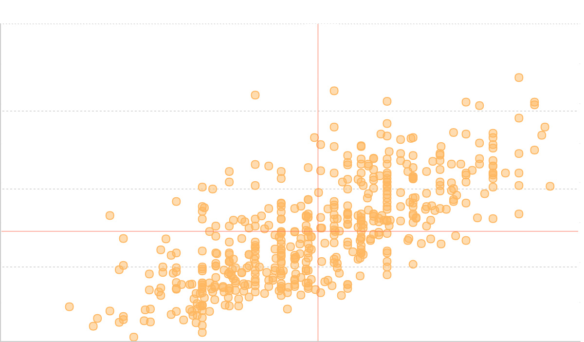
散点图是一种通过二维坐标平面上的点来展示两个连续变量之间关系的可视化图表。每个数据点的位置由两个变量的值决定,其中一个变量确定水平位置(x 轴),另一个变量确定垂直位置(y 轴)。
散点图有别于折线图,散点图主要用于探索和展示变量间的相关性、分布模式以及异常值的识别,而折线图更适合展示连续数据的趋势变化。
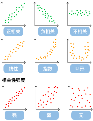
通过观察散点图上数据点的分布情况,我们可以推断出变量间的相关性。如果变量之间不存在相互关系,那么在散点图上就会表现为随机分布的离散的点,如果存在某种相关性,那么大部分数据点就会相对密集并以某种趋势呈现。数据的相关关系主要分为:正相关(两个变量值同时增长)、负相关(一个变量值增加另一个变量值下降)、不相关、线性相关、指数相关等。
英文名:Scatter plot, Scatter chart
散点图的构成
| 图表类型 | 散点图 |
|---|---|
| 适合的数据 | 列表:两个连续数据字段 |
| 功能 | 探索两个变量之间的相关性,识别数据模式和异常值 |
| 数据与图形的映射 | 第一个连续数据字段映射到横轴位置 第二个连续数据字段映射到纵轴位置 可选分类字段映射到点的颜色或大小 |
| 适合的数据条数 | 10-1000 条数据,数据过多时可考虑采样或使用密度图 |
组成元素:
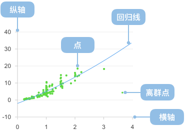
- 数据点(Points):代表数据集中每个观测值的圆点或其他形状
- X 轴(X-axis):水平坐标轴,通常表示自变量
- Y 轴(Y-axis):垂直坐标轴,通常表示因变量
- 坐标网格(Grid):辅助读数的参考线
- 图例(Legend):当有多个数据系列时,说明不同点的含义
import { Chart } from '@antv/g2';

const chart = new Chart({ container: 'container' });

chart.options({
  type: 'point',
  autoFit: true,
  data: [
    { height: 161, weight: 50 },
    { height: 167, weight: 55 },
    { height: 171, weight: 63 },
    { height: 174, weight: 58 },
    { height: 176, weight: 65 },
    { height: 178, weight: 70 },
    { height: 180, weight: 72 },
    { height: 182, weight: 75 },
    { height: 185, weight: 78 },
    { height: 188, weight: 82 },
  ],
  encode: { x: 'height', y: 'weight' },
  scale: { x: { range: [0, 1] }, y: { domainMin: 0, nice: true } },
  axis: {
    x: { title: '身高 (cm)' },
    y: { title: '体重 (kg)' },
  },
  style: {
    fill: '#1890ff',
    fillOpacity: 0.7,
    stroke: '#1890ff',
    strokeWidth: 2,
    r: 6,
  },
});

chart.render();
散点图的应用场景
适合的场景
散点图特别适合展示数据分布和变量间的相关性。以下通过四个渐进的例子来展示散点图的不同应用:
1. 基础散点图 - 展示数据分布
最基础的散点图用于展示两个连续变量的分布关系:
import { Chart } from '@antv/g2';

const chart = new Chart({ container: 'container' });

chart.options({
  type: 'point',
  data: {
    type: 'fetch',
    value:
      'https://assets.antv.antgroup.com/g2/top-30-countries-by-quality-of-life.json',
  },
  encode: { x: 'x', y: 'y' },
  scale: { x: { domain: [137.5, 212] }, y: { domain: [0, 80] } },
  labels: [{ text: 'name', fontSize: 10, dy: 6 }],
  style: { mainStroke: '#5B8FF9', mainLineWidth: 2 },
});

chart.render();
2. 添加数据标注 - 增强可读性
通过添加数据标注,例如线标注、区间标注来帮助用户更好地理解数据:
import { Chart } from '@antv/g2';

const chart = new Chart({ container: 'container' });

chart.options({
  type: 'view',
  data: {
    type: 'fetch',
    value:
      'https://assets.antv.antgroup.com/g2/top-30-countries-by-quality-of-life.json',
  },
  style: { mainStroke: '#5B8FF9', mainLineWidth: 2 },
  axis: { x: false, y: false },
  children: [
    {
      type: 'range',
      data: [
        { x: [0, 0.5], y: [0, 0.5] },
        { x: [0.5, 1], y: [0.5, 1] },
      ],
      encode: { x: 'x', y: 'y' },
      scale: {
        x: { independent: true, domain: [0, 1] },
        y: { independent: true, domain: [0, 1] },
      },
      style: { stroke: '#5B8FF9', lineWidth: 1, fillOpacity: 0.15 },
      animate: false,
      tooltip: false,
    },
    {
      type: 'point',
      encode: { x: 'x', y: 'y', shape: 'point' },
      scale: { x: { domain: [137.5, 212] }, y: { domain: [0, 80] } },
      labels: [{ text: 'name', fontSize: 10, dy: 6 }],
    },
  ],
});

chart.render();
3. 使用颜色通道 - 展示分类信息
通过颜色通道来区分不同类别的数据:
import { Chart } from '@antv/g2';

const chart = new Chart({ container: 'container' });

chart.options({
  type: 'point',
  autoFit: true,
  data: {
    type: 'fetch',
    value:
      'https://gw.alipayobjects.com/os/basement_prod/6b4aa721-b039-49b9-99d8-540b3f87d339.json',
  },
  encode: { x: 'height', y: 'weight', color: 'gender' },
});

chart.render();
4. 添加回归线 - 显示趋势关系
还可以通过自定义数据转换函数来对数据进行预处理,添加回归线来显示变量间的趋势关系:
import { Chart } from '@antv/g2';
import { regressionLinear } from 'd3-regression';

const chart = new Chart({ container: 'container' });

chart.options({
  type: 'view',
  autoFit: true,
  data: {
    type: 'fetch',
    value: 'https://assets.antv.antgroup.com/g2/linear-regression.json',
  },
  children: [
    {
      type: 'point',
      encode: { x: (d) => d[0], y: (d) => d[1], shape: 'point' },
      scale: { x: { domain: [0, 1] }, y: { domain: [0, 5] } },
      style: { fillOpacity: 0.75 },
    },
    {
      type: 'line',
      data: {
        transform: [
          {
            type: 'custom',
            callback: regressionLinear(),
          },
        ],
      },
      encode: { x: (d) => d[0], y: (d) => d[1] },
      style: { stroke: '#30BF78', lineWidth: 2 },
      labels: [
        {
          text: 'y = 1.7x+3.01',
          selector: 'last',
          position: 'right',
          textAlign: 'end',
          dy: -8,
        },
      ],
      tooltip: false,
    },
  ],
});

chart.render();
不适合的场景
数据点重叠严重的情况
当数据在某些位置高度重叠时,普通散点图无法清晰展示数据的真实分布。例如下图展示了一个存在严重重叠问题的散点图:
import { Chart } from '@antv/g2';

const chart = new Chart({ container: 'container' });

chart.options({
  type: 'point',
  autoFit: true,
  data: {
    type: 'fetch',
    value:
      'https://gw.alipayobjects.com/os/bmw-prod/2c813e2d-2276-40b9-a9af-cf0a0fb7e942.csv',
  },
  encode: {
    y: 'Horsepower',
    x: 'Cylinders',
    shape: 'hollow',
    color: 'Cylinders',
  },
  transform: [{ type: 'sortX', channel: 'x' }],
  scale: { x: { type: 'point' }, color: { type: 'ordinal' } },
});

chart.render();
解决方案:使用抖动变换(Jitter)
通过添加随机偏移来避免重叠,使数据分布更加清晰:
import { Chart } from '@antv/g2';

const chart = new Chart({ container: 'container' });

chart.options({
  type: 'point',
  autoFit: true,
  data: {
    type: 'fetch',
    value:
      'https://gw.alipayobjects.com/os/bmw-prod/2c813e2d-2276-40b9-a9af-cf0a0fb7e942.csv',
  },
  encode: {
    y: 'Horsepower',
    x: 'Cylinders',
    shape: 'hollow',
    color: 'Cylinders',
  },
  transform: [{ type: 'sortX', channel: 'x' }, { type: 'jitterX' }],
  scale: { x: { type: 'point' }, color: { type: 'ordinal' } },
});

chart.render();
例子 2: 不适合展示分类数据的对比
散点图不适合用于展示分类数据的数值对比,如下图试图用散点图展示不同产品的销量:
import { Chart } from '@antv/g2';

const chart = new Chart({
  container: 'container',
});

chart.options({
  type: 'point',
  autoFit: true,
  data: [
    { product: '产品A', sales: 275 },
    { product: '产品B', sales: 115 },
    { product: '产品C', sales: 120 },
    { product: '产品D', sales: 350 },
    { product: '产品E', sales: 150 },
  ],
  encode: { x: 'product', y: 'sales' },
  scale: { x: { range: [0, 1] }, y: { domainMin: 0, nice: true } },
  axis: {
    x: { title: '产品类型' },
    y: { title: '销量' },
  },
  title: '不适合的用法:用散点图展示分类数据',
  style: {
    fill: '#1890ff',
    fillOpacity: 0.8,
    stroke: '#1890ff',
    strokeWidth: 2,
    r: 8,
  },
});

chart.render();
对于分类数据的对比,更适合使用柱状图:
import { Chart } from '@antv/g2';

const chart = new Chart({
  container: 'container',
});

chart.options({
  type: 'interval',
  autoFit: true,
  data: [
    { product: '产品A', sales: 275 },
    { product: '产品B', sales: 115 },
    { product: '产品C', sales: 120 },
    { product: '产品D', sales: 350 },
    { product: '产品E', sales: 150 },
  ],
  encode: { x: 'product', y: 'sales', color: 'product' },
  axis: {
    x: { title: '产品类型' },
    y: { title: '销量' },
  },
  title: '更适合的选择:用柱状图展示分类数据',
});

chart.render();
散点图的扩展
带趋势线的散点图
添加回归线来更清晰地展示数据趋势:
import { Chart } from '@antv/g2';

const chart = new Chart({ container: 'container' });

const data = [
  { x: 1, y: 2.1 },
  { x: 2, y: 3.8 },
  { x: 3, y: 5.2 },
  { x: 4, y: 6.9 },
  { x: 5, y: 8.1 },
  { x: 6, y: 9.8 },
  { x: 7, y: 11.2 },
  { x: 8, y: 13.1 },
  { x: 9, y: 14.8 },
  { x: 10, y: 16.5 },
];

chart.options({
  type: 'view',
  autoFit: true,
  data,
  encode: { x: 'x', y: 'y' },
  scale: { x: { range: [0, 1] }, y: { domainMin: 0, nice: true } },
  children: [
    {
      type: 'point',
      style: {
        fill: '#1890ff',
        fillOpacity: 0.8,
        stroke: '#1890ff',
        strokeWidth: 2,
        r: 6,
      },
    },
    {
      type: 'line',
      style: {
        stroke: '#ff4d4f',
        strokeWidth: 2,
        strokeDasharray: [4, 4],
      },
    },
  ],
  axis: {
    x: { title: 'X 变量' },
    y: { title: 'Y 变量' },
  },
  title: '带趋势线的散点图',
});

chart.render();
带标签的散点图
为重要数据点添加文本标签,提升数据可读性:
import { Chart } from '@antv/g2';

const chart = new Chart({ container: 'container' });

const data = [
  { product: '产品A', satisfaction: 8.5, sales: 120, category: '科技' },
  { product: '产品B', satisfaction: 7.2, sales: 85, category: '家居' },
  { product: '产品C', satisfaction: 9.1, sales: 200, category: '科技' },
  { product: '产品D', satisfaction: 6.8, sales: 95, category: '服装' },
  { product: '产品E', satisfaction: 8.9, sales: 160, category: '科技' },
  { product: '产品F', satisfaction: 7.5, sales: 110, category: '家居' },
  { product: '产品G', satisfaction: 6.2, sales: 70, category: '服装' },
  { product: '产品H', satisfaction: 8.7, sales: 185, category: '科技' },
];

chart.options({
  type: 'view',
  autoFit: true,
  data,
  encode: { x: 'satisfaction', y: 'sales', color: 'category' },
  children: [
    {
      type: 'point',
      style: {
        r: 8,
        fillOpacity: 0.8,
        strokeWidth: 2,
      },
    },
    {
      type: 'text',
      encode: { text: 'product' },
      style: {
        fontSize: 10,
        textAlign: 'center',
        dy: -12,
        fontWeight: 'bold',
      },
    },
  ],
  axis: {
    x: { title: '客户满意度' },
    y: { title: '销量 (万件)' },
  },
  legend: { color: { position: 'top' } },
  title: '产品满意度 vs 销量分析',
});

chart.render();
分组对比散点图
使用 facet 来创建分面散点图,便于不同组间的对比分析:
import { Chart } from '@antv/g2';

const chart = new Chart({ container: 'container' });

const data = [
  // 2020年数据
  { year: 2020, quarter: 'Q1', revenue: 120, profit: 15, company: '公司A' },
  { year: 2020, quarter: 'Q2', revenue: 135, profit: 18, company: '公司A' },
  { year: 2020, quarter: 'Q3', revenue: 145, profit: 22, company: '公司A' },
  { year: 2020, quarter: 'Q4', revenue: 160, profit: 25, company: '公司A' },
  { year: 2020, quarter: 'Q1', revenue: 95, profit: 12, company: '公司B' },
  { year: 2020, quarter: 'Q2', revenue: 110, profit: 14, company: '公司B' },
  { year: 2020, quarter: 'Q3', revenue: 125, profit: 18, company: '公司B' },
  { year: 2020, quarter: 'Q4', revenue: 140, profit: 21, company: '公司B' },
  // 2021年数据
  { year: 2021, quarter: 'Q1', revenue: 170, profit: 28, company: '公司A' },
  { year: 2021, quarter: 'Q2', revenue: 185, profit: 32, company: '公司A' },
  { year: 2021, quarter: 'Q3', revenue: 195, profit: 35, company: '公司A' },
  { year: 2021, quarter: 'Q4', revenue: 210, profit: 38, company: '公司A' },
  { year: 2021, quarter: 'Q1', revenue: 150, profit: 23, company: '公司B' },
  { year: 2021, quarter: 'Q2', revenue: 165, profit: 26, company: '公司B' },
  { year: 2021, quarter: 'Q3', revenue: 175, profit: 29, company: '公司B' },
  { year: 2021, quarter: 'Q4', revenue: 190, profit: 32, company: '公司B' },
];

chart.options({
  type: 'facetRect',
  autoFit: true,
  margin: 30,
  data,
  encode: { x: 'year' },
  children: [
    {
      type: 'point',
      encode: {
        x: 'revenue',
        y: 'profit',
        color: 'company',
        shape: 'quarter',
      },
      scale: {
        shape: { range: ['circle', 'square', 'triangle', 'diamond'] },
        x: { nice: true },
        y: { nice: true },
      },
      style: {
        r: 6,
        fillOpacity: 0.8,
        stroke: '#fff',
        strokeWidth: 1,
      },
    },
  ],
  axis: {
    x: { title: '营收 (万元)' },
    y: { title: '利润 (万元)' },
  },
  legend: {
    color: { position: 'top' },
    shape: { position: 'right' },
  },
  title: '公司营收利润关系年度对比',
});

chart.render();
矩阵散点图
使用多个散点图组成矩阵,展示多变量间的相关性:
import { Chart } from '@antv/g2';

const chart = new Chart({ container: 'container' });

// 生成相关性数据
const generateCorrelationData = () => {
  const data = [];
  const variables = ['销售额', '广告投入', '客户满意度'];

  for (let i = 0; i < 50; i++) {
    const sales = 100 + Math.random() * 200;
    const advertising = sales * 0.1 + Math.random() * 20;
    const satisfaction = 6 + (sales - 100) / 50 + Math.random() * 2;

    data.push({
      id: i,
      销售额: sales,
      广告投入: advertising,
      客户满意度: Math.min(10, Math.max(1, satisfaction)),
    });
  }

  return data;
};

const rawData = generateCorrelationData();

// 转换数据为矩阵格式
const matrixData = [];
const variables = ['销售额', '广告投入', '客户满意度'];

variables.forEach((xVar) => {
  variables.forEach((yVar) => {
    rawData.forEach((d) => {
      matrixData.push({
        xVar,
        yVar,
        x: d[xVar],
        y: d[yVar],
        id: d.id,
      });
    });
  });
});

const axisStyle = {
  title: false,
  labelFormatter: (d) => (typeof d === 'number' ? d.toFixed(0) : d),
};

chart.options({
  type: 'facetRect',
  autoFit: true,
  margin: 30,
  data: matrixData,
  encode: { x: 'xVar', y: 'yVar' },
  children: [
    {
      type: 'point',
      encode: { x: 'x', y: 'y' },
      style: {
        r: 3,
        fillOpacity: 0.6,
        fill: '#1890ff',
        stroke: '#fff',
        strokeWidth: 0.5,
      },
      scale: {
        x: { nice: true },
        y: { nice: true },
      },
    },
  ],
  axis: {
    x: axisStyle,
    y: axisStyle,
  },
  title: '多变量相关性矩阵散点图',
});

chart.render();
散点图与其他图表类型的对比
| 图表类型 | 适用场景 | 优势 | 劣势 |
|---|---|---|---|
| 散点图 | 探索两变量关系、异常值检测 | 直观展示相关性、易于识别模式 | 数据点过多时可能重叠 |
| 折线图 | 时间序列数据、趋势展示 | 清晰显示变化趋势 | 不适合展示变量间相关性 |
| 柱状图 | 分类数据比较 | 便于比较不同类别 | 无法展示连续变量关系 |
| 气泡图 | 三维数据展示 | 信息量更大 | 复杂度较高,解读难度增加 |