
双向柱状图
双向柱状图的简介
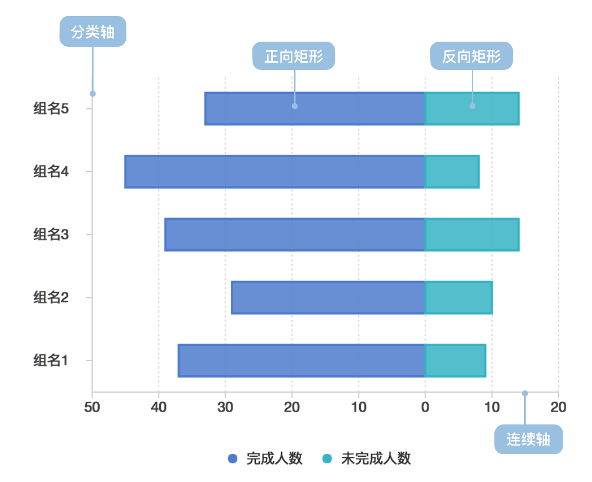
双向柱状图(又名正负条形图),使用正向和反向的柱子显示类别之间的数值比较。其中分类轴表示需要对比的分类维度,连续轴代表相应的数值,分为两种情况,一种是正向刻度值与反向刻度值完全对称,另一种是正向刻度值与反向刻度值反向对称,即互为相反数。
英文名:Bi-Directional Bar,Bi-Directional Column
双向柱状图的构成
| 图表类型 | 双向柱状图 |
|---|---|
| 适合的数据 | 列表:一个分类数据字段、两个连续数据字段 |
| 功能 | 对比分类数据的数值大小 |
| 数据与图形的映射 | 分类数据字段映射到分类轴的位置;一个连续数据字段映射到正向矩形的长度;另一个连续数据字段映射到反向矩形的长度;正反向数据可以设置颜色或形状(shape)增强区分度;分类数据可以设置颜色增强分类的区分度 |
| 适合的数据条数 | 横向不超过 30 条数据、纵向不超过 12 条数据 |
双向柱状图的应用场景
适合的场景
例子 1: 正反分类数据对比
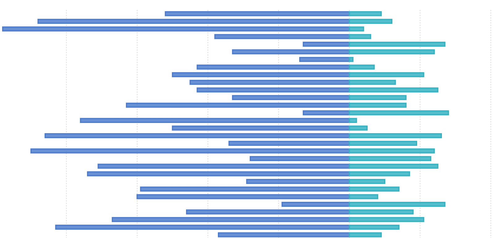
下图是模拟某个公司各个部门对某项任务的完成情况数据的对比图,完成人数使用正向柱状图表示、未完成人数使用反向柱状图表示。
| 部门 | 小组 | 完成人数 | 未完成人数 |
|---|---|---|---|
| 部门 0 | 组名 0 | 37 | 9 |
| … | … | … | … |
import { Chart } from '@antv/g2';

const chart = new Chart({
  container: 'container',
});

const data = [
  { department: '部门 0', group: '组名0', people: 37, type: 'completed' },
  { department: '部门 0', group: '组名0', people: 9, type: 'uncompleted' },
  { department: '部门 0', group: '组名1', people: 27, type: 'completed' },
  { department: '部门 0', group: '组名1', people: 10, type: 'uncompleted' },
  { department: '部门 1', group: '组名2', people: 37, type: 'completed' },
  { department: '部门 1', group: '组名2', people: 19, type: 'uncompleted' },
  { department: '部门 1', group: '组名3', people: 37, type: 'completed' },
  { department: '部门 1', group: '组名3', people: 29, type: 'uncompleted' },
  { department: '部门 2', group: '组名4', people: 20, type: 'completed' },
  { department: '部门 2', group: '组名4', people: 2, type: 'uncompleted' },
  { department: '部门 2', group: '组名5', people: 40, type: 'completed' },
  { department: '部门 2', group: '组名5', people: 10, type: 'uncompleted' },
  { department: '部门 3', group: '组名6', people: 25, type: 'completed' },
  { department: '部门 3', group: '组名6', people: 3, type: 'uncompleted' },
  { department: '部门 3', group: '组名7', people: 55, type: 'completed' },
  { department: '部门 3', group: '组名7', people: 8, type: 'uncompleted' },
];

const range = ['#7593ed', '#95e3b0', '#6c7893', '#e7c450', '#7460eb'];

chart.options({
  type: 'interval',
  coordinate: { transform: [{ type: 'transpose' }] },
  autoFit: true,
  data: data,
  encode: {
    x: 'group',
    y: (d) => (d.type === 'completed' ? d.people : -d.people),
    color: 'department',
  },

  scale: {
    x: { padding: 0.5 },
    color: {
      type: 'ordinal',
      range,
    },
  },
  axis: {
    x: { title: '' },
    y: {
      labelFormatter: (d) => {
        return Math.abs(d);
      },
    },
  },
  style: {
    fill: ({ type }, i, data) => {
      if (type === 'uncompleted') {
        return 'transparent';
      }
    },
    stroke: (d, i, data, ...re) => {
      const { type } = d;
      if (type === 'uncompleted') {
        return range[i / 2];
      }
    },
    lineWidth: 2,
  },
  tooltip: {
    title: (d) => {
      return `${d.department}-${d.group}`;
    },
    items: [
      (d, i, data, column) => ({
        name: d.type === 'completed' ? '完成' : '未完成',
        value: d.people,
      }),
    ],
  },
});

chart.render();
说明 :
- 使用了
颜色用于区分不同的部门 - 使用了
形状(空心和实心)用于区分完成人数和未完成人数 - 使用了
位置用于区分不同小组
不适合的场景
双向柱状图不适合不含相反含义的数据
双向柱状图的扩展
例子 1: 层叠双向柱状图
下图展示了不同类型的人群对某个问题的同意程度的统计数据,分为非常不同意、不同意、没意见、同意和非常同意五种程度,其中非常不同意、不同意和没意见作为反向柱状图,不同程度用不同颜色来表示。虚构数据
| type | Strongly agree | Agree | Neither agree nor disagree | Disagree | Strongly disagree |
|---|---|---|---|---|---|
| Question 1 | 11.7 | 59.9 | 18.5 | 9.1 | 0.7 |
| … | … | … | … | … | … |
import { Chart } from '@antv/g2';

const chart = new Chart({
  container: 'container',
});

const types = [
  'Strongly disagree',
  'Disagree',
  'Neither agree nor disagree',
  'Agree',
  'Strongly agree',
];
const colors = ['#c30d24', '#f3a583', '#cccccc', '#94c6da', '#1770ab'];

chart.options({
  type: 'interval',
  coordinate: { transform: [{ type: 'transpose' }] },
  autoFit: true,
  data: {
    type: 'fetch',
    value:
      'https://gw.alipayobjects.com/os/bmw-prod/82c97016-0f99-433b-ab21-9ecf14244610.csv',
  },
  transform: [{ type: 'stackY' }],
  encode: {
    x: 'question',
    y: (d) =>
      d.type === 'Disagree' || d.type === 'Strongly disagree'
        ? -d.percentage
        : d.type === 'Neither agree nor disagree'
        ? -d.percentage / 2
        : +d.percentage,
    color: 'type',
  },

  scale: {
    x: { padding: 0.5 },
    color: { domain: types, range: colors },
  },
  axis: {
    x: { title: '' },
    y: {
      labelFormatter: (d) => {
        return Math.abs(d);
      },
    },
  },

  tooltip: {
    items: [
      (d, i, data, column) => ({
        name: d.type,
        value: d.percentage,
      }),
    ],
  },
});

chart.render();
说明 :
- 使用了
颜色用于区分不同程度 - 使用了
位置用于区分不同问题
双向柱状图与其他图表的对比
双向柱状图和柱状图
- 柱状图只能绘制在同一个坐标轴内,每个柱子只能表示一个数据
- 双向柱状图包含正向和反向两个坐标轴,每个柱子可以表示一个正向数据和一个反向数据


