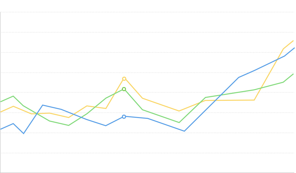
面积图

面积图的简介
面积图是在折线图的基础上,将折线与坐标轴之间的区域进行填充,用于强调数量的变化趋势。面积图可以更好地展示趋势变化中的峰谷,使用填充区域的视觉效果,强调数量随时间变化的程度。
面积图特别适合展示连续的时间序列数据,可以直观地表达数据变化的趋势,同时通过面积的视觉效果,强调总量在某个区间内的变化情况。
当需要同时展示多个序列的数据时,可以使用堆叠面积图或者百分比堆叠面积图,用于比较各个类别的数据在总数中的占比及其随时间的变化。
英文名:Area Chart, Area Graph
面积图的构成
基础面积图

| 图表类型 | 基础面积图 |
|---|---|
| 适合的数据 | 时间序列数据:一个有序/连续数据字段(通常是时间)、一个连续数据字段 |
| 功能 | 展示数据随时间或有序维度的变化趋势 |
| 数据与图形的映射 | 时间字段映射到横轴的位置 数值字段映射到纵轴的高度 面积填充强调数据变化的程度 |
| 适合的场景 | 单一数据系列随时间的变化趋势 |
堆叠面积图

| 图表类型 | 堆叠面积图 |
|---|---|
| 适合的数据 | 多序列时间数据:一个有序/连续数据字段(通常是时间)、一个连续数据字段、一个分类数据字段 |
| 功能 | 展示多个数据系列随时间变化的趋势及其叠加总量 |
| 数据与图形的映射 | 时间字段映射到横轴的位置 数值字段映射到纵轴的高度 分类字段映射到不同的颜色和堆叠区域 |
| 适合的场景 | 多数据系列及其总量随时间的变化趋势对比 |
面积图的应用场景
适合的场景
例子 1: 适合展示连续时间序列的趋势
下图是一个股票价格走势的面积图,展示了某公司股票价格随时间的变化趋势。
| date(日期) | close(收盘价) |
|---|---|
| 2015/1/5 | 121.73 |
| 2015/1/6 | 115.07 |
| 2015/1/7 | 116.75 |
| … | … |
import { Chart } from '@antv/g2';

const chart = new Chart({
  container: 'container',
  theme: 'classic',
});

chart.options({
  type: 'view',
  autoFit: true,
  data: {
    type: 'fetch',
    value: 'https://assets.antv.antgroup.com/g2/aapl.json',
    transform: [
      {
        type: 'map',
        callback: (d) => ({
          ...d,
          date: new Date(d.date),
        }),
      },
    ],
  },
  encode: { x: 'date', y: 'close' },
  axis: {
    x: {
      title: null,
    },
    y: {
      title: null,
    },
  },
  children: [
    {
      type: 'area',
      style: {
        fill: 'l(270) 0:#ffffff 0.5:#7ec2f3 1:#1890ff',
        fillOpacity: 0.6,
      },
    },
    {
      type: 'line',
      style: {
        lineWidth: 2,
      },
    },
  ],
});

chart.render();
说明 :
date字段,映射到横轴的位置,表示时间的先后顺序close字段,映射到纵轴的高度和填充面积,展示了价格随时间的变化趋势- 同时使用面积填充和线条,增强了视觉效果,方便观察变化趋势
例子 2: 适合展示多个数据系列的堆叠趋势
堆叠面积图可以同时展示多个数据系列随时间的变化,以及它们的总和趋势。下图展示了不同行业失业人数的变化趋势。
import { Chart } from '@antv/g2';

const chart = new Chart({
  container: 'container',
  theme: 'classic',
});

chart.options({
  type: 'area',
  autoFit: true,
  data: {
    type: 'fetch',
    value: 'https://assets.antv.antgroup.com/g2/unemployment-by-industry.json',
  },
  encode: {
    x: (d) => new Date(d.date),
    y: 'unemployed',
    color: 'industry',
  },
  transform: [
    {
      type: 'stackY',
    },
  ],
  axis: {
    x: {
      title: null,
    },
    y: {
      title: null,
    },
  },
});

chart.render();
说明:
date字段映射到横轴,表示时间维度unemployed字段映射到纵轴,表示失业人数industry字段映射到颜色,区分不同行业- 使用
stackY转换将各系列数据堆叠显示
例子 3: 百分比堆叠面积图展示占比变化
当需要展示各类别在总体中的占比随时间的变化时,百分比堆叠面积图是非常合适的选择。
import { Chart } from '@antv/g2';

const chart = new Chart({
  container: 'container',
  theme: 'classic',
});

chart.options({
  type: 'area',
  autoFit: true,
  data: [
    { country: 'Asia', year: '1750', value: 502 },
    { country: 'Asia', year: '1800', value: 635 },
    { country: 'Asia', year: '1850', value: 809 },
    { country: 'Asia', year: '1900', value: 947 },
    { country: 'Asia', year: '1950', value: 1402 },
    { country: 'Asia', year: '1999', value: 3634 },
    { country: 'Asia', year: '2050', value: 5268 },
    { country: 'Africa', year: '1750', value: 106 },
    { country: 'Africa', year: '1800', value: 107 },
    { country: 'Africa', year: '1850', value: 111 },
    { country: 'Africa', year: '1900', value: 133 },
    { country: 'Africa', year: '1950', value: 221 },
    { country: 'Africa', year: '1999', value: 767 },
    { country: 'Africa', year: '2050', value: 1766 },
    { country: 'Europe', year: '1750', value: 163 },
    { country: 'Europe', year: '1800', value: 203 },
    { country: 'Europe', year: '1850', value: 276 },
    { country: 'Europe', year: '1900', value: 408 },
    { country: 'Europe', year: '1950', value: 547 },
    { country: 'Europe', year: '1999', value: 729 },
    { country: 'Europe', year: '2050', value: 628 },
  ],
  encode: { x: 'year', y: 'value', color: 'country' },
  transform: [{ type: 'stackY' }, { type: 'normalizeY' }],
  axis: {
    x: {
      title: null,
    },
    y: {
      title: null,
      labelFormatter: '.0%',
    },
  },
});

chart.render();
说明:
- 组合使用
stackY和normalizeY转换,将堆叠数据标准化为百分比 - 纵轴格式化为百分比显示,更直观地表示各区域的占比变化
不适合的场景
例子 1: 不适合比较精确的单一数值
面积图通过填充区域的方式展示数据变化,不适合用于需要精确比较单一数值的场景。如果主要目的是比较不同类别的具体数值,柱状图或条形图会是更好的选择。
例子 2: 数据波动剧烈时可能造成视觉混乱
当多个数据系列波动剧烈且交叉频繁时,使用堆叠面积图可能会导致视觉混乱,难以辨别各个系列的具体变化趋势。这种情况下,可以考虑使用多条折线图或小型多图表示。
面积图的扩展
区间面积图
区间面积图可以表示数据的上下限范围,通常用于表示数据的不确定性或波动范围。
/**
 * A recreation of this demo: https://www.anychart.com/zh/products/anychart/gallery/Combined_Charts/Range_Spline-Area,_Spline_and_Marker_Chart.php
 */
import { Chart } from '@antv/g2';

const chart = new Chart({
  container: 'container',
  autoFit: true,
});

chart.options({
  type: 'view',
  autoFit: true,
  data: {
    type: 'fetch',
    value: 'https://assets.antv.antgroup.com/g2/range-spline-area.json',
    transform: [
      {
        type: 'map',
        callback: ([x, low, high, v2, v3]) => ({
          x,
          low,
          high,
          v2,
          v3,
        }),
      },
    ],
  },
  scale: { x: { type: 'linear', tickCount: 10 } },
  axis: { y: { title: false } },
  children: [
    {
      type: 'area',
      encode: { x: 'x', y: ['low', 'high'], shape: 'smooth' },
      style: { fillOpacity: 0.65, fill: '#64b5f6', lineWidth: 1 },
    },
    {
      type: 'point',
      encode: { x: 'x', y: 'v2', size: 2, shape: 'point' },
      tooltip: { items: ['v2'] },
    },
    {
      type: 'line',
      encode: { x: 'x', y: 'v3', color: '#FF6B3B', shape: 'smooth' },
    },
  ],
});

chart.render();
说明:
- 使用
'y', ['low', 'high']指定区间的上下界 - 数据区间使用透明度较低的填充色,突出显示不确定性范围
差分面积图
差分面积图用于比较两个数据系列,突出它们之间的差异区域。
import { Chart } from '@antv/g2';

const chart = new Chart({
  container: 'container',
  theme: 'classic',
});

chart.options({
  type: 'area',
  autoFit: true,
  data: {
    type: 'fetch',
    value: 'https://assets.antv.antgroup.com/g2/temperature-compare.json',
    transform: [
      {
        type: 'fold',
        fields: ['New York', 'San Francisco'],
        key: 'city',
        value: 'temperature',
      },
    ],
  },
  transform: [{ type: 'diffY' }],
  encode: {
    x: (d) => new Date(d.date),
    y: 'temperature',
    color: 'city',
  },
  scale: {
    color: {
      range: ['#67a9cf', '#ef8a62'],
    },
  },
  axis: {
    y: { title: null },
    x: { title: null },
  },
});

chart.render();
说明:
- 使用
transform: [{ type: 'diffY' }]实现差分效果 - 颜色编码区分了两个数据系列,并突出了它们的差异区域
面积图与其他图表的对比
面积图和折线图
- 面积图和折线图都适合展示连续数据的变化趋势
- 面积图通过填充区域强调数量的视觉效果,更适合展示总量变化
- 折线图更适合展示准确的变化轨迹和多条数据线的比较
面积图和柱状图、饼图
- 面积图侧重展示随时间变化的趋势和总量,强调变化过程
- 柱状图侧重于不同分类之间数值大小的比较,强调对比关系
- 饼图侧重展示在特定时间点上的占比关系,而非随时间的变化
面积图与堆叠面积图
- 基础面积图适合单一数据系列的趋势展示
- 堆叠面积图适合多数据系列及其总和的展示