弧长连接图
弧长连接图的简介
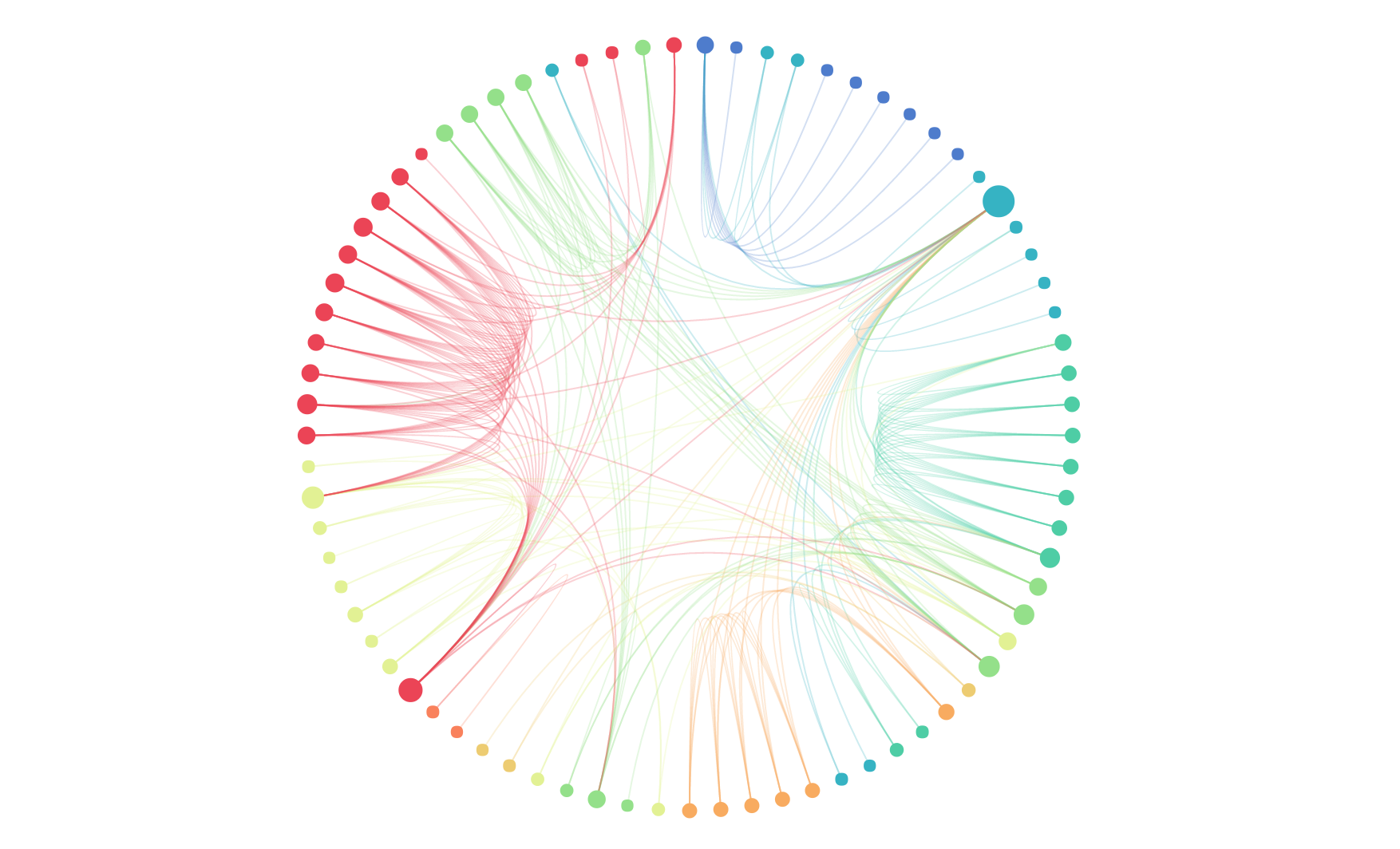
弧长连接图是节点-链接法的一个变种,节点-链接法是指用节点表示对象,用线(或边)表示关系的节点-链接布局(node-link)的一种可视化布局表示。弧长连接图在此概念的基础上,采用一维布局方式,即节点沿某个线性轴或环状排列,用圆弧表达节点之间的链接关系。这种方法不能像二维布局那样表达图的全局结构,但在节点良好排序后可清晰的呈现环和桥的结构。
英文名:Arc diagram
弧长连接图的构成
线性弧长连接图
| 图表类型 | 线性弧长连接图 |
|---|---|
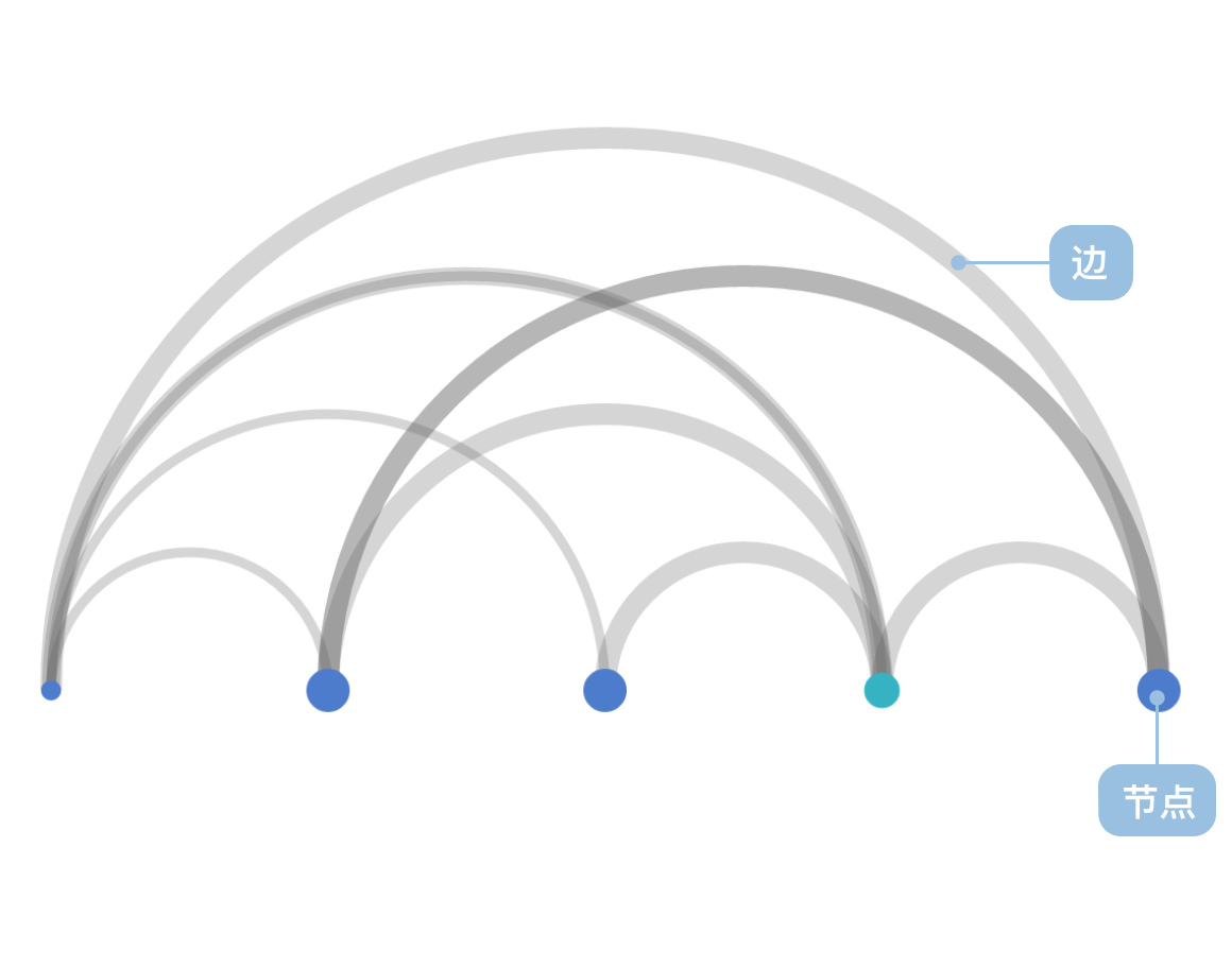
| 适合的数据 | 列表:一组节点数据(包含节点 id 字段)、一组链接数据(包含源节点字段和目标节点字段) |
| 功能 | 表示数据之间的链接关系 |
| 数据与图形的映射 | 节点的坐标(自动计算)字段映射到节点的坐标轴的位置 链接的坐标(自动计算)映射到半圆弧的顶点坐标轴位置 节点中的分类数据也可以设置颜色增强区分度 |
| 适合的数据条数 | 不少于 2 条数据 |
环形弧长连接图
| 图表类型 | 环形弧长连接图 |
|---|---|
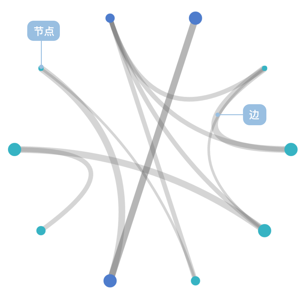
| 适合的数据 | 列表:一组节点数据(包含节点 id 字段)、一组链接数据(包含源节点字段和目标节点字段) |
| 功能 | 表示数据之间的链接关系 |
| 数据与图形的映射 | 节点的坐标(自动计算)字段映射到节点的坐标轴的位置 链接的坐标(自动计算)映射到以圆心为控制点的贝塞尔曲线的顶点坐标轴位置 节点中的分类数据也可以设置颜色增强区分度 |
| 适合的数据条数 | 不少于 5 条节点数据 |
弧长连接图的应用场景
适合的场景
例子 1: 表达数据之间的关系,以及关系的重要性
下图这个网络代表了维克多·雨果的经典小说“Les Misérables”中的人物关系。
节点数据:
| name | group | id |
|---|---|---|
| Myriel | 1 | 0 |
| … | … | … |
链接数据:
| source | target | value |
|---|---|---|
| 1 | 0 | 1 |
| … | … | … |
import { Chart } from '@antv/g2';

const colors = [
  '#ff7875',
  '#ffa940',
  '#fadb14',
  '#73d13d',
  '#40a9ff',
  '#b37feb',
  '#ff85c0',
  '#ffc069',
  '#95de64',
];

const chart = new Chart({
  container: 'container',
  theme: 'classic',
});

chart.options({
  type: 'view',
  autoFit: true,
  data: {
    type: 'fetch',
    value:
      'https://gw.alipayobjects.com/os/antvdemo/assets/data/relationship.json',
    transform: [
      {
        type: 'custom',
        callback: (data) => {
          const { nodes, links } = data;

          const arcData = [];
          links.forEach((link) => {
            const sourceId = parseInt(link.source);
            const targetId = parseInt(link.target);

            const sourceIndex = nodes.findIndex((n) => n.id === sourceId);
            const targetIndex = nodes.findIndex((n) => n.id === targetId);

            if (sourceIndex !== -1 && targetIndex !== -1) {
              const sourceX = sourceIndex * 15 + 50;
              const targetX = targetIndex * 15 + 50;
              const distance = Math.abs(targetX - sourceX);
              const arcHeight = Math.min(150, distance * 0.1);

              for (let i = 0; i <= 15; i++) {
                const t = i / 15;
                const x = sourceX + (targetX - sourceX) * t;
                const y = 600 - arcHeight * Math.sin(Math.PI * t);

                arcData.push({
                  x: x,
                  y: y,
                  linkId: `${sourceId}-${targetId}`,
                  sourceName: nodes[sourceIndex].label,
                  targetName: nodes[targetIndex].label,
                  type: 'link',
                });
              }
            }
          });

          const nodeData = nodes.map((node, i) => ({
            name: node.label,
            group: node.modularity_class,
            size: node.size,
            displaySize: Math.sqrt(node.size) * 4,
            x: i * 15 + 50,
            y: 600,
            type: 'node',
          }));

          return [...arcData, ...nodeData];
        },
      },
    ],
  },
  children: [
    {
      type: 'line',
      data: {
        transform: [{ type: 'filter', callback: (d) => d.type === 'link' }],
      },
      encode: { x: 'x', y: 'y', series: 'linkId' },
      style: { stroke: '#1890ff', strokeWidth: 0.8, strokeOpacity: 0.4 },
    },
    {
      type: 'point',
      data: {
        transform: [{ type: 'filter', callback: (d) => d.type === 'node' }],
      },
      encode: { x: 'x', y: 'y', color: 'group' },
      scale: {
        color: {
          type: 'ordinal',
          range: colors,
        },
      },
      style: {
        r: 4,
        fill: (d) => colors[parseInt(d.group)] || '#40a9ff',
        stroke: 'none',
        fillOpacity: 0.8,
      },
    },
  ],
});

chart.render();
说明:
group字段,使用了颜色用于区分不同的节点类型value字段,使用弧线粗细表示关系的强度
例子 2: 环形布局展示复杂关系网络
使用极坐标系可以将例 1 的数据绘制成环形弧长连接图,更适合展示具有大量节点和复杂关系的网络数据。
import { Chart } from '@antv/g2';

const colors = [
  '#ff7875',
  '#ffa940',
  '#fadb14',
  '#73d13d',
  '#40a9ff',
  '#b37feb',
  '#ff85c0',
  '#ffc069',
  '#95de64',
];

const chart = new Chart({
  container: 'container',
  theme: 'classic',
  width: 600,
  height: 600,
});

const nodeFilter = {
  transform: [{ type: 'filter', callback: (d) => d.type === 'node' }],
};

chart.options({
  type: 'view',
  autoFit: true,
  data: {
    type: 'fetch',
    value:
      'https://gw.alipayobjects.com/os/antvdemo/assets/data/relationship.json',
    transform: [
      {
        type: 'custom',
        callback: (data) => {
          const { nodes, links } = data;

          const centerX = 300;
          const centerY = 300;
          const radius = 200;
          const nodeCount = nodes.length;

          const nodePositions = nodes.map((node, i) => {
            const angle = (i / nodeCount) * 2 * Math.PI - Math.PI / 2;
            const x = centerX + radius * Math.cos(angle);
            const y = centerY + radius * Math.sin(angle);
            return {
              ...node,
              x,
              y,
              angle,
              index: i,
            };
          });

          const arcData = [];
          links.forEach((link) => {
            const sourceId = parseInt(link.source);
            const targetId = parseInt(link.target);

            const sourceNode = nodePositions.find((n) => n.id === sourceId);
            const targetNode = nodePositions.find((n) => n.id === targetId);

            if (sourceNode && targetNode) {
              const steps = 20;
              for (let i = 0; i <= steps; i++) {
                const t = i / steps;

                const x =
                  Math.pow(1 - t, 2) * sourceNode.x +
                  2 * (1 - t) * t * centerX +
                  Math.pow(t, 2) * targetNode.x;
                const y =
                  Math.pow(1 - t, 2) * sourceNode.y +
                  2 * (1 - t) * t * centerY +
                  Math.pow(t, 2) * targetNode.y;

                arcData.push({
                  x,
                  y,
                  linkId: `${sourceId}-${targetId}`,
                  sourceName: sourceNode.label,
                  targetName: targetNode.label,
                  type: 'link',
                });
              }
            }
          });

          const nodeData = nodePositions.map((node) => ({
            name: node.label,
            group: node.modularity_class,
            size: node.size,
            displaySize: Math.sqrt(node.size) * 4,
            x: node.x,
            y: node.y,
            type: 'node',
          }));

          return [...arcData, ...nodeData];
        },
      },
    ],
  },
  children: [
    {
      type: 'line',
      data: {
        transform: [{ type: 'filter', callback: (d) => d.type === 'link' }],
      },
      encode: { x: 'x', y: 'y', series: 'linkId' },
      style: {
        stroke: '#1890ff',
        strokeWidth: 1.2,
        strokeOpacity: 0.3,
        lineCap: 'round',
      },
    },
    {
      type: 'point',
      data: nodeFilter,
      encode: { x: 'x', y: 'y', color: 'group' },
      scale: {
        color: {
          type: 'ordinal',
          range: colors,
        },
      },
      style: {
        r: 6,
        fill: (d) => colors[parseInt(d.group)] || '#40a9ff',
        stroke: '#fff',
        strokeWidth: 2,
        fillOpacity: 0.9,
      },
    },
    {
      type: 'text',
      data: nodeFilter,
      encode: { x: 'x', y: 'y', text: 'name' },
      style: {
        textAlign: 'center',
        textBaseline: 'middle',
        fontSize: 10,
        fill: '#333',
        fontWeight: 'bold',
        dy: -15,
      },
    },
  ],
});

chart.render();
不适合的场景
例子 1: 不适合表示层次结构
弧长连接图采用线性或环形的一维布局,无法有效表达数据的层次关系,对于具有明显层级结构的数据,树形图或组织架构图更为合适。
例子 2: 不适合处理过多节点
当节点数量过多时,弧长连接图会变得拥挤难读,连线重叠严重,影响可读性。此时应考虑使用力导向图或其他网络图布局。
弧长连接图与其他图表的对比
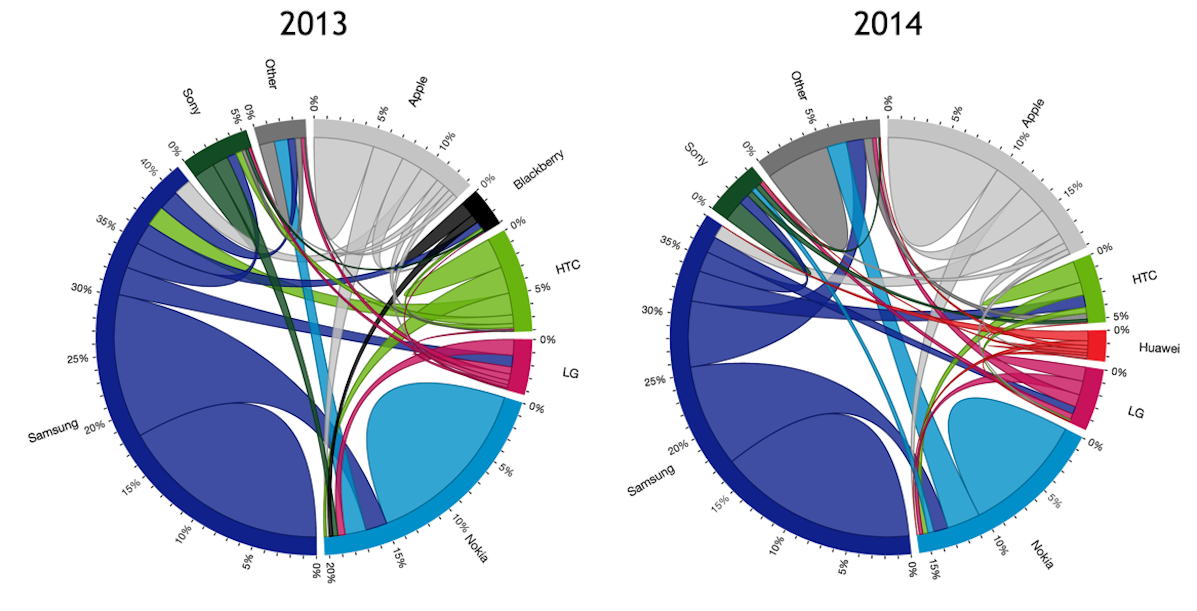
弧长连接图和和弦图
- 弧长连接图的节点使用标准线性布局,节点权重决定节点大小但不影响位置
- 弧长连接图的连线可以使用权重控制线宽,粗细均匀
- 弧长连接图的连线重叠绘制在节点上
- 和弦图的节点使用权重线性布局,节点权重即决定节点大小,又决定节点位置
- 和弦图的连线使用源权重和目标权重控制线宽,粗细非均匀
- 和弦图的节点宽度为连线宽度之和,节点处的连线平铺不重叠
弧长连接图和桑基图
- 弧长连接图主要用于表示节点之间的关系连接,不体现流量或数据流向
- 桑基图专门用于表示数据流,连线宽度表示流量大小,具有明确的流向
- 弧长连接图采用弧形连线,视觉上更加优雅
- 桑基图采用直线或曲线连接,更直观地表达流向关系