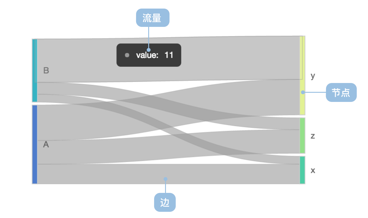
Sankey Diagram
Previous
Bullet Chart
Next
Gantt Chart
Loading...

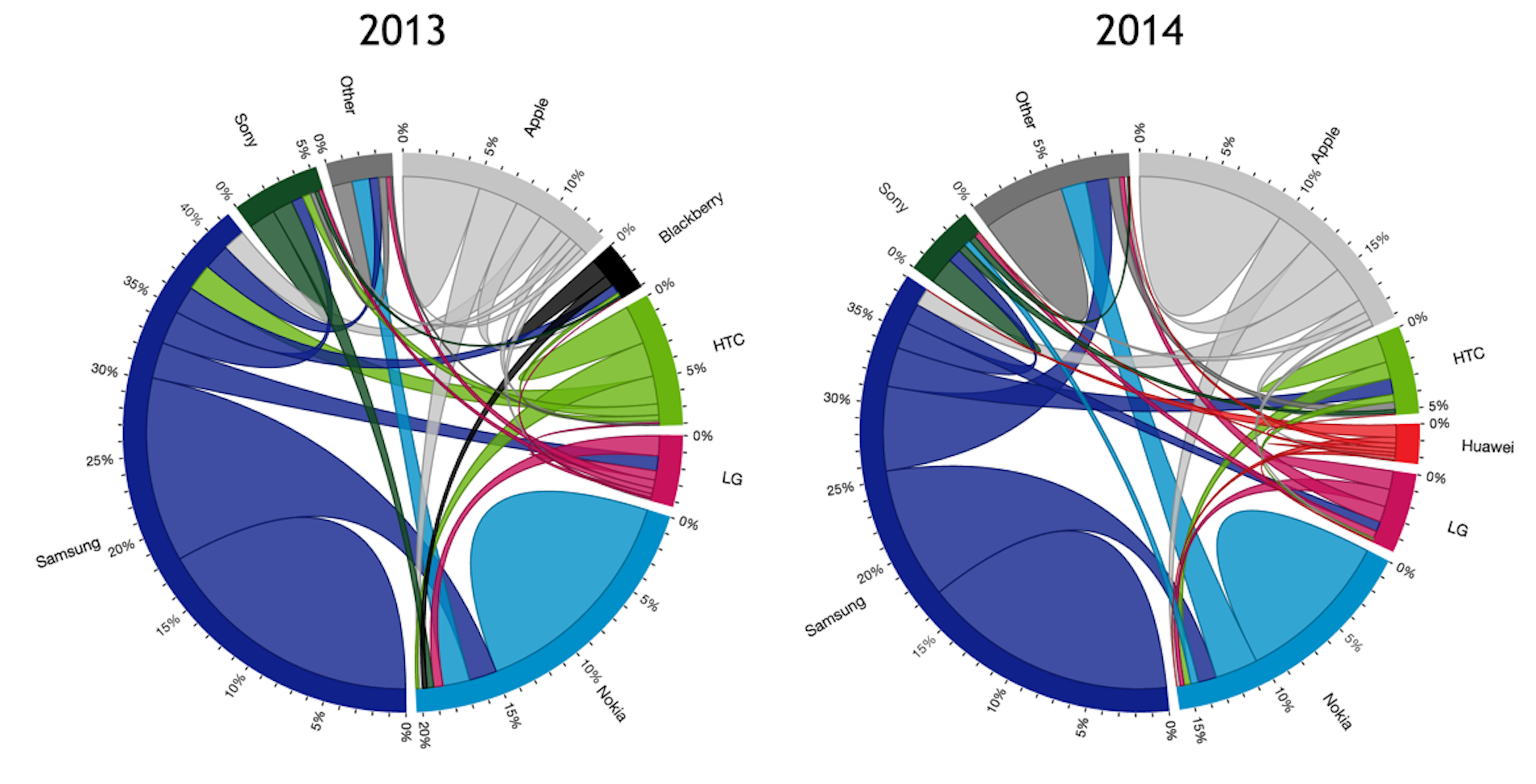
A Sankey diagram (Sankey Diagram) is a specialized flow diagram used to depict the flow of values from one set of nodes to another. The image above shows Napoleon's Russian Campaign of 1812, drawn by Charles Minard in 1869, which is a flow diagram overlaid on a map using the Sankey diagram technique. In 1898, Irish engineer Matthew Henry Phineas Riall Sankey first introduced an energy flow diagram in a paper about steam engine efficiency in the Minutes of Proceedings of the Institution of Civil Engineers, after which this type of diagram was named the Sankey diagram.
The width of the extending branches in the diagram corresponds to the size of the data flow. Key characteristics of Sankey diagrams include:
Sankey diagrams are commonly used for visualizing data in energy, material composition, and financial analysis.
Chinese Name: 桑基图
| Chart Type | Basic Sankey Diagram |
|---|---|
| Suitable Data | Flow data: containing source nodes, target nodes, and flow values |
| Function | Display flow relationships and quantities between different nodes |
| Data-Visual Mapping | Source nodes mapped to left positions Target nodes mapped to right positions Flow values mapped to link widths |
| Suitable Scenarios | Energy flow analysis, fund flow tracking, user path analysis |
Example 1: Energy Flow Analysis
The following diagram shows an energy flow Sankey chart, displaying the complete process from primary energy sources to final consumption.
import { Chart } from '@antv/g2';const chart = new Chart({container: 'container',theme: 'classic',});chart.options({type: 'sankey',autoFit: true,data: {type: 'fetch',value: 'https://assets.antv.antgroup.com/g2/energy.json',transform: [{type: 'custom',callback: (data) => ({ links: data }),},],},layout: {nodeAlign: 'center',nodePadding: 0.03,},style: {labelSpacing: 3,labelFontWeight: 'bold',nodeStrokeWidth: 1.2,linkFillOpacity: 0.4,},});chart.render();
Explanation:
source field maps to starting nodes, representing energy sourcestarget field maps to destination nodes, representing energy destinationsvalue field maps to link width, representing flow quantityExample 2: User Path Analysis
Sankey diagrams can effectively show user behavior paths within websites or applications, helping analyze user drop-off points and conversion funnels.
import { Chart } from '@antv/g2';const data = {links: [{ source: 'Homepage', target: 'Product Page', value: 1000 },{ source: 'Homepage', target: 'About Us', value: 300 },{ source: 'Homepage', target: 'Contact', value: 200 },{ source: 'Product Page', target: 'Shopping Cart', value: 600 },{ source: 'Product Page', target: 'Product Details', value: 400 },{ source: 'Shopping Cart', target: 'Checkout', value: 450 },{ source: 'Shopping Cart', target: 'Continue Shopping', value: 150 },{ source: 'Checkout', target: 'Payment Success', value: 380 },{ source: 'Checkout', target: 'Abandon Payment', value: 70 },{ source: 'Product Details', target: 'Shopping Cart', value: 200 },{ source: 'Product Details', target: 'Go Back', value: 200 },],};const chart = new Chart({container: 'container',theme: 'classic',});chart.options({type: 'sankey',autoFit: true,data: { value: data },layout: {nodeAlign: 'justify',nodePadding: 0.05,},style: {labelSpacing: 5,labelFontSize: 12,nodeStrokeWidth: 2,linkFillOpacity: 0.6,},scale: {color: {range: ['#1890ff', '#52c41a', '#faad14', '#f5222d', '#722ed1'],},},});chart.render();
Explanation:
Example 3: Budget Flow Analysis
Sankey diagrams are particularly suitable for displaying budget allocation, cost analysis, and other financial flow relationships.
import { Chart } from '@antv/g2';const budgetData = {links: [{ source: 'Total Budget', target: 'R&D Department', value: 5000000 },{ source: 'Total Budget', target: 'Marketing Department', value: 3000000 },{ source: 'Total Budget', target: 'Operations Department', value: 2000000 },{ source: 'R&D Department', target: 'Product Development', value: 3000000 },{ source: 'R&D Department', target: 'Technology Research', value: 2000000 },{ source: 'Marketing Department', target: 'Advertising', value: 2000000 },{source: 'Marketing Department',target: 'Brand Building',value: 1000000,},{source: 'Operations Department',target: 'Personnel Costs',value: 1200000,},{ source: 'Operations Department', target: 'Office Costs', value: 800000 },{ source: 'Product Development', target: 'Mobile App', value: 1800000 },{ source: 'Product Development', target: 'Web Platform', value: 1200000 },{ source: 'Advertising', target: 'Online Ads', value: 1500000 },{ source: 'Advertising', target: 'Offline Promotion', value: 500000 },],};const chart = new Chart({container: 'container',theme: 'classic',});chart.options({type: 'sankey',autoFit: true,data: { value: budgetData },layout: {nodeAlign: 'center',nodePadding: 0.08,},style: {labelSpacing: 8,labelFontSize: 11,nodeStrokeWidth: 1.5,linkFillOpacity: 0.5,},scale: {color: {range: ['#096dd9', '#36cfc9', '#52c41a', '#faad14', '#ff7a45'],},},});chart.render();
Explanation:
Example 1: Not suitable for simple categorical comparisons
When data is primarily used for comparing values across different categories rather than showing flow relationships, Sankey diagrams are not the best choice. In such cases, bar charts or pie charts would be more intuitive.
import { Chart } from '@antv/g2';// Example: Sales comparison data (not suitable for Sankey diagrams)const salesData = [{ category: 'Phones', value: 25000 },{ category: 'Computers', value: 18000 },{ category: 'Tablets', value: 12000 },{ category: 'Headphones', value: 8000 },{ category: 'Accessories', value: 5000 },];const chart = new Chart({container: 'container',theme: 'classic',});chart.options({type: 'interval',autoFit: true,data: { value: salesData },encode: {x: 'category',y: 'value',color: 'category',},axis: {y: { title: 'Sales Amount ($)' },x: { title: 'Product Category' },},style: {fill: '#1890ff',},});chart.render();
Explanation: This type of data is better suited for bar charts because the focus is on comparing numerical values across categories, not showing flow relationships between data points. Using a Sankey diagram in this scenario would add unnecessary complexity.
Example 2: Not suitable for overly complex network relationships
When there are too many nodes (over 30) or overly complex flow relationships, Sankey diagrams may become difficult to read. In such cases, consider using network graphs or hierarchical diagrams.
import { Chart } from '@antv/g2';// Example: Complex organizational structure (not suitable for Sankey diagrams)const complexData = {links: [{ source: 'CEO', target: 'R&D VP', value: 1 },{ source: 'CEO', target: 'Sales VP', value: 1 },{ source: 'CEO', target: 'Marketing VP', value: 1 },{ source: 'CEO', target: 'Operations VP', value: 1 },{ source: 'R&D VP', target: 'Frontend Team', value: 1 },{ source: 'R&D VP', target: 'Backend Team', value: 1 },{ source: 'R&D VP', target: 'QA Team', value: 1 },{ source: 'R&D VP', target: 'DevOps Team', value: 1 },{ source: 'Sales VP', target: 'Direct Sales', value: 1 },{ source: 'Sales VP', target: 'Channel Sales', value: 1 },{ source: 'Sales VP', target: 'Business Dev', value: 1 },{ source: 'Sales VP', target: 'Customer Service', value: 1 },{ source: 'Marketing VP', target: 'Brand Team', value: 1 },{ source: 'Marketing VP', target: 'Events Team', value: 1 },{ source: 'Marketing VP', target: 'Content Team', value: 1 },{ source: 'Operations VP', target: 'Data Team', value: 1 },{ source: 'Operations VP', target: 'Product Team', value: 1 },{ source: 'Operations VP', target: 'User Experience', value: 1 },],};const chart = new Chart({container: 'container',theme: 'classic',});chart.options({type: 'sankey',autoFit: true,data: { value: complexData },layout: {nodeAlign: 'justify',nodePadding: 0.02,},style: {labelSpacing: 2,labelFontSize: 10,nodeStrokeWidth: 1,linkFillOpacity: 0.3,},});chart.render();
Explanation: This type of hierarchical structural data becomes overcrowded and difficult to read when displayed as a Sankey diagram. It's better suited for organizational charts, tree diagrams, or network graphs. Sankey diagrams excel at showing meaningful "flow" relationships rather than just organizational structures.
Different node alignment methods can be used to optimize the layout of Sankey diagrams.
import { Chart } from '@antv/g2';const chart = new Chart({container: 'container',theme: 'classic',});chart.options({type: 'sankey',autoFit: true,data: {type: 'fetch',value: 'https://assets.antv.antgroup.com/g2/energy.json',transform: [{type: 'custom',callback: (data) => ({ links: data.slice(0, 20) }), // Use partial data for demonstration},],},layout: {nodeAlign: 'left', // Options: 'left', 'right', 'center', 'justify'nodePadding: 0.05,nodeWidth: 0.02,},style: {labelSpacing: 5,labelFontWeight: 'bold',nodeStrokeWidth: 2,linkFillOpacity: 0.3,},});chart.render();
Explanation:
nodeAlign: 'left' aligns all nodes to the leftnodePadding controls spacing between nodesnodeWidth controls the width of nodesColors can be customized based on node type or flow direction.
import { Chart } from '@antv/g2';const chart = new Chart({container: 'container',theme: 'classic',});chart.options({type: 'sankey',autoFit: true,data: {type: 'fetch',value: 'https://assets.antv.antgroup.com/g2/energy.json',transform: [{type: 'custom',callback: (data) => ({ links: data }),},],},layout: {nodeAlign: 'justify',nodePadding: 0.03,},encode: {color: (d, idx) => {// Assign colors based on first letter of node nameconst firstChar = d.key?.charAt(0).toLowerCase() || '';if (firstChar <= 'f') return '#1890ff';if (firstChar <= 'n') return '#52c41a';if (firstChar <= 's') return '#faad14';return '#f5222d';},},style: {labelSpacing: 3,labelFontWeight: 'bold',nodeStrokeWidth: 1,linkFillOpacity: 0.6,},});chart.render();
Explanation:
encode.color to define custom color mapping functions