Arc Diagram
Previous
📈 Chart Gallery
Next
Mosaic Plot
Loading...
An arc diagram is a variation of the node-link method, which refers to a visual layout representation of node-link layouts that use nodes to represent objects and lines (or edges) to represent relationships. Based on this concept, arc diagrams adopt a one-dimensional layout approach, where nodes are arranged along a linear axis or in a circular pattern, and arcs are used to express the linking relationships between nodes. While this method cannot express the global structure of a graph like two-dimensional layouts can, it can clearly present ring and bridge structures when nodes are well-ordered.
Other Names: Arc diagram
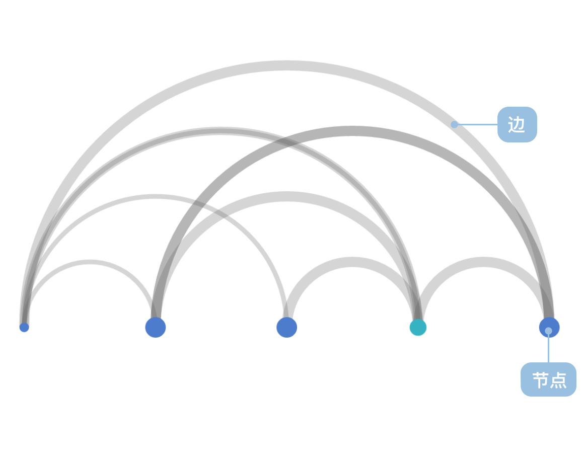
| Chart Type | Linear Arc Diagram |
|---|---|
| Suitable Data | List: A set of node data (containing node id field), a set of link data (containing source node field and target node field) |
| Function | Represents linking relationships between data |
| Data-to-Visual Mapping | Node coordinates (automatically calculated) field mapped to node position on coordinate axis Link coordinates (automatically calculated) mapped to semicircle arc vertex coordinate axis position Categorical data in nodes can also be color-coded for enhanced distinction |
| Suitable Data Volume | No less than 2 data entries |
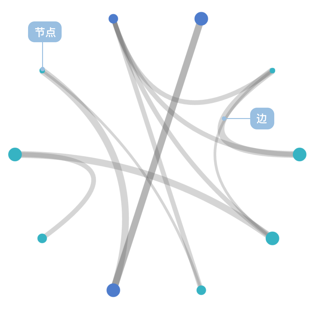
| Chart Type | Circular Arc Diagram |
|---|---|
| Suitable Data | List: A set of node data (containing node id field), a set of link data (containing source node field and target node field) |
| Function | Represents linking relationships between data |
| Data-to-Visual Mapping | Node coordinates (automatically calculated) field mapped to node position on coordinate axis Link coordinates (automatically calculated) mapped to Bézier curve vertex coordinate axis position with circle center as control point Categorical data in nodes can also be color-coded for enhanced distinction |
| Suitable Data Volume | No less than 5 node data entries |
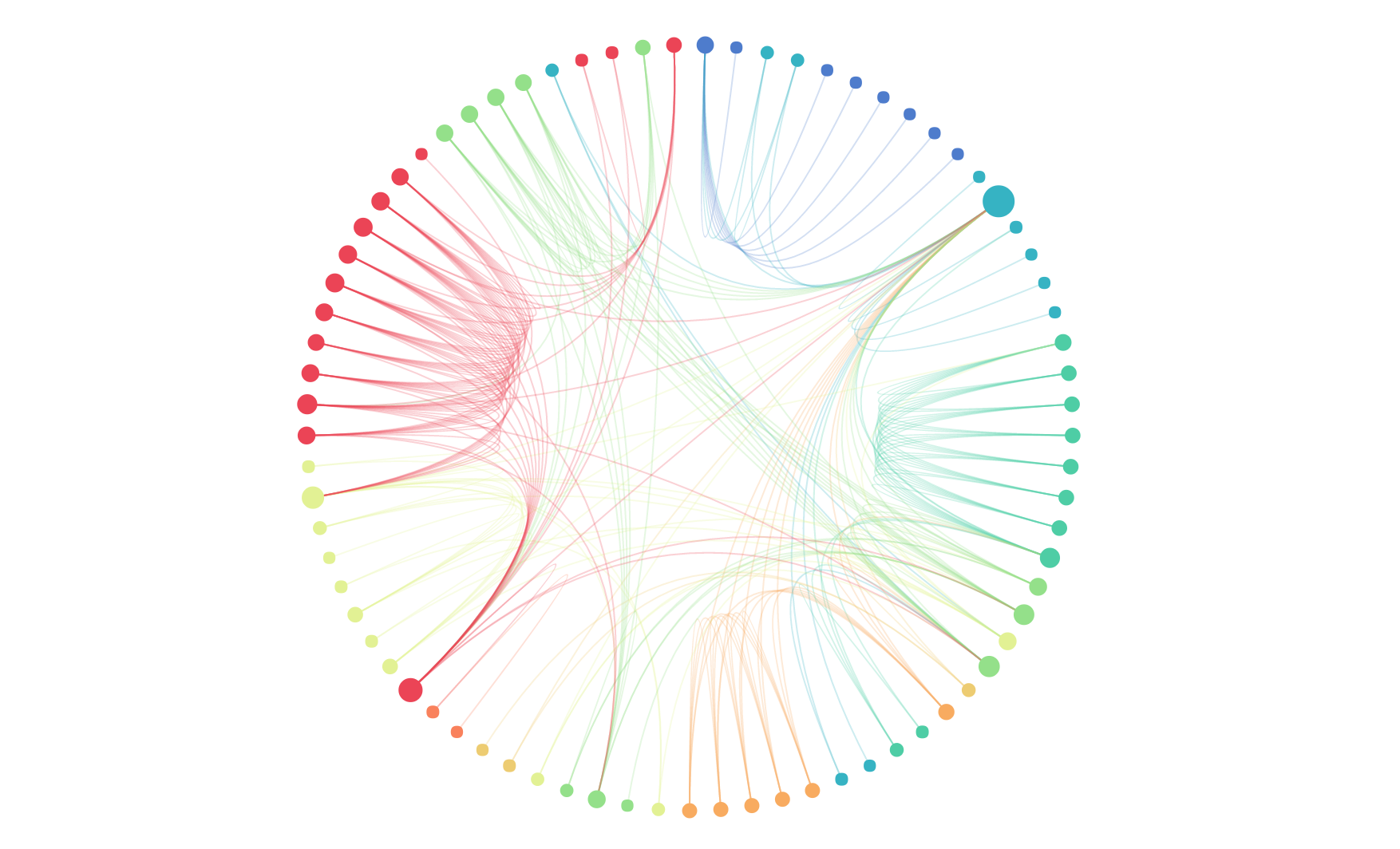
Example 1: Expressing relationships between data and the importance of relationships
The network shown below represents character relationships in Victor Hugo's classic novel "Les Misérables".
Node Data:
| name | group | id |
|---|---|---|
| Myriel | 1 | 0 |
| ... | ... | ... |
Link Data:
| source | target | value |
|---|---|---|
| 1 | 0 | 1 |
| ... | ... | ... |
import { Chart } from '@antv/g2';const chart = new Chart({container: 'container',theme: 'classic',});chart.options({type: 'view',autoFit: true,data: {type: 'fetch',value:'https://gw.alipayobjects.com/os/antvdemo/assets/data/relationship.json',transform: [{type: 'custom',callback: (data) => {const { nodes, links } = data;const arcData = [];links.forEach((link) => {const sourceId = parseInt(link.source);const targetId = parseInt(link.target);const sourceIndex = nodes.findIndex((n) => n.id === sourceId);const targetIndex = nodes.findIndex((n) => n.id === targetId);if (sourceIndex !== -1 && targetIndex !== -1) {const sourceX = sourceIndex * 15 + 50;const targetX = targetIndex * 15 + 50;const distance = Math.abs(targetX - sourceX);const arcHeight = Math.min(150, distance * 0.1);for (let i = 0; i <= 15; i++) {const t = i / 15;const x = sourceX + (targetX - sourceX) * t;const y = 600 - arcHeight * Math.sin(Math.PI * t);arcData.push({x: x,y: y,linkId: `${sourceId}-${targetId}`,sourceName: nodes[sourceIndex].label,targetName: nodes[targetIndex].label,type: 'link',});}}});const nodeData = nodes.map((node, i) => ({name: node.label,group: node.modularity_class,size: node.size,displaySize: Math.sqrt(node.size) * 4,x: i * 15 + 50,y: 600,type: 'node',}));return [...arcData, ...nodeData];},},],},});chart.line().data({ transform: [{ type: 'filter', callback: (d) => d.type === 'link' }] }).encode('x', 'x').encode('y', 'y').encode('series', 'linkId').style('stroke', '#1890ff').style('strokeWidth', 0.8).style('strokeOpacity', 0.4);chart.point().data({ transform: [{ type: 'filter', callback: (d) => d.type === 'node' }] }).encode('x', 'x').encode('y', 'y').encode('color', 'group').scale('color', {type: 'ordinal',range: ['#ff7875','#ffa940','#fadb14','#73d13d','#40a9ff','#b37feb','#ff85c0','#ffc069','#95de64',],}).style('r', 4).style('fill', (d) => {const colors = ['#ff7875','#ffa940','#fadb14','#73d13d','#40a9ff','#b37feb','#ff85c0','#ffc069','#95de64',];return colors[parseInt(d.group)] || '#40a9ff';}).style('stroke', 'none').style('fillOpacity', 0.8);chart.render();
Description:
group field uses color to distinguish different node typesvalue field uses arc thickness to represent relationship strengthExample 2: Circular layout for displaying complex relationship networks
Using a polar coordinate system, the data from Example 1 can be rendered as a circular arc diagram, which is more suitable for displaying network data with large numbers of nodes and complex relationships.
import { Chart } from '@antv/g2';const chart = new Chart({container: 'container',theme: 'classic',width: 600,height: 600,});chart.options({type: 'view',autoFit: true,data: {type: 'fetch',value:'https://gw.alipayobjects.com/os/antvdemo/assets/data/relationship.json',transform: [{type: 'custom',callback: (data) => {const { nodes, links } = data;const centerX = 300;const centerY = 300;const radius = 200;const nodeCount = nodes.length;const nodePositions = nodes.map((node, i) => {const angle = (i / nodeCount) * 2 * Math.PI - Math.PI / 2;const x = centerX + radius * Math.cos(angle);const y = centerY + radius * Math.sin(angle);return {...node,x: x,y: y,angle: angle,index: i,};});const arcData = [];links.forEach((link) => {const sourceId = parseInt(link.source);const targetId = parseInt(link.target);const sourceNode = nodePositions.find((n) => n.id === sourceId);const targetNode = nodePositions.find((n) => n.id === targetId);if (sourceNode && targetNode) {const steps = 20;for (let i = 0; i <= steps; i++) {const t = i / steps;const x =Math.pow(1 - t, 2) * sourceNode.x +2 * (1 - t) * t * centerX +Math.pow(t, 2) * targetNode.x;const y =Math.pow(1 - t, 2) * sourceNode.y +2 * (1 - t) * t * centerY +Math.pow(t, 2) * targetNode.y;arcData.push({x: x,y: y,linkId: `${sourceId}-${targetId}`,sourceName: sourceNode.label,targetName: targetNode.label,type: 'link',});}}});const nodeData = nodePositions.map((node) => ({name: node.label,group: node.modularity_class,size: node.size,displaySize: Math.sqrt(node.size) * 4,x: node.x,y: node.y,type: 'node',}));return [...arcData, ...nodeData];},},],},});chart.line().data({ transform: [{ type: 'filter', callback: (d) => d.type === 'link' }] }).encode('x', 'x').encode('y', 'y').encode('series', 'linkId').style('stroke', '#1890ff').style('strokeWidth', 1.2).style('strokeOpacity', 0.3).style('lineCap', 'round');chart.point().data({ transform: [{ type: 'filter', callback: (d) => d.type === 'node' }] }).encode('x', 'x').encode('y', 'y').encode('color', 'group').scale('color', {type: 'ordinal',range: ['#ff7875','#ffa940','#fadb14','#73d13d','#40a9ff','#b37feb','#ff85c0','#ffc069','#95de64',],}).style('r', 6).style('fill', (d) => {const colors = ['#ff7875','#ffa940','#fadb14','#73d13d','#40a9ff','#b37feb','#ff85c0','#ffc069','#95de64',];return colors[parseInt(d.group)] || '#40a9ff';}).style('stroke', '#fff').style('strokeWidth', 2).style('fillOpacity', 0.9);chart.text().data({ transform: [{ type: 'filter', callback: (d) => d.type === 'node' }] }).encode('x', 'x').encode('y', 'y').encode('text', 'name').style('textAlign', 'center').style('textBaseline', 'middle').style('fontSize', 10).style('fill', '#333').style('fontWeight', 'bold').style('dy', -15);chart.render();
Example 1: Not suitable for representing hierarchical structures
Arc diagrams use linear or circular one-dimensional layouts and cannot effectively express hierarchical relationships in data. For data with obvious hierarchical structures, tree diagrams or organizational charts are more appropriate.
Example 2: Not suitable for handling too many nodes
When there are too many nodes, arc diagrams become crowded and difficult to read, with serious line overlap affecting readability. In such cases, force-directed graphs or other network graph layouts should be considered.