Histogram Chart
Previous
Dot Map
Next
Line Chart
Loading...

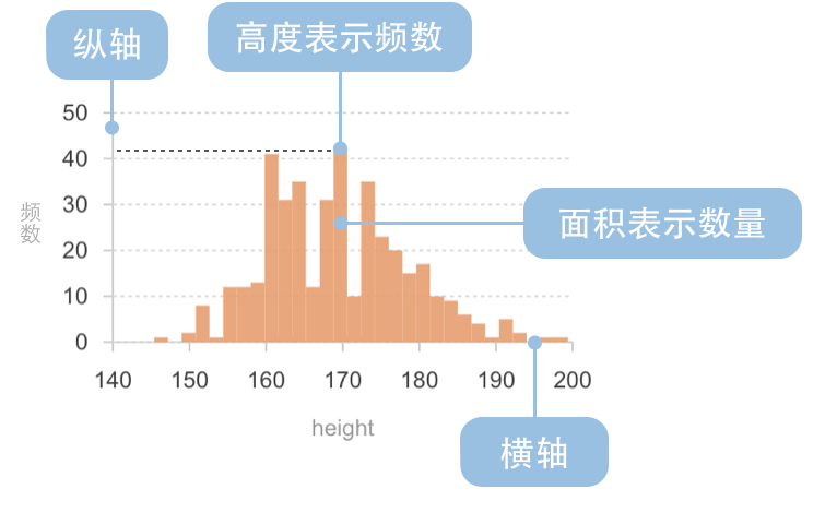
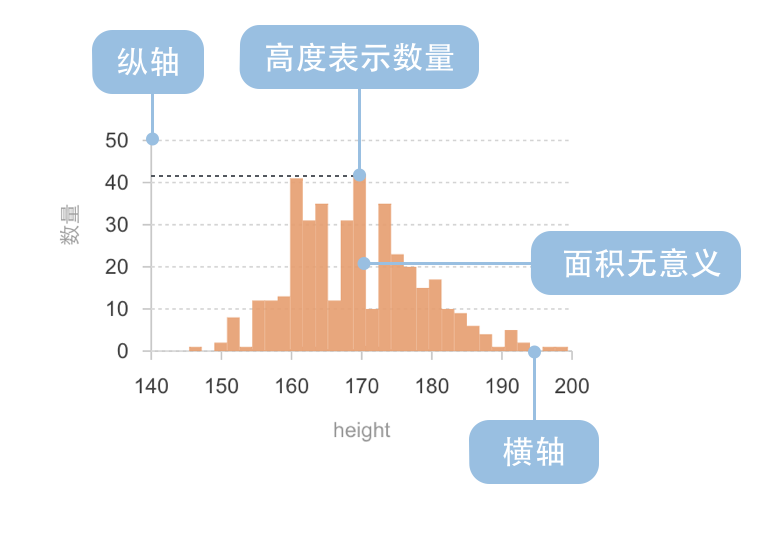
A histogram is a chart that, while similar in shape to bar charts, has a completely different meaning. Histograms involve statistical concepts, first grouping data, then counting the number of data elements in each group. In a Cartesian coordinate system, the horizontal axis marks the endpoints of each group, the vertical axis represents frequency, and the height of each rectangle represents the corresponding frequency, called a frequency distribution histogram. Standard frequency distribution histograms require calculating frequency times class width to get the count for each group. Since the class width is fixed for the same histogram, using the vertical axis to directly represent counts, with each rectangle's height representing the corresponding number of data elements, preserves the distribution shape while intuitively showing the count for each group. All examples in this document use non-standard histograms with the vertical axis representing counts.
Related Concepts:
Functions of Histograms:
Through histograms, you can also observe and estimate which data is more concentrated and where abnormal or isolated data is distributed.
Other Names: Frequency Distribution Chart
Creating a histogram in G2 requires the following core elements:
Histograms need to use the rect mark rather than the interval mark. This is because:
x and x1 channels, which can precisely represent the start and end positions of data intervalsx to x1, conforming to the mathematical definition of a histogramx value, with bars aligned at tick points, which is not suitable for representing continuous intervalsThe binX transform is the key to creating histograms. Its functions are:
x) and end position (x1) of each intervalBasic Usage:
.transform({type: 'binX',y: 'count', // Count the number in each intervalthresholds: 20, // Optional: specify the number of bins})
import { Chart } from '@antv/g2';const chart = new Chart({container: 'container',autoFit: true,});chart.options({type: 'rect', // Use rect markdata: {type: 'fetch',value: 'data.json',},encode: {x: 'value', // Continuous numerical fieldy: 'count', // Frequency},transform: [{ type: 'binX', y: 'count' } // binX transform],});chart.render();
| Chart Type | Frequency Distribution Histogram |
|---|---|
| Suitable Data | List: one continuous data field, one categorical field (optional) |
| Function | Show data distribution across different intervals |
| Data-to-Visual Mapping | Grouped data field (statistical result) mapped to horizontal axis position Frequency field (statistical result) mapped to rectangle height Categorical data can use color to enhance category distinction |
| Suitable Data Volume | No less than 50 data points |
| Chart Type | Non-standard Histogram |
|---|---|
| Suitable Data | List: one continuous data field, one categorical field (optional) |
| Function | Show data distribution across different intervals |
| Data-to-Visual Mapping | Grouped data field (statistical result) mapped to horizontal axis position Count field (statistical result) mapped to rectangle height Categorical data can use color to enhance category distinction |
| Suitable Data Volume | No less than 50 data points |
Example 1: Statistical Analysis of Data Distribution
The following chart shows a histogram of diamond weight distribution, displaying how diamond weights are distributed across different intervals.
import { Chart } from '@antv/g2';const chart = new Chart({container: 'container',theme: 'classic',autoFit: true,});chart.options({type: 'rect',data: {type: 'fetch',value: 'https://gw.alipayobjects.com/os/antvdemo/assets/data/diamond.json',},encode: {x: 'carat',y: 'count',},transform: [{ type: 'binX', y: 'count' },],scale: {y: { nice: true },},axis: {x: { title: 'Diamond Weight (Carat)' },y: { title: 'Frequency' },},style: {fill: '#1890FF',fillOpacity: 0.9,},});chart.render();
Notes:
rect mark combined with binX transform to create the histogrambinX transform automatically bins the carat field and counts the frequency of each intervalExample 2: Using Different Binning Methods
The key to histograms is how to divide data intervals (i.e., "binning"). Different binning methods affect the understanding of data distribution. The chart below uses a custom number of bins.
import { Chart } from '@antv/g2';const chart = new Chart({container: 'container',theme: 'classic',autoFit: true,});chart.options({type: 'rect',data: {type: 'fetch',value: 'https://gw.alipayobjects.com/os/antvdemo/assets/data/diamond.json',},encode: {x: 'carat',y: 'count',},transform: [{ type: 'binX', y: 'count', thresholds: 30 }, // Specify number of bins],scale: {y: { nice: true },},axis: {x: { title: 'Diamond Weight (Carat)' },y: { title: 'Frequency' },},style: {fill: '#1890FF',fillOpacity: 0.9,},});chart.render();
Notes:
transform: { type: 'binX', thresholds: 30 } to specify 30 binsExample 1: Not Suitable for Comparing Categorical Data
Histograms are designed for continuous numerical data distribution and are not suitable for comparing non-numerical categorical data. For counting statistics of categorical data, regular bar charts should be used instead.
Example 2: Not Suitable for Showing Time Series Trends
Histograms focus on showing data distribution characteristics rather than trends over time. If you need to display how data changes over time, line charts or area charts should be used instead.
A multi-distribution histogram can display the distribution of multiple datasets in the same coordinate system, facilitating comparison of distribution characteristics between different datasets.
import { Chart } from '@antv/g2';const chart = new Chart({container: 'container',theme: 'classic',autoFit: true,});chart.options({type: 'rect',data: {type: 'fetch',value: 'https://gw.alipayobjects.com/os/antvdemo/assets/data/diamond.json',transform: [{type: 'map',callback: (d) => ({...d,group: d.cut === 'Ideal' ? 'Ideal' : 'Others',}),},],},encode: {x: 'price',y: 'count',color: 'group',},transform: [{ type: 'binX', y: 'count', thresholds: 30, groupBy: ['group'] },],scale: {y: { nice: true },color: { range: ['#1890FF', '#FF6B3B'] },},axis: {x: { title: 'Price (USD)' },y: { title: 'Frequency' },},style: {fillOpacity: 0.7,},legend: true,});chart.render();
Notes:
color: 'group' and groupBy: ['group'] to achieve multi-distribution comparison