Kagi Chart
Previous
Gantt Chart
Next
Chord Diagram
Loading...
Kagi charts were invented around the 1870s when the Japanese stock market began trading. In the United States, the Kagi chart analysis method became popular after Steven Nison published "Beyond Candlesticks." Due to its ability to clearly and effectively display price movement paths, the Kagi chart is one of the tools investors use to make better decisions about stocks.
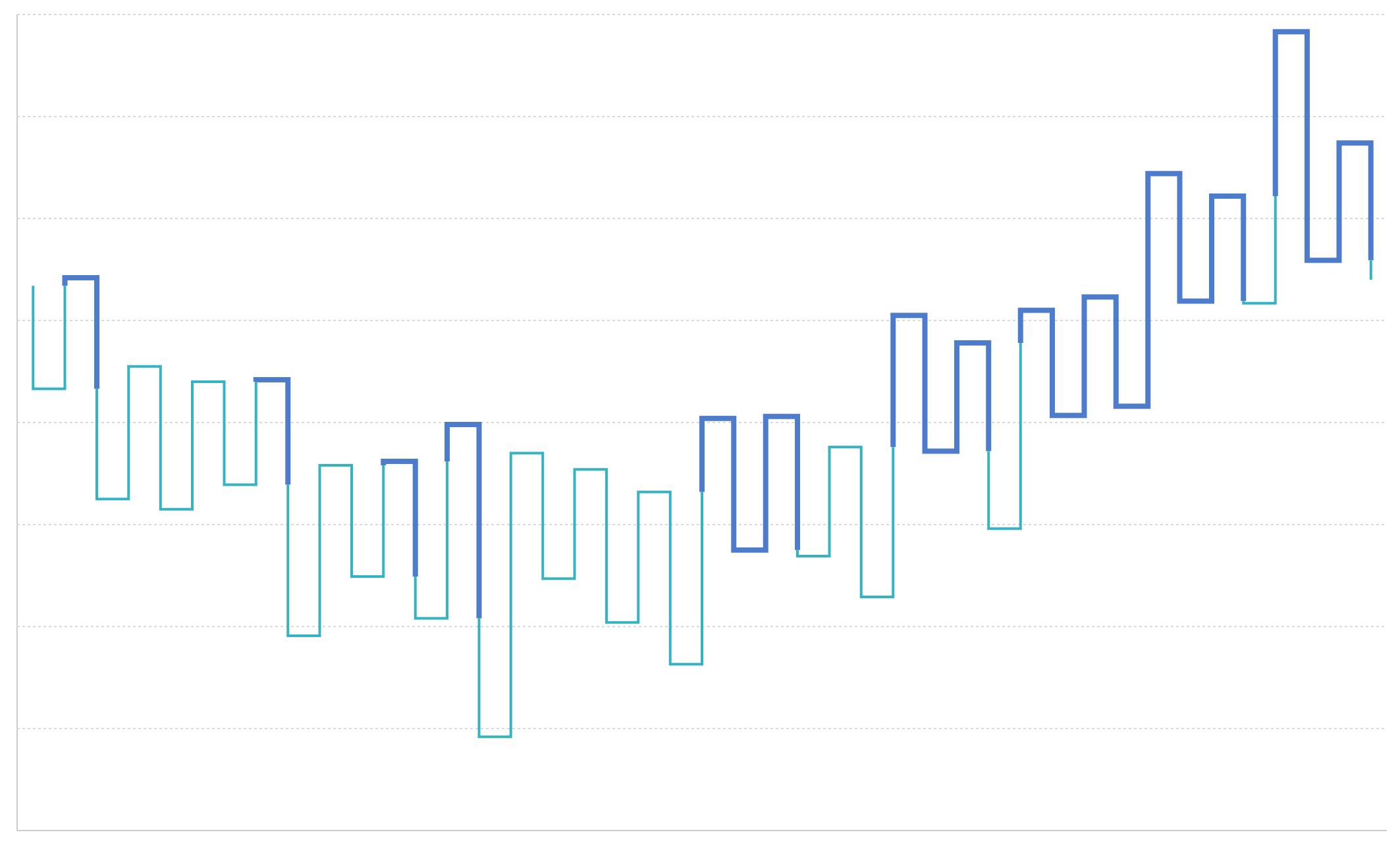
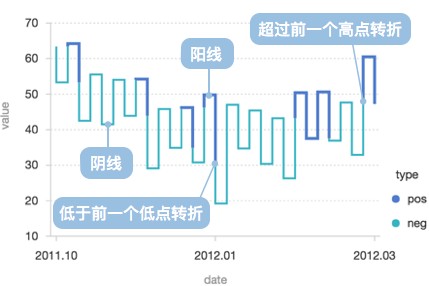
A Kagi chart consists of a series of vertical lines connected by short horizontal lines. The horizontal lines serve as connectors, while the thickness and direction of the vertical lines depend on price movements. An upward vertical line indicates a price increase, while a downward vertical line indicates a price decrease. A new vertical line is drawn when the price movement reverses beyond a threshold, connected by a horizontal line at the turning point. Thick lines (Yang lines) are used when the price rises above the previous high, and thin lines (Yin lines) are used when the price falls below the previous low.
Features of Kagi Charts:
The lines drawn in a Kagi chart are calculated using the Kagi chart algorithm and differ from the original data curve.
English Name: Kagi Chart
| Chart Type | Kagi Chart |
|---|---|
| Suitable Data | One categorical field, one continuous field |
| Function | Observing data trends |
| Data Mapping | Turning point time categories (auto-calculated) mapped to the x-axis, turning point values mapped to the y-axis |
| Suitable Data Count | More than 10 data points |
Key Elements:
Use Case 1: Displaying Price or Stock Movement Trends
Kagi charts are most suitable for analyzing trends in price changes for stocks, futures, forex, and other financial markets. By filtering out daily minor fluctuations, they highlight significant turning points in prices, helping investors identify trend changes.
Use Case 2: Technical Analysis and Trend Judgement
Kagi charts are particularly useful in technical analysis because they:
Use Case 1: Time-Sensitive Data
Kagi charts are independent of time and only represent the upward and downward trends of data. They cannot reflect certain characteristics of data over time, such as cycles. Therefore, Kagi charts are not recommended for time-sensitive data.
For example, website traffic data often has clear time cycles (weekday vs. weekend, day vs. night). Using Kagi charts would lose these important time features. For such data, line charts or area charts are recommended.
Use Case 2: Comparing Multiple Data Groups
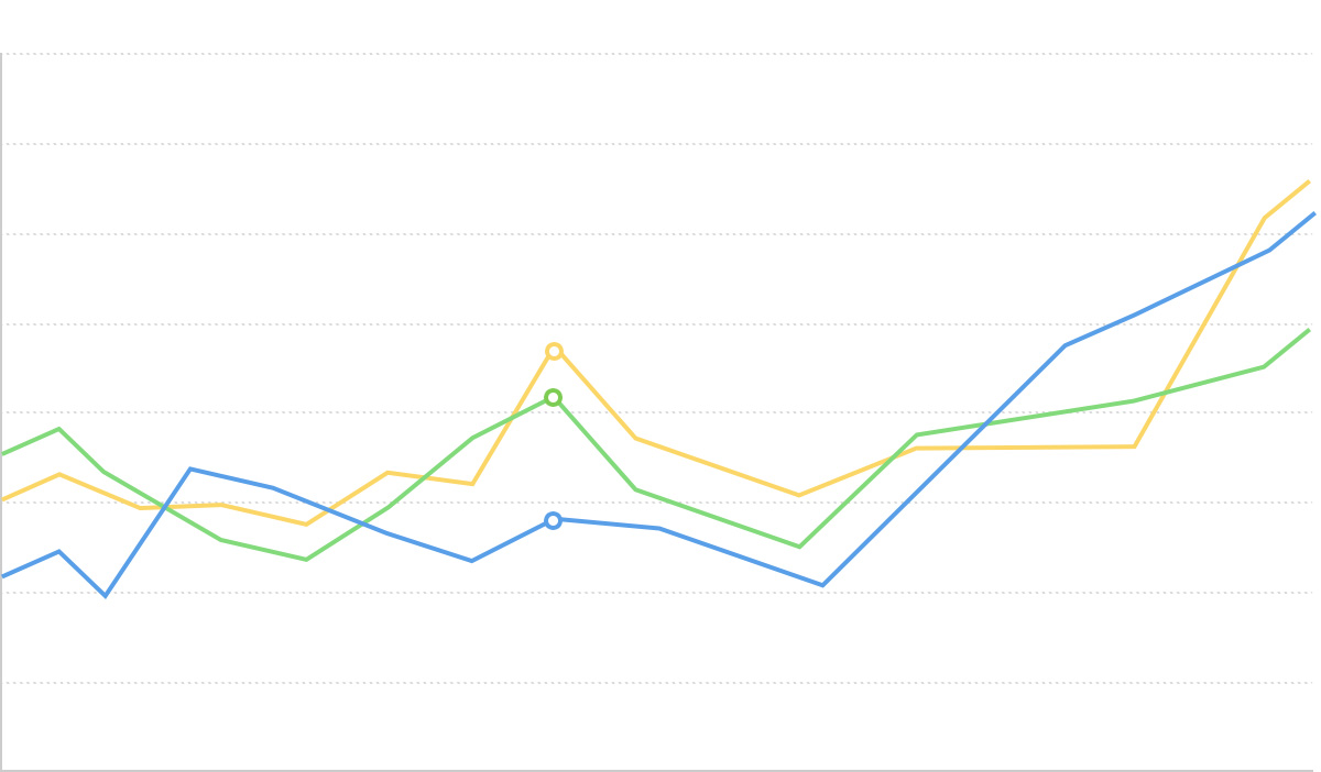
The x-axis of Kagi charts is unique (turning point time), making it impossible to plot multiple Kagi charts on the same x-axis for comparative analysis. To compare multiple data series, multi-series line charts are recommended.
| Feature | Kagi Chart | Candlestick Chart |
|---|---|---|
| Time Dependency | Independent of time, shows trends | Time-dependent, each period corresponds to a candlestick |
| Data Display | Filters minor fluctuations, highlights key turning points | Displays open, high, low, and close prices for a specific time period |
| Analysis Focus | Trend direction and turning points | Price fluctuations and volume within a time period |
| Suitable Scenarios | Medium- to long-term trend analysis | Short-term trading and time-sensitive analysis |
| Feature | Kagi Chart | Line Chart |
|---|---|---|
| Data Processing | Turning point data calculated by algorithm | Strictly plotted based on original data coordinates |
| Axis | X-axis represents calculated turning points | Both axis correspond to original data |
| Line Meaning | Color and thickness represent specific meanings (Yang and Yin lines) | Usually only represents data connection relationships |
| Multi-Series | Cannot plot multiple data groups | Can plot multiple data groups for comparison |
| Noise Filtering | Automatically filters minor fluctuations | Displays all data fluctuations |