
Funnel Chart
Previous
Choropleth Map
Next
K-Chart
Loading...
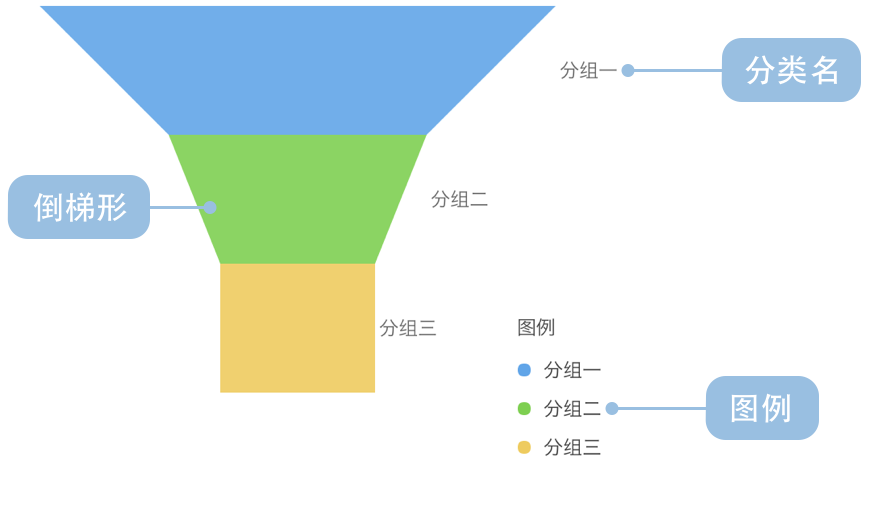
A funnel chart is a specialized visualization used to represent data flow through different stages of a business process. Named after its resemblance to a physical funnel, it displays data quantities across successive stages, typically with a wide top and narrow bottom, reflecting the process of data loss or conversion.
Funnel charts are particularly suited for visualizing conversion rates in business processes, such as sales pipelines, user registration flows, or marketing funnels. Through funnel charts, you can intuitively observe data changes across various stages and identify critical conversion points or bottlenecks.
Each layer in a funnel chart represents a stage in the process, with the width or area of the layer typically proportional to the quantity of data at that stage, clearly reflecting the data loss during the conversion process.
Other Names: Funnel Diagram, Sales Funnel
| Chart Type | Basic Funnel Chart |
|---|---|
| Suitable Data | Ordered categorical data: a categorical field for process stages and a value field for each stage |
| Function | Display data flow and conversion rates across stages of a business process |
| Data-to-Visual Mapping | Stage field mapped to funnel layers Value field mapped to layer width or area Colors distinguish different stages |
| Suitable Scenarios | Analyzing conversions and identifying loss points in multi-stage processes |
Example 1: Sales Process Conversion Analysis
The chart below shows the conversion across different stages of a sales funnel, from initial leads to final deals.
| stage | value |
|---|---|
| Visits | 8043 |
| Inquiries | 2136 |
| Quotes | 908 |
| Negotiations | 691 |
| Deals | 527 |
import { Chart } from '@antv/g2';const chart = new Chart({container: 'container',theme: 'classic',});chart.options({type: 'interval',data: [{ stage: 'Visits', value: 8043 },{ stage: 'Inquiries', value: 2136 },{ stage: 'Quotes', value: 908 },{ stage: 'Negotiations', value: 691 },{ stage: 'Deals', value: 527 },],encode: {x: 'stage',y: 'value',color: 'stage',shape: 'funnel',},coordinate: { transform: [{ type: 'transpose' }] },transform: [{type: 'symmetryY',},],scale: {color: {palette: 'spectral',},},style: {labelText: (d) => `${d.stage}: ${d.value}`,},animate: { enter: { type: 'fadeIn' } },axis: false,labels: [{text: (d) => `${d.stage}\n${d.value}`,position: 'inside',transform: [{ type: 'contrastReverse' }],},],legend: false,});chart.render();
Explanation:
stage field is mapped to each layer of the funnel, representing different stages of the sales processvalue field is mapped to the width of each layer, intuitively showing the conversion from the top to the bottom of the funnelExample 2: Website Traffic Conversion Analysis
Funnel charts can effectively analyze the conversion of website traffic from visits to final actions, helping identify key points of user drop-off.
import { Chart } from '@antv/g2';const chart = new Chart({container: 'container',theme: 'classic',});chart.options({type: 'interval',data: [{ stage: 'Homepage Visit', value: 100000, percent: '100%' },{ stage: 'Product Search', value: 60000, percent: '60%' },{ stage: 'Product Detail View', value: 30000, percent: '30%' },{ stage: 'Add to Cart', value: 10000, percent: '10%' },{ stage: 'Completed Purchase', value: 5000, percent: '5%' },],encode: {x: 'stage',y: 'value',color: 'stage',shape: 'funnel',},coordinate: { transform: [{ type: 'transpose' }] },transform: [{type: 'symmetryY',},],scale: {color: {palette: 'blues',},},style: {labelText: (d) => `${d.stage}: ${d.percent}`,},animate: { enter: { type: 'fadeIn' } },axis: false,labels: [{text: (d) => `${d.stage}\n${d.percent}`,position: 'inside',transform: [{ type: 'contrastReverse' }],},],legend: false,});chart.render();
Explanation:
Example 3: Comparative Funnel Charts for Different Channels
When you need to compare conversion effectiveness across different channels or time periods, comparative funnel charts are useful for analysis.
import { Chart } from '@antv/g2';const chart = new Chart({container: 'container',theme: 'classic',});chart.options({type: 'view',data: [{ stage: 'Visits', value: 8043, category: 'Channel A' },{ stage: 'Inquiries', value: 2136, category: 'Channel A' },{ stage: 'Quotes', value: 908, category: 'Channel A' },{ stage: 'Negotiations', value: 691, category: 'Channel A' },{ stage: 'Deals', value: 527, category: 'Channel A' },{ stage: 'Visits', value: 6841, category: 'Channel B' },{ stage: 'Inquiries', value: 2761, category: 'Channel B' },{ stage: 'Quotes', value: 1098, category: 'Channel B' },{ stage: 'Negotiations', value: 624, category: 'Channel B' },{ stage: 'Deals', value: 487, category: 'Channel B' },],axis: false,children: [{type: 'interval',region: { start: { x: 0, y: 0 }, end: { x: 0.48, y: 1 } },transform: [{ type: 'filter', callback: (d) => d.category === 'Channel A' },],encode: {x: 'stage',y: 'value',color: 'stage',shape: 'funnel',},coordinate: { transform: [{ type: 'transpose' }] },transform: [{type: 'symmetryY',},],scale: {color: { palette: 'spectral' },},style: {labelText: (d) => `${d.value}`,},animate: { enter: { type: 'fadeIn' } },axis: false,labels: [{text: (d) => `${d.value}`,position: 'inside',transform: [{ type: 'contrastReverse' }],},],title: 'Channel A',},{type: 'interval',region: { start: { x: 0.52, y: 0 }, end: { x: 1, y: 1 } },transform: [{ type: 'filter', callback: (d) => d.category === 'Channel B' },],encode: {x: 'stage',y: 'value',color: 'stage',shape: 'funnel',},coordinate: { transform: [{ type: 'transpose' }] },transform: [{type: 'symmetryY',},],scale: {color: { palette: 'spectral' },},style: {labelText: (d) => `${d.value}`,},animate: { enter: { type: 'fadeIn' } },axis: false,labels: [{text: (d) => `${d.value}`,position: 'inside',transform: [{ type: 'contrastReverse' }],},],title: 'Channel B',},],legend: false,});chart.render();
Explanation:
Example 4: Intuitive and Visual Chart Form, Often Used to Display Hierarchical Structures or Distribution Proportions
Company hierarchy pyramid structure, where employees are divided into multiple levels based on their rank, with significant differences in population proportions, responsibilities, and authority across levels, intuitively reflecting the hierarchical differentiation within the company.
import { Chart } from '@antv/g2';const chart = new Chart({container: 'container',theme: 'classic',});chart.options({type: 'interval',coordinate: {transform: [{ type: 'transpose' }],},data: [{ text: 'Top Level', value: 5 },{ text: 'Upper Middle', value: 10 },{ text: 'Middle', value: 20 },{ text: 'Lower Middle', value: 25 },{ text: 'Bottom Level', value: 40 },],transform: [{type: 'symmetryY',},],axis: {x: false,y: false,},style: {reverse: true,},encode: {x: 'text',y: 'value',color: 'text',shape: 'pyramid',},scale: {x: { paddingOuter: 0, paddingInner: 0 },color: { type: 'ordinal' },},labels: [{text: (d) => d.text,position: "inside"},{text: (d) => d.value + "%",position: "inside",style: { dy: 15 }},]})chart.render();
Explanation:
reverse: true to change the narrowing position of the funnel chartExample 1: Not Suitable for Unordered Data or Data Without Clear Hierarchy
The essence of a funnel chart is to display conversion in an ordered process. If the data has no clear sequence or hierarchical relationship, using a funnel chart can be misleading. For such data, bar charts or pie charts might be more appropriate choices.
Example 2: Not Suitable for Data with Fluctuating or Increasing Values Across Stages
Funnel charts typically express a decreasing process from more to less. If there are stages where values increase compared to previous stages (e.g., user numbers increasing due to marketing campaigns), traditional funnel charts may not be suitable, and other chart forms should be considered.
Comparative funnel charts can more clearly show comparisons between two different processes or entities, helping to identify differences and advantages between different approaches.
import { Chart } from '@antv/g2';const chart = new Chart({ container: 'container' });chart.options({type: 'view',autoFit: true,data: [{ action: 'Visit', visitor: 500, site: 'Site1' },{ action: 'Browse', visitor: 400, site: 'Site1' },{ action: 'Interact', visitor: 300, site: 'Site1' },{ action: 'Order', visitor: 200, site: 'Site1' },{ action: 'Complete', visitor: 100, site: 'Site1' },{ action: 'Visit', visitor: 550, site: 'Site2' },{ action: 'Browse', visitor: 420, site: 'Site2' },{ action: 'Interact', visitor: 280, site: 'Site2' },{ action: 'Order', visitor: 150, site: 'Site2' },{ action: 'Complete', visitor: 80, site: 'Site2' },],scale: {x: { padding: 0 },color: { range: ['#0050B3', '#1890FF', '#40A9FF', '#69C0FF', '#BAE7FF'] },},coordinate: { transform: [{ type: 'transpose' }] },axis: false,children: [{type: 'interval',data: {transform: [{ type: 'filter', callback: (d) => d.site === 'Site1' }],},encode: { x: 'action', y: 'visitor', color: 'action', shape: 'funnel' },style: { stroke: '#FFF' },animate: { enter: { type: 'fadeIn' } },labels: [{text: 'visitor',position: 'inside',transform: [{ type: 'contrastReverse' }],},{text: 'action',position: 'right',dx: (d) => {return d.action === 'Complete' ? 48 : 16;},},],},{type: 'interval',data: {transform: [{ type: 'filter', callback: (d) => d.site === 'Site2' }],},encode: {x: 'action',y: (d) => -d.visitor,color: 'action',shape: 'funnel',},style: { stroke: '#FFF' },animate: { enter: { type: 'fadeIn' } },labels: [{text: 'visitor',position: 'inside',transform: [{ type: 'contrastReverse' }],},],},],});chart.render();
Explanation:
Pyramid funnel charts are a variant that displays conversion processes through symmetrical pyramid shapes, better highlighting the conversion rate changes at each stage.
import { Chart } from '@antv/g2';const chart = new Chart({ container: 'container' });chart.options({type: 'interval',autoFit: true,paddingRight: 80,data: {type: 'inline',value: [{ action: 'Browse Website', pv: 50000 },{ action: 'Add to Cart', pv: 35000 },{ action: 'Generate Order', pv: 25000 },{ action: 'Pay Order', pv: 15000 },{ action: 'Complete Transaction', pv: 8000 },],transform: [{type: 'custom',callback: (data) =>data.map((d) => ({...d,rate: d.pv / data[0].pv,})),},],},encode: { x: 'action', y: 'pv', color: 'action', shape: 'pyramid' },transform: [{ type: 'symmetryY' }],scale: { x: { padding: 0 } },coordinate: { transform: [{ type: 'transpose' }] },animate: { enter: { type: 'fadeIn' } },axis: false,legend: { color: { position: 'bottom' } },labels: [{ text: (d) => `${d.action} ${d.pv}`, textAlign: 'left' },{text: (d) => `${(d.rate * 100).toFixed(1)}%`,position: 'inside',transform: [{ type: 'contrastReverse' }],},],});chart.render();
Explanation:
shape: "pyramid" to create symmetrical pyramid shape for better visual balancesymmetryY transformation