
Nightingale Rose Chart
Previous
Gauge Chart
Next
Contour Line Chart
Loading...
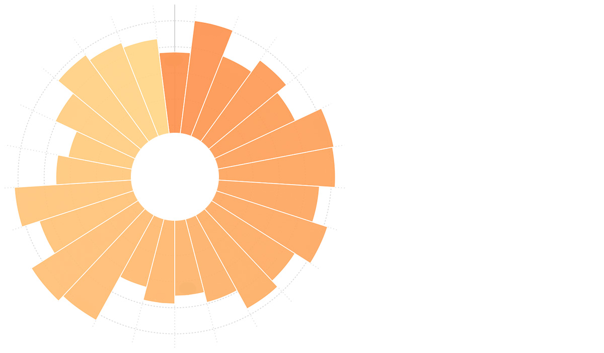
The Nightingale Rose Chart (also known as Coxcomb Chart or Polar Area Diagram) is a chart form invented by Florence Nightingale during the Crimean War for a report on soldier mortality.
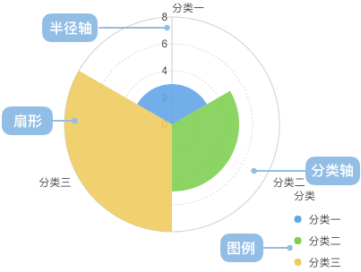
The Nightingale Rose Chart is a bar chart plotted in polar coordinates, using the radius of circular arcs to represent the magnitude of data (the quantity).
Other Names
Nightingale Rose Chart, Coxcomb Chart, Polar Area Diagram
| Chart Type | Nightingale Rose Chart |
|---|---|
| Suitable Data | List: One categorical data field, one continuous data field |
| Functionality | Comparing the numerical values of categorical data |
| Data-to-Graphic Mapping | Categorical data field maps to the position on the category axis Continuous data field maps to the height on the radius axis Categorical data can also set color to enhance category distinction |
| Suitable Data Count | Not exceeding 30 data items |
Example 1: Comparing the size of different categories
The chart below shows a comparison of manufacturing indices for various countries, with the United States as the benchmark (100). China's manufacturing cost index is 96, meaning that if a product costs $1 to manufacture in the US, it would cost $0.96 in China. The chart indicates that China's manufacturing advantage is no longer significant.
| country(Country) | cost(Manufacturing Index) |
|---|---|
| China | 96 |
| Germany | 121 |
| United States | 100 |
| Japan | 111 |
| South Korea | 102 |
| ... | ... |
import { Chart } from '@antv/g2';const chart = new Chart({container: 'container',theme: 'classic',});chart.options({type: 'interval',autoFit: true,coordinate: { type: 'polar' },data: [{ country: 'China', cost: 96 },{ country: 'Germany', cost: 121 },{ country: 'USA', cost: 100 },{ country: 'Japan', cost: 111 },{ country: 'Korea', cost: 102 },{ country: 'France', cost: 124 },{ country: 'Italy', cost: 123 },{ country: 'Netherlands', cost: 111 },{ country: 'Belgium', cost: 123 },{ country: 'UK', cost: 109 },{ country: 'Canada', cost: 115 },{ country: 'Russia', cost: 99 },{ country: 'Mexico', cost: 91 },{ country: 'India', cost: 87 },{ country: 'Switzerland', cost: 125 },{ country: 'Australia', cost: 130 },{ country: 'Spain', cost: 109 },{ country: 'Brazil', cost: 123 },{ country: 'Thailand', cost: 91 },{ country: 'Indonesia', cost: 83 },{ country: 'Poland', cost: 101 },{ country: 'Sweden', cost: 116 },{ country: 'Austria', cost: 111 },{ country: 'Czech', cost: 107 },],encode: {x: 'country',y: 'cost',color: 'country',},scale: {y: { nice: true },color: { palette: 'category20' },},axis: {y: { labelFormatter: null },x: { grid: true },},interaction: [{type: 'elementHighlight',background: true,},],});chart.render();
Example 1: Scenarios with too few categories
The chart below shows the number of male and female students in a class. This scenario compares a rose chart with a pie chart. When there are very few categories, a pie chart is more suitable than a rose chart.
| gender | count |
|---|---|
| Male | 40 |
| Female | 30 |
import { Chart } from '@antv/g2';const chart = new Chart({container: 'container',theme: 'classic',});chart.options({type: 'interval',autoFit: true,coordinate: { type: 'polar' },data: [{ gender: 'Male', count: 40 },{ gender: 'Female', count: 30 },],encode: {x: 'gender',y: 'count',color: 'gender',},scale: {y: { nice: true, min: 0 },},});chart.render();
import { Chart } from '@antv/g2';const chart = new Chart({container: 'container',theme: 'classic',});chart.options({type: 'interval',autoFit: true,coordinate: { type: 'polar' },data: [{ gender: 'Male', count: 40 },{ gender: 'Female', count: 30 },],encode: {x: 'gender',y: 'count',color: 'gender',},scale: {y: { nice: true, min: 0 },},});chart.render();
Example 2: Scenarios with vastly different category values
Below, a Nightingale Rose Chart and a horizontal bar chart are used to display population data for various provinces. In this scenario, using a rose chart is inappropriate because the vast differences in values make it difficult to observe smaller categories. A horizontal bar chart is recommended.
| province | population |
|---|---|
| Beijing | 19,612,368 |
| Tianjin | 12,938,693 |
| Hebei | 71,854,210 |
| Shanxi | 27,500,000 |
| ... | ... |
Nightingale Rose Chart (Not Recommended)
import { Chart } from '@antv/g2';const chart = new Chart({container: 'container',theme: 'classic',});chart.options({type: 'interval',autoFit: true,coordinate: { type: 'polar' },data: [{ province: 'Beijing', population: 19612368 },{ province: 'Tianjin', population: 12938693 },{ province: 'Hebei', population: 71854210 },{ province: 'Shanxi', population: 27500000 },{ province: 'Inner Mongolia', population: 24706291 },{ province: 'Liaoning', population: 43746323 },{ province: 'Jilin', population: 27452815 },{ province: 'Heilongjiang', population: 38313991 },{ province: 'Shanghai', population: 23019196 },{ province: 'Jiangsu', population: 78660941 },{ province: 'Zhejiang', population: 54426891 },{ province: 'Anhui', population: 59500468 },{ province: 'Fujian', population: 36894217 },{ province: 'Jiangxi', population: 44567797 },{ province: 'Shandong', population: 95792719 },{ province: 'Henan', population: 94029939 },{ province: 'Hubei', population: 57237727 },{ province: 'Hunan', population: 65700762 },{ province: 'Guangdong', population: 104320459 },{ province: 'Guangxi', population: 46023761 },{ province: 'Hainan', population: 8671485 },{ province: 'Chongqing', population: 28846170 },{ province: 'Sichuan', population: 80417528 },{ province: 'Guizhou', population: 34748556 },{ province: 'Yunnan', population: 45966766 },{ province: 'Tibet', population: 3002165 },{ province: 'Shaanxi', population: 37327379 },{ province: 'Gansu', population: 25575263 },{ province: 'Qinghai', population: 5626723 },],encode: {x: 'province',y: 'population',color: 'province',},scale: {y: { nice: true },color: { palette: 'category20' },},axis: {y: { labelFormatter: null },x: {labelFormatter: (text) =>text.length > 6 ? text.slice(0, 6) + '...' : text,labelRotate: Math.PI / 4,},},});chart.render();
Horizontal Bar Chart (Recommended)
import { Chart } from '@antv/g2';const chart = new Chart({container: 'container',theme: 'classic',});chart.options({type: 'interval',autoFit: true,coordinate: { type: 'rect' },data: [{ province: 'Beijing', population: 19612368 },{ province: 'Tianjin', population: 12938693 },{ province: 'Hebei', population: 71854210 },{ province: 'Shanxi', population: 27500000 },{ province: 'Inner Mongolia', population: 24706291 },{ province: 'Liaoning', population: 43746323 },{ province: 'Jilin', population: 27452815 },{ province: 'Heilongjiang', population: 38313991 },{ province: 'Shanghai', population: 23019196 },{ province: 'Jiangsu', population: 78660941 },{ province: 'Zhejiang', population: 54426891 },{ province: 'Anhui', population: 59500468 },{ province: 'Fujian', population: 36894217 },{ province: 'Jiangxi', population: 44567797 },{ province: 'Shandong', population: 95792719 },{ province: 'Henan', population: 94029939 },{ province: 'Hubei', population: 57237727 },{ province: 'Hunan', population: 65700762 },{ province: 'Guangdong', population: 104320459 },{ province: 'Guangxi', population: 46023761 },{ province: 'Hainan', population: 8671485 },{ province: 'Chongqing', population: 28846170 },{ province: 'Sichuan', population: 80417528 },{ province: 'Guizhou', population: 34748556 },{ province: 'Yunnan', population: 45966766 },{ province: 'Tibet', population: 3002165 },{ province: 'Shaanxi', population: 37327379 },{ province: 'Gansu', population: 25575263 },{ province: 'Qinghai', population: 5626723 },],encode: {x: 'province',y: 'population',color: 'province',},scale: {y: { nice: true },color: { palette: 'category20' },},axis: {y: { labelFormatter: null },x: {labelFormatter: (text) =>text.length > 6 ? text.slice(0, 6) + '...' : text,labelRotate: Math.PI / 4,},},});chart.render();
Example 3: Scenarios where some category values are too small
The chart below shows the pass rates for various subjects in a class, displayed using both a Nightingale Rose Chart and a horizontal bar chart. In this scenario, because some category values are too small, using a Nightingale Rose Chart can distort the graph, making it difficult to observe the true proportions of the data.
| Subject | Pass Rate |
|---|---|
| Math | 98% |
| English | 95% |
| Physics | 60% |
| Chemistry | 55% |
| Biology | 30% |
| Geography | 5% |
import { Chart } from '@antv/g2';const chart = new Chart({container: 'container',theme: 'classic',});chart.options({type: 'interval',autoFit: true,coordinate: { type: 'polar' },data: [{ subject: 'Math', passRate: 98 },{ subject: 'English', passRate: 95 },{ subject: 'Physics', passRate: 60 },{ subject: 'Chemistry', passRate: 55 },{ subject: 'Biology', passRate: 30 },{ subject: 'Geography', passRate: 5 },],encode: {x: 'subject',y: 'passRate',color: 'subject',},scale: {y: { nice: true },color: { palette: 'category20' },},axis: {y: { labelFormatter: null },x: {labelFormatter: (text) =>text.length > 6 ? text.slice(0, 6) + '...' : text,labelRotate: Math.PI / 4,},},});chart.render();
import { Chart } from '@antv/g2';const chart = new Chart({container: 'container',theme: 'classic',});chart.options({type: 'interval',autoFit: true,coordinate: { type: 'rect' },data: [{ subject: 'Math', passRate: 98 },{ subject: 'English', passRate: 95 },{ subject: 'Physics', passRate: 60 },{ subject: 'Chemistry', passRate: 55 },{ subject: 'Biology', passRate: 30 },{ subject: 'Geography', passRate: 5 },],encode: {x: 'subject',y: 'passRate',color: 'subject',},scale: {y: { nice: true },color: { palette: 'category20' },},axis: {y: { labelFormatter: null },x: {labelFormatter: (text) =>text.length > 6 ? text.slice(0, 6) + '...' : text,labelRotate: Math.PI / 4,},},});chart.render();
A sector Nightingale Rose Chart can be achieved by setting the start angle of the polar coordinates:
import { Chart } from '@antv/g2';const chart = new Chart({container: 'container',theme: 'classic',});chart.options({type: 'interval',autoFit: true,coordinate: {type: 'polar',startAngle: Math.PI,endAngle: Math.PI * (3 / 2),},data: [{ country: 'China', cost: 96 },{ country: 'Germany', cost: 121 },{ country: 'USA', cost: 100 },{ country: 'Japan', cost: 111 },{ country: 'Korea', cost: 102 },{ country: 'France', cost: 124 },{ country: 'Italy', cost: 123 },{ country: 'Netherlands', cost: 111 },{ country: 'Belgium', cost: 123 },{ country: 'UK', cost: 109 },{ country: 'Canada', cost: 115 },{ country: 'Russia', cost: 99 },],encode: {x: 'country',y: 'cost',color: 'country',},scale: {y: { nice: true },color: { range: ['#fc8f48', '#ffd787'] },},style: {lineWidth: 1,stroke: '#fff',},labels: [{text: 'cost',style: {textAlign: 'center',fontSize: 10,fontWeight: 'bold',},transform: [{ type: 'overlapDodgeY' }],},],});chart.render();
The Nightingale Rose Chart is essentially a bar chart plotted in polar coordinates. If a bar chart is extended to a stacked bar chart, a stacked rose chart can also be implemented.
The chart below shows refugee data from the last decade, broadly categorized into refugees who have crossed national borders, internally displaced persons who have not, and asylum-seekers who have not yet obtained refugee status.
| year | internally displaced persons | refugees (crossed borders) | asylum-seekers |
|---|---|---|---|
| 2000 | 21.0 | 16 | 0.8 |
| 2001 | 25.0 | 16 | 0.8 |
| ... | ... | ... | ... |
import { Chart } from '@antv/g2';const chart = new Chart({container: 'container',theme: 'classic',});chart.options({type: 'interval',autoFit: true,coordinate: {type: 'polar',innerRadius: 0.1,},data: [{ year: '2000', type: 'Internally Displaced', count: 21.0 },{ year: '2000', type: 'Cross-border Refugees', count: 16 },{ year: '2000', type: 'Asylum Seekers', count: 0.8 },{ year: '2001', type: 'Internally Displaced', count: 25.0 },{ year: '2001', type: 'Cross-border Refugees', count: 16 },{ year: '2001', type: 'Asylum Seekers', count: 0.8 },{ year: '2002', type: 'Internally Displaced', count: 25.0 },{ year: '2002', type: 'Cross-border Refugees', count: 15 },{ year: '2002', type: 'Asylum Seekers', count: 0.8 },{ year: '2003', type: 'Internally Displaced', count: 25.0 },{ year: '2003', type: 'Cross-border Refugees', count: 14 },{ year: '2003', type: 'Asylum Seekers', count: 0.7 },{ year: '2004', type: 'Internally Displaced', count: 25.0 },{ year: '2004', type: 'Cross-border Refugees', count: 14 },{ year: '2004', type: 'Asylum Seekers', count: 0.7 },{ year: '2005', type: 'Internally Displaced', count: 24.0 },{ year: '2005', type: 'Cross-border Refugees', count: 13 },{ year: '2005', type: 'Asylum Seekers', count: 0.8 },{ year: '2006', type: 'Internally Displaced', count: 24.0 },{ year: '2006', type: 'Cross-border Refugees', count: 14 },{ year: '2006', type: 'Asylum Seekers', count: 0.7 },{ year: '2007', type: 'Internally Displaced', count: 26.0 },{ year: '2007', type: 'Cross-border Refugees', count: 16 },{ year: '2007', type: 'Asylum Seekers', count: 0.7 },{ year: '2008', type: 'Internally Displaced', count: 26.0 },{ year: '2008', type: 'Cross-border Refugees', count: 15.2 },{ year: '2008', type: 'Asylum Seekers', count: 0.8 },{ year: '2009', type: 'Internally Displaced', count: 27.1 },{ year: '2009', type: 'Cross-border Refugees', count: 15.2 },{ year: '2009', type: 'Asylum Seekers', count: 1.0 },{ year: '2010', type: 'Internally Displaced', count: 27.5 },{ year: '2010', type: 'Cross-border Refugees', count: 15.4 },{ year: '2010', type: 'Asylum Seekers', count: 0.8 },{ year: '2011', type: 'Internally Displaced', count: 26.4 },{ year: '2011', type: 'Cross-border Refugees', count: 15.2 },{ year: '2011', type: 'Asylum Seekers', count: 0.9 },{ year: '2012', type: 'Internally Displaced', count: 28.8 },{ year: '2012', type: 'Cross-border Refugees', count: 15.4 },{ year: '2012', type: 'Asylum Seekers', count: 0.9 },{ year: '2013', type: 'Internally Displaced', count: 33.3 },{ year: '2013', type: 'Cross-border Refugees', count: 16.7 },{ year: '2013', type: 'Asylum Seekers', count: 1.2 },{ year: '2014', type: 'Internally Displaced', count: 38.2 },{ year: '2014', type: 'Cross-border Refugees', count: 19.5 },{ year: '2014', type: 'Asylum Seekers', count: 1.8 },],encode: {x: 'year',y: 'count',color: 'type',series: 'type',},transform: [{ type: 'stackY' }],scale: {color: {range: ['rgb(136,186,174)', 'rgb(184,189,61)', 'rgb(107,136,138)'],},},style: {stroke: 'white',lineWidth: 1,},});chart.render();
Nightingale Rose Charts and Pie Charts


