K-Chart
Previous
Funnel Chart
Next
Scatter Plot
Loading...
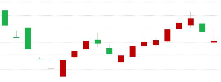
K-Charts, originally known as Candlestick Charts, are commonly used to display stock trading data. A K-line graphically represents the daily, weekly, or monthly changes in a stock's opening price, closing price, highest price, and lowest price.
Through its intuitive visual representation, K-Charts can quickly reflect price trends over a certain period, helping analysts and investors judge market trends. Each K-line contains four key pieces of price information: opening price, closing price, highest price, and lowest price. These four prices constitute complete trading information.
The design concept of K-Charts originated in Japan, initially used for rice futures trading, and later widely adopted in technical analysis across various financial markets.
Other Names: Candlestick Chart (also known as Yin-Yang lines, bar lines, red-black lines, or candle lines).
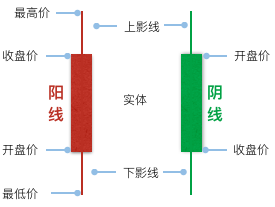
A K-line is structured as follows:
When the closing price is higher than the opening price, meaning the stock price is trending upwards, the K-line is called a Yang line (bullish candle). Its real body is usually represented in red or hollow. Conversely, it's called a Yin line (bearish candle), represented by a green or black real body.
| Chart Type | K-Chart |
|---|---|
| Suitable Data | Time series: One time field, four numerical fields (open, close, high, low prices) |
| Function | Observe data trends Compare price ranges across different periods |
| Data-Graphic Mapping | Time field mapped to the horizontal axis Four price fields mapped to the vertical axis, forming the K-line's body and shadows Up/down status mapped to color |
| Suitable Data Count | Suitable for medium to long-term data, typically tens to hundreds of trading periods |
Scenario 1: Stock Price Analysis
The most classic application of K-Charts is in stock market analysis. By observing the patterns of K-lines, one can judge the balance of power between bulls and bears in the market.
import { Chart } from '@antv/g2';const chart = new Chart({container: 'container',autoFit: true,});const data = [{ time: '2015-11-19', start: 8.18, max: 8.33, min: 7.98, end: 8.32 },{ time: '2015-11-18', start: 8.37, max: 8.6, min: 8.03, end: 8.09 },{ time: '2015-11-17', start: 8.7, max: 8.78, min: 8.32, end: 8.37 },{ time: '2015-11-16', start: 8.48, max: 8.85, min: 8.43, end: 8.7 },{ time: '2015-11-13', start: 8.01, max: 8.75, min: 7.97, end: 8.41 },{ time: '2015-11-12', start: 7.76, max: 8.18, min: 7.61, end: 8.15 },{ time: '2015-11-11', start: 7.55, max: 7.81, min: 7.49, end: 7.8 },{ time: '2015-11-10', start: 7.5, max: 7.68, min: 7.44, end: 7.57 },];chart.data(data).encode('x', 'time').encode('color', (d) => {const trend = Math.sign(d.start - d.end);// Note: In many Western contexts, red is down and green is up.// This example uses red for up ('上涨') and green for down ('下跌').// Translated labels: 'Down', 'Unchanged', 'Up'// Original colors: Down '#4daf4a' (green), Up '#e41a1c' (red)return trend > 0 ? 'Down' : trend === 0 ? 'Unchanged' : 'Up';}).scale('x', {compare: (a, b) => new Date(a).getTime() - new Date(b).getTime(),}).scale('color', {domain: ['Down', 'Unchanged', 'Up'],range: ['#4daf4a', '#999999', '#e41a1c'], // Green for Down, Gray for Unchanged, Red for Up});chart.link().encode('y', ['min', 'max']).tooltip({title: 'time',items: [{ field: 'start', name: 'Open' },{ field: 'end', name: 'Close' },{ field: 'min', name: 'Low' },{ field: 'max', name: 'High' },],});chart.interval().encode('y', ['start', 'end']).style('fillOpacity', 1).style('stroke', (d) => {if (d.start === d.end) return '#999999';}).axis('y', {title: 'Price',}).tooltip({title: 'time',items: [{ field: 'start', name: 'Open' },{ field: 'end', name: 'Close' },{ field: 'min', name: 'Low' },{ field: 'max', name: 'High' },],});chart.render();
Scenario 2: Commodity Futures Analysis
K-Charts are also applicable to the price analysis of commodity futures, foreign exchange, and other financial derivatives, helping traders identify price patterns and trends.
Scenario 3: Cryptocurrency Analysis
In cryptocurrency trading, K-Charts are the most commonly used technical analysis tool, clearly displaying price fluctuations.
Scenario 4: Comprehensive Market Analysis with Volume Data
Combining K-Charts with volume indicators provides a more holistic view of market dynamics.
K-Charts with Volume Charts
Pairing K-Charts with volume bar charts allows for a more comprehensive analysis of market behavior.
import { Chart } from '@antv/g2';// Create containers for K-Chart and Volume Chartdocument.getElementById('container').innerHTML = `<div id="kChart" style="height: 300px;"></div><div id="volumeChart" style="height: 150px; margin-top: 10px;"></div>`;const data = [{time: '2015-11-19',start: 8.18,max: 8.33,min: 7.98,end: 8.32,volumn: 1810,},{time: '2015-11-18',start: 8.37,max: 8.6,min: 8.03,end: 8.09,volumn: 2790,},{time: '2015-11-17',start: 8.7,max: 8.78,min: 8.32,end: 8.37,volumn: 3729,},{time: '2015-11-16',start: 8.48,max: 8.85,min: 8.43,end: 8.7,volumn: 2890,},];const KChart = new Chart({container: 'kChart',autoFit: true,});KChart.options({type: 'view',data,encode: {x: 'time',color: (d) => {const trend = Math.sign(d.start - d.end);return trend > 0 ? 'Down' : trend === 0 ? 'Unchanged' : 'Up';},},scale: {color: {domain: ['Down', 'Unchanged', 'Up'],range: ['#4daf4a', '#999999', '#e41a1c'],},},children: [{type: 'link',encode: { y: ['min', 'max'] },},{type: 'interval',encode: { y: ['start', 'end'] },style: { fillOpacity: 1 },},],axis: {y: { title: 'Price' },},});// Volume Chartconst VolumeChart = new Chart({container: 'volumeChart',autoFit: true,});VolumeChart.options({type: 'interval',data,encode: {x: 'time',y: 'volumn',color: (d) => {const trend = Math.sign(d.start - d.end);return trend > 0 ? 'Down' : trend === 0 ? 'Unchanged' : 'Up';},},scale: {color: {domain: ['Down', 'Unchanged', 'Up'],range: ['#4daf4a', '#999999', '#e41a1c'],},},axis: {y: { title: 'Volume' },},});KChart.render();VolumeChart.render();
Notes:
K-Charts with Bar Charts for Volume (Full Data Source)
Using a more complete data source, combine K-Charts and bar charts to show the relationship between stock prices and trading volume, with support for legend interaction.
import { Chart } from '@antv/g2';// Create containers for K-Chart and Column Chartdocument.getElementById('container').innerHTML = `<div id="kChart" style="height: 360px;"></div><div id="columnChart" style="height: 180px;"></div>`;const KChart = new Chart({container: 'kChart',autoFit: true,height: 360,paddingLeft: 60,});KChart.options({type: 'view',data: {type: 'fetch',value:'https://gw.alipayobjects.com/os/antvdemo/assets/data/candle-sticks.json',},encode: {x: 'time',color: (d) => {const trend = Math.sign(d.start - d.end);return trend > 0 ? 'Down' : trend === 0 ? 'Unchanged' : 'Up';},},scale: {x: {compare: (a, b) => new Date(a).getTime() - new Date(b).getTime(),},color: {domain: ['Down', 'Unchanged', 'Up'],range: ['#4daf4a', '#999999', '#e41a1c'],},},children: [{type: 'link',encode: { y: ['min', 'max'] },tooltip: {title: 'time',items: [{ field: 'start', name: 'Open' },{ field: 'end', name: 'Close' },{ field: 'min', name: 'Low' },{ field: 'max', name: 'High' },],},},{type: 'interval',encode: { y: ['start', 'end'] },style: {fillOpacity: 1,stroke: (d) => (d.start === d.end ? '#999999' : undefined),},axis: {x: { title: false },y: { title: false },},tooltip: {title: 'time',items: [{ field: 'start', name: 'Open' },{ field: 'end', name: 'Close' },{ field: 'min', name: 'Low' },{ field: 'max', name: 'High' },],},},],});const ColumnChart = new Chart({container: 'columnChart',autoFit: true,paddingTop: 0,paddingBottom: 0,height: 180,paddingLeft: 60,});ColumnChart.options({type: 'interval',data: {type: 'fetch',value:'https://gw.alipayobjects.com/os/antvdemo/assets/data/candle-sticks.json',},encode: {x: 'time',y: 'volumn',color: (d) => {const trend = Math.sign(d.start - d.end);return trend > 0 ? 'Down' : trend === 0 ? 'Unchanged' : 'Up';},},scale: {x: {compare: (a, b) => new Date(a).getTime() - new Date(b).getTime(),},color: {domain: ['Down', 'Unchanged', 'Up'],range: ['#4daf4a', '#999999', '#e41a1c'],},},axis: {x: false,y: { title: false },},});// Legend interaction linkageKChart.on('legend:filter', (e) => {const { nativeEvent, data } = e;if (!nativeEvent) return;ColumnChart.emit('legend:filter', { data });});KChart.on('legend:reset', (e) => {const { nativeEvent, data } = e;if (!nativeEvent) return;ColumnChart.emit('legend:reset', { data });});KChart.render();ColumnChart.render();
Notes:
Scenario 1: Non-Time Series Data
K-Charts are specifically designed for time series data. For comparing categorical data that does not involve a time dimension, Bar Charts or Column Charts should be used.
Scenario 2: Displaying Single Numerical Trends
If you only need to show simple numerical trends, Line Charts or Area Charts would be more concise and clear.
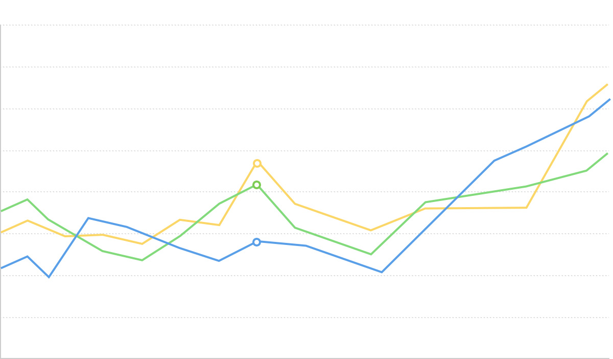
K-Charts and Line Charts:
K-Charts and Bar Charts:
K-Charts and Box Plots: