分布曲线图
上一篇
堆叠柱状图
下一篇
分组柱状图
Loading...
分布曲线图是一种用于展示数据频率分布的统计图表,通过平滑的曲线形式直观地反映数据在不同数值区间的分布密度和集中趋势。它是理解数据分布特征、识别数据模式的重要可视化工具。
分布曲线图特别适合用于探索性数据分析、多组数据分布比较、数据质量检查以及统计分布特征识别等场景,是统计分析和数据科学中的重要工具。
英文名:Distribution Curve, Frequency Curve, Density Curve
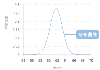
分布曲线图由以下元素构成:
例子 1: 展示正态分布数据的分布特征
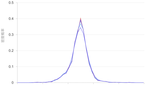
分布曲线图非常适合展示正态分布数据,能够清晰地显示数据的集中趋势、对称性和分布形态。
import { Chart } from '@antv/g2';// 生成正态分布数据const generateNormalData = (count, mean, std) => {const data = [];for (let i = 0; i < count; i++) {// 使用Box-Muller变换生成正态分布数据const u1 = Math.random();const u2 = Math.random();const z0 = Math.sqrt(-2 * Math.log(u1)) * Math.cos(2 * Math.PI * u2);data.push({ value: mean + std * z0 });}return data;};const chart = new Chart({container: 'container',theme: 'classic',});chart.options({type: 'line',data: {value: generateNormalData(1000, 100, 15),transform: [{type: 'custom',callback: (data) => {// 提取数值数据const values = data.map(d => d.value).filter(v => !isNaN(v));// 计算数据范围const min = Math.min(...values);const max = Math.max(...values);const binCount = 30;const binWidth = (max - min) / binCount;// 创建分箱const bins = Array.from({ length: binCount }, (_, i) => ({x0: min + i * binWidth,x1: min + (i + 1) * binWidth,count: 0,}));// 统计每个分箱的频数values.forEach(value => {const binIndex = Math.min(Math.floor((value - min) / binWidth),binCount - 1);bins[binIndex].count++;});// 计算频率密度并生成曲线数据const total = values.length;return bins.map(bin => ({x: (bin.x0 + bin.x1) / 2, // 区间中心点y: bin.count / total, // 频率密度frequency: bin.count,range: `${bin.x0.toFixed(1)}-${bin.x1.toFixed(1)}`,}));},},],},encode: {x: 'x',y: 'y',shape: 'smooth',},style: {lineWidth: 3,stroke: '#1890ff',},axis: {x: { title: '测量值' },y: { title: '频率密度' },},tooltip: {title: (d) => `区间: ${d.range}`,items: [{ field: 'frequency', name: '频数' },{ field: 'y', name: '频率密度', valueFormatter: '.3f' },],},});chart.render();
说明:
例子 2: 多组数据分布比较分析
当需要比较不同条件或分组下的数据分布时,分布曲线图能够直观地展示各组间的分布差异。
import { Chart } from '@antv/g2';const chart = new Chart({container: 'container',theme: 'classic',});chart.options({type: 'line',data: {type: 'fetch',value: 'https://assets.antv.antgroup.com/g2/species.json',transform: [{type: 'custom',callback: (data) => {// 按物种分组数据const groups = {};data.forEach(d => {if (!groups[d.species]) groups[d.species] = [];groups[d.species].push(d.y);});const binCount = 20;const results = [];// 为每个物种创建分布曲线数据Object.entries(groups).forEach(([species, values]) => {const filteredValues = values.filter(v => !isNaN(v));if (filteredValues.length === 0) return;const min = Math.min(...filteredValues);const max = Math.max(...filteredValues);const binWidth = (max - min) / binCount;// 创建分箱const bins = Array.from({ length: binCount }, (_, i) => ({x0: min + i * binWidth,x1: min + (i + 1) * binWidth,count: 0,}));// 统计频数filteredValues.forEach(value => {const binIndex = Math.min(Math.floor((value - min) / binWidth),binCount - 1);bins[binIndex].count++;});// 生成曲线数据const total = filteredValues.length;bins.forEach(bin => {results.push({x: (bin.x0 + bin.x1) / 2,y: bin.count / total,species,frequency: bin.count,range: `${bin.x0.toFixed(2)}-${bin.x1.toFixed(2)}`,});});});return results;},},],},encode: {x: 'x',y: 'y',color: 'species',shape: 'smooth',},style: {lineWidth: 2,strokeOpacity: 0.8,},axis: {x: { title: '花瓣长度' },y: { title: '频率密度' },},legend: {color: {title: '物种',position: 'right',},},tooltip: {title: (d) => `${d.species} - 区间: ${d.range}`,items: [{ field: 'frequency', name: '频数' },{ field: 'y', name: '频率密度', valueFormatter: '.3f' },],},});chart.render();
说明:
例子 1: 数据量过少时效果不佳
当数据点过少时,分箱统计可能不够准确,生成的分布曲线可能不能准确反映真实的分布特征。
import { Chart } from '@antv/g2';// 模拟少量数据const smallData = [12, 15, 13, 14, 16, 18, 11, 17, 15, 13];const chart = new Chart({container: 'container',theme: 'classic',height: 250,});chart.options({type: 'point',data: smallData.map((value, index) => ({ index: index + 1, value })),encode: {x: 'index',y: 'value',size: 6,},style: {fill: '#1890ff',fillOpacity: 0.8,},axis: {x: { title: '数据点序号' },y: { title: '数值' },},title: '数据量少时建议使用散点图',});chart.render();
问题说明:
例子 2: 离散型分类数据不适用
对于离散的分类数据,连续的分布曲线没有实际意义,因为分类之间不存在连续性关系。
import { Chart } from '@antv/g2';// 离散分类数据const discreteData = [{ category: '产品A', sales: 45 },{ category: '产品B', sales: 67 },{ category: '产品C', sales: 33 },{ category: '产品D', sales: 52 },{ category: '产品E', sales: 28 },];const chart = new Chart({container: 'container',theme: 'classic',height: 250,});chart.options({type: 'interval',data: discreteData,encode: {x: 'category',y: 'sales',color: 'category',},style: {fillOpacity: 0.8,},axis: {x: { title: '产品类别' },y: { title: '销售数量' },},title: '分类数据建议使用柱状图',});chart.render();
问题说明: