
色块图
上一篇
气泡图
下一篇
韦恩图
Loading...
典型的色块图,是一种使用颜色编码数值数据的可视化图表。它将矩形区域划分为网格,每个网格单元代表一组分类数据的交叉点,通过颜色的深浅表示数值的大小。与热力图不同,色块图通常用于显示离散分类数据之间的关系,而不是连续的数据分布。
色块图特别适合展示多个分类变量之间的关系和模式,例如不同时间段内不同产品的销售额、不同地区不同年份的气温变化等。通过颜色编码,用户可以快速识别出数据集中的高低值区域和整体分布模式。
需要注意的是,当色块图中的分类过多时,可能会导致标签重叠和可读性下降的问题,下面我们会举例说明。
英文名:Color Map, Color Block Chart
| 图表类型 | 基础色块图 |
|---|---|
| 适合的数据 | 具有两个分类维度和一个数值维度的数据集 |
| 功能 | 展示两个分类维度和一个数值变量之间的关系 |
| 数据与图形的映射 | 两个分类数据维度映射到网格的行和列 数值数据映射到颜色深浅 可以添加文本标签显示具体数值 |
| 适合的数据条数 | 每个维度通常不超过 20 个分类,总单元格数建议不超过 400 个 |
import { Chart } from '@antv/g2';const chart = new Chart({container: 'container',theme: 'classic',});chart.options({type: 'view',autoFit: true,data: [{ month: '一月', product: '产品A', sales: 123 },{ month: '一月', product: '产品B', sales: 231 },{ month: '一月', product: '产品C', sales: 145 },{ month: '二月', product: '产品A', sales: 132 },{ month: '二月', product: '产品B', sales: 112 },{ month: '二月', product: '产品C', sales: 178 },{ month: '三月', product: '产品A', sales: 99 },{ month: '三月', product: '产品B', sales: 288 },{ month: '三月', product: '产品C', sales: 133 },{ month: '四月', product: '产品A', sales: 181 },{ month: '四月', product: '产品B', sales: 223 },{ month: '四月', product: '产品C', sales: 141 },{ month: '五月', product: '产品A', sales: 152 },{ month: '五月', product: '产品B', sales: 219 },{ month: '五月', product: '产品C', sales: 109 },{ month: '六月', product: '产品A', sales: 167 },{ month: '六月', product: '产品B', sales: 187 },{ month: '六月', product: '产品C', sales: 255 },],coordinate: {type: 'cartesian',},children: [{type: 'cell',encode: {x: 'month',y: 'product',color: 'sales',link: 'sales',},style: {inset: 1,},labels: [{text: 'sales',style: {fill: (d) => (d.sales > 200 ? '#fff' : '#000'),},},],},],legend: {color: {position: 'right',flipPage: false,},},scale: {color: {palette: 'rdBu',offset: (t) => 1 - t,},},});chart.render();

| 图表类型 | 带条件格式的色块图 |
|---|---|
| 适合的数据 | 需要突出显示特定阈值或范围的数据集 |
| 功能 | 根据数据值的不同范围应用不同的颜色编码,突出显示关键数据点 |
| 数据与图形的映射 | 除基础色块图的映射外,还可以添加自定义的颜色区间和边界标记 |
| 使用建议 | 为不同颜色区间添加清晰的图例说明 使用对比鲜明的颜色表示不同的数据状态 避免使用过多的颜色区间造成混淆 |
import { Chart } from '@antv/g2';const chart = new Chart({container: 'container',theme: 'classic',});const data = [{ month: '一月', product: '产品A', sales: 123, target: 150 },{ month: '一月', product: '产品B', sales: 231, target: 200 },{ month: '一月', product: '产品C', sales: 145, target: 150 },{ month: '二月', product: '产品A', sales: 132, target: 150 },{ month: '二月', product: '产品B', sales: 112, target: 200 },{ month: '二月', product: '产品C', sales: 178, target: 150 },{ month: '三月', product: '产品A', sales: 99, target: 150 },{ month: '三月', product: '产品B', sales: 288, target: 200 },{ month: '三月', product: '产品C', sales: 133, target: 150 },{ month: '四月', product: '产品A', sales: 181, target: 150 },{ month: '四月', product: '产品B', sales: 223, target: 200 },{ month: '四月', product: '产品C', sales: 141, target: 150 },{ month: '五月', product: '产品A', sales: 152, target: 150 },{ month: '五月', product: '产品B', sales: 219, target: 200 },{ month: '五月', product: '产品C', sales: 109, target: 150 },{ month: '六月', product: '产品A', sales: 167, target: 150 },{ month: '六月', product: '产品B', sales: 187, target: 200 },{ month: '六月', product: '产品C', sales: 255, target: 150 },];// 计算每个单元格的性能状态const processedData = data.map((d) => ({...d,// 计算与目标的比例performance: d.sales / d.target,// 添加状态标签status:d.sales < d.target * 0.8? '不达标': d.sales < d.target? '接近目标': d.sales < d.target * 1.2? '达标': '超额完成',}));chart.options({type: 'view',autoFit: true,data: processedData,coordinate: {type: 'cartesian',},children: [{type: 'cell',encode: {x: 'month',y: 'product',color: 'performance',},style: {inset: 1,},labels: [{text: (d) => `${d.sales}/${d.target}`,style: {fill: (d) => (d.performance > 0.95 ? '#fff' : '#000'),textAlign: 'center',fontSize: 11,},},],},],legend: {color: {position: 'right',flipPage: false,},},scale: {color: {type: 'threshold',domain: [0.8, 1, 1.2],range: ['#F4664A', '#FAAD14', '#30BF78', '#0891B2'],},},});chart.render();
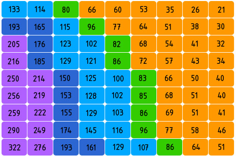
例子 1: 杭州地铁票价图
下图是模拟的杭州地铁票价图。这个色块图展示了不同地铁站点之间的票价关系,通过颜色深浅表示不同的票价级别。可以快速识别票价区间以及任意两站间的出行成本。
| from(起点) | to(终点) | price(票价) |
|---|---|---|
| 湘湖 | 滨和路 | 2 |
| 湘湖 | 西兴 | 3 |
| ... | ... | ... |
import { Chart } from '@antv/g2';const chart = new Chart({container: 'container',theme: 'classic',height: 500,});// 地铁1号线站点const sites = ['湘湖','滨康路','西兴','滨和路','江陵路','近江','婺江路','城站','定安路','龙翔桥','凤起路','武林广场','西湖文化广场','打铁关','火车东站','闸弄口','彭埠','七堡','九和路','九堡','客运中心','下沙西','金沙湖','高沙路','文泽路',];// 生成地铁票价数据const data = [];for (let i = 0; i < sites.length; i++) {for (let j = sites.length - 1; j >= i; j--) {let price = 0;const step = Math.abs(j - i);if (step <= 2) {price = 2;} else if (step <= 4) {price = 3;} else if (step <= 7) {price = 4;} else if (step <= 13) {price = 5;} else if (step <= 16) {price = 6;} else if (step <= 21) {price = 7;} else {price = 8;}data.push({ from: sites[i], to: sites[j], price: price });}}chart.options({type: 'view',autoFit: true,data,coordinate: {type: 'cartesian',},children: [{type: 'cell',encode: {x: 'from',y: 'to',color: 'price',},style: {inset: 1,stroke: '#fff',strokeWidth: 1,},labels: [{text: 'price',style: {fill: (d) => (d.price > 5 ? '#fff' : '#000'),textAlign: 'center',fontSize: 10,},},],},],legend: {color: {position: 'right',title: '票价(元)',flipPage: false,},},scale: {color: {domain: [2, 3, 4, 5, 6, 7, 8],range: ['#ffffcc','#c7e9b4','#7fcdbb','#41b6c4','#2c7fb8','#253494','#081d58',],},from: {values: sites,},to: {values: sites.slice().reverse(),},},axis: {x: {title: false,grid: false,tickLine: false,labelRotate: -Math.PI / 4,labelOffset: 5,},y: {title: false,grid: false,tickLine: false,},},});chart.render();
分析:
x、y 轴,以确定位置例子 2: 考试成绩分析
import { Chart } from '@antv/g2';const chart = new Chart({container: 'container',theme: 'classic',});const students = ['张三','李四','王五','赵六','钱七','孙八','周九','吴十',];const subjects = ['语文', '数学', '英语', '物理', '化学', '生物'];// 生成成绩数据const data = [];students.forEach((student) => {subjects.forEach((subject) => {// 随机生成50-100之间的成绩const score = Math.floor(Math.random() * 51) + 50;data.push({student,subject,score,});});});chart.options({type: 'view',autoFit: true,data,coordinate: {type: 'cartesian',},children: [{type: 'cell',encode: {x: 'subject',y: 'student',color: 'score',},style: {inset: 1,},labels: [{text: 'score',style: {fill: (d) => (d.score > 85 ? '#fff' : '#000'),textAlign: 'center',},},],},],legend: {color: {position: 'right',flipPage: false,title: '分数',},},scale: {color: {domain: [60, 70, 80, 90],range: ['#F4664A', '#FAAD14', '#30BF78', '#0891B2', '#5B8FF9'],},},});chart.render();
例子 1: 数据点过少
当数据集只有少量的分类交叉点时,色块图可能不是最佳选择,这种情况下简单的表格或条形图可能更为直观。
import { Chart } from '@antv/g2';const chart = new Chart({container: 'container',theme: 'classic',});// 只有很少的数据点const data = [{ region: '东部', year: '2022', value: 125 },{ region: '西部', year: '2022', value: 87 },];chart.options({type: 'view',autoFit: true,data,children: [{type: 'cell',encode: {x: 'year',y: 'region',color: 'value',},style: {inset: 1,},labels: [{text: 'value',},],},],});chart.render();
这种情况下,使用柱状图会更加直观:
import { Chart } from '@antv/g2';const chart = new Chart({container: 'container',theme: 'classic',});chart.options({type: 'interval',autoFit: true,data: [{ region: '东部', year: '2022', value: 125 },{ region: '西部', year: '2022', value: 87 },],encode: {x: 'region',y: 'value',color: 'region',},labels: [{text: 'value',position: 'top',},],});chart.render();
例子 2: 需要展示精确趋势变化
当需要展示随时间的精确变化趋势时,色块图不如折线图直观。以下是一个使用色块图展示月度数据变化的例子,但这种情况更适合使用折线图。
import { Chart } from '@antv/g2';const chart = new Chart({container: 'container',theme: 'classic',});const months = ['一月','二月','三月','四月','五月','六月','七月','八月','九月','十月','十一月','十二月',];const data = months.map((month, index) => ({month,metric: '销售额',value: 100 + Math.sin(index / 2) * 50 + Math.random() * 10,}));chart.options({type: 'view',autoFit: true,data,children: [{type: 'cell',encode: {x: 'month',y: 'metric',color: 'value',},style: {inset: 1,},labels: [{text: (d) => d.value.toFixed(0),},],},],});chart.render();
使用折线图更适合展示趋势:
import { Chart } from '@antv/g2';const chart = new Chart({container: 'container',theme: 'classic',});const months = ['一月','二月','三月','四月','五月','六月','七月','八月','九月','十月','十一月','十二月',];const data = months.map((month, index) => ({month,value: 100 + Math.sin(index / 2) * 50 + Math.random() * 10,}));chart.options({type: 'line',autoFit: true,data,encode: {x: 'month',y: 'value',},style: {lineWidth: 2,point: {fill: '#1890ff',r: 4,},},labels: [{text: (d) => d.value.toFixed(0),position: 'top',},],});chart.render();
| 图表类型 | 主要特点 | 适用场景 | 数据要求 |
|---|---|---|---|
| 色块图 | 使用规则网格展示两个分类维度的交叉 | 分类数据之间的关系对比 | 两个分类维度和一个数值维度 |
| 热力图 | 可以使用连续尺度,展示数据的空间分布 | 展示空间密度或强度分布 | 通常需要连续的或近似连续的数据 |
| 矩形树图 | 通过嵌套矩形展示层次结构数据 | 表示层次数据的比例关系 | 需要有明确的层次结构 |
颜色选择
网格设计
标签和交互
import { Chart } from '@antv/g2';const chart = new Chart({container: 'container',theme: 'classic',});// 生成示例数据const rows = ['A', 'B', 'C', 'D', 'E'];const cols = ['P1', 'P2', 'P3', 'P4', 'P5', 'P6'];const data = [];rows.forEach((row) => {cols.forEach((col) => {const value = Math.floor(Math.random() * 100);const baseline = 50;data.push({row,col,value,diff: value - baseline,performance: value >= baseline ? '达标' : '不达标',});});});console.log('data', data);chart.options({type: 'view',autoFit: true,data,children: [{type: 'cell',encode: {x: 'col',y: 'row',color: 'diff',},style: {inset: 2,},labels: [{text: 'value',style: {fill: (d) => (Math.abs(d.diff) > 25 ? '#fff' : '#000'),textAlign: 'center',fontWeight: 'bold',},},],},],scale: {color: {type: 'threshold',domain: [0],range: ['#2B83BA', '#D7191C'],},},tooltip: {title: (d) => `${d.row}-${d.col}`,items: [{ field: 'value', name: '数值' },{ field: 'diff', name: '与基准差异' },{ field: 'performance', name: '达标状态' },],},legend: false,interaction: [{ type: 'tooltip' }, { type: 'elementHighlight' }],});chart.render();
色块图可以通过多种方式进行扩展,使其更适应不同的数据可视化需求:

