
图表 API
创建可视化
new Chart()
new Chart(params: ChartCfg) => View;创建 Chart 图表对象。
const chart = new Chart({
  container: 'container',
  width: 640,
  height: 480,
});
ChartCfg.container
<description> string | HTMLElement optional </description>
指定 chart 绘制的 DOM,可以传入 DOM id,也可以直接传入 DOM 实例。
// 传入 DOM id
const chart = new Chart({
  container: 'container',
});
// 传入 DOM 实例
const container = document.createElement('div');
const chart = new Chart({
  container,
});

// 获取默认的 container
const chart = new Chart();
chart.options({});
chart.render();
return chart.getContainer();
ChartCfg.autoFit
<description> boolean optional default: false</description>
图表是否自适应容器宽高,默认为 false,用户需要手动设置 width 和 height。当 autoFit: true 时,会自动取图表容器的宽高,如果用户设置了 height,那么会以用户设置的 height 为准。
ChartCfg.clip
<description> boolean optional default: false</description>
是否隐藏超出绘制区域的图形。
clip = false 时,不会对超出绘制区域的图形进行截断。
import { Chart } from '@antv/g2';

const chart = new Chart({
  container: 'container',
});

chart.options({
  type: 'view',
  data: [
    { year: '1991', value: 3 },
    { year: '1992', value: 4 },
    { year: '1993', value: 3.5 },
    { year: '1994', value: 5 },
    { year: '1995', value: 4.9 },
    { year: '1996', value: 6 },
    { year: '1997', value: 7 },
    { year: '1998', value: 9 },
    { year: '1999', value: 13 },
  ],
  encode: { x: 'year', y: 'value' },
  scale: {
    x: { range: [0, 1] },
    y: { domainMin: 6, nice: true },
  },
  children: [
    {
      type: 'line',
      labels: [{
        text: 'value',
        style: {
          dx: -10,
          dy: -12,
        },
      }],
    },
    { type: 'point', style: { fill: 'white' }, tooltip: false },
  ],
});

chart.render();
如果不希望绘制超出绘制区域的图形,需要配置clip = true,此时 类似于 point 标记的图形可能被截断,可以通过调整 inset 大小来解决。
import { Chart } from '@antv/g2';

const chart = new Chart({
  container: 'container',
  clip: true,
  inset: 20,
});

chart.options({
  type: 'view',
  data: [
    { year: '1991', value: 3 },
    { year: '1992', value: 4 },
    { year: '1993', value: 3.5 },
    { year: '1994', value: 5 },
    { year: '1995', value: 4.9 },
    { year: '1996', value: 6 },
    { year: '1997', value: 7 },
    { year: '1998', value: 9 },
    { year: '1999', value: 13 },
  ],
  encode: { x: 'year', y: 'value' },
  scale: {
    x: { range: [0, 1] },
    y: { domainMin: 6, nice: true },
  },
  children: [
    {
      type: 'line',
      labels: [{
        text: 'value',
        style: {
          dx: -10,
          dy: -12,
        },
      }],
    },
    { type: 'point', style: { fill: 'white' }, tooltip: false },
  ],
});

chart.render();
ChartCfg.width
<description> number optional default: 640 </description>
图表宽度。
ChartCfg.height
<description>number optional default: 480 </description>
图表高度。
ChartCfg.depth
<description> number optional default: 0 </description>
图表深度,在 3D 图表中使用。
ChartCfg.padding
<description> ‘auto’ | number optional default: 'auto'</description>
设置图表的内边距,使用方式参考 CSS 盒模型。
const chart = new Chart({
  container: 'container',
  width: 1000,
  height: 500,
  padding: 20,
});
ChartCfg.margin
<description> number optional default: 16</description>
设置图表的外边距,使用方式参考 CSS 盒模型。
const chart = new Chart({
  container: 'container',
  width: 1000,
  height: 500,
  margin: 20,
});
ChartCfg.inset
<description> number optional default: 0</description>
设置图表的呼吸范围宽度。
const chart = new G2.Chart({
  container: 'container',
  width: 1000,
  height: 500,
  inset: 20,
});
关于图表布局的更多内容见 图表布局。
ChartCfg.renderer
<description>Canvas | SVG | WebGL optional default: Canvas </description>
指定渲染引擎,默认使用 Canvas。
当前为了 G2 整体包大小,所以仅仅内置 Canvas 渲染, 如果需要使用 SVG 渲染或者 WebGL 渲染,需要先引入相应的包。
import { Chart } from '@antv/g2';
import { Renderer as SVGRenderer } from '@antv/g-svg';
import { Renderer as WebGLRenderer } from '@antv/g-webgl';

const chart = new Chart({
  container: 'container',
  // 或者选择 WebGLRenderer 渲染器,不设置默认为 CanvasRenderer.
  renderer: new SVGRenderer(),
});
关于渲染器的更多内容见 renderer。
ChartCfg.theme
<description> ‘classic’ | ‘classicDark’ | ‘academy’ | customTheme optional</description>
配置图表主题,目前 g2 内置有三种主题模式,如需要自定义配置,可以先通过 register 注册主题,再设置主题 key。
import { Light, register, Chart } from '@antv/g2';

// 定义主题
function CustomTheme() {
  const light = Light();
  return {
    ...light,
    category20: [
      '#FFC0CB',
      '#A2F5E8',
      '#D4B0FF',
      '#FFF3A3',
      '#9AD6E3',
      '#FFD8B1',
      '#C3E6B4',
      '#E8CFF8',
      '#FFB7A0',
      '#B8D0EB',
      '#F5E6C3',
      '#EED5B7',
      '#C5D4EB',
      '#D9C2F0',
      '#D4EDC9',
      '#B8E0A8',
      '#EFD3A7',
      '#F7CBD4',
      '#F7ABD4',
      '#F0E6E6',
    ],
  };
}

// 注册主题
register('theme.custom', CustomTheme);

const chart = new Chart({
  container: 'container',
  theme: { type: 'custom' }, // 使用主题
});

chart.options({
  type: 'interval',
  data: {
    type: 'fetch',
    value:
      'https://gw.alipayobjects.com/os/bmw-prod/fb9db6b7-23a5-4c23-bbef-c54a55fee580.csv',
  },
  encode: { x: 'letter', y: 'frequency', color: 'letter' },
  axis: { y: { labelFormatter: '.0%' } },
});

chart.render();
ChartCfg.plugins
<description> any[] optional</description>
指定渲染时使用的插件。插件作为一种灵活的拓展机制,用户可以通过插件来扩展 G2 的功能。
例如手绘风格的图表。
import { Plugin } from '@antv/g-plugin-rough-canvas-renderer';

const chart = new Chart({
  container: 'container',
  plugins: [new Plugin()],
});
还可以通过插件实现无障碍中的文本搜索功能。
import { Plugin } from '@antv/g-plugin-a11y';

const plugin = new Plugin({ enableExtractingText: true });

const chart = new Chart({
  container: 'container',
  plugins: [plugin],
});
关于插件使用的更多内容见 plugin-rough、plugin-a11y。
配置图表
G2 提供了一套命令式的 Functional API 去声明图表,比如如下声明一个最简单的条形图。
import { Chart } from '@antv/g2';

// 初始化图表实例

const chart = new Chart({
  container: 'container',
});

// 声明可视化
chart.options({
  // 创建一个 Interval 标记
  type: 'interval',
  data: [
    // 绑定数据
    { genre: 'Sports', sold: 275 },
    { genre: 'Strategy', sold: 115 },
    { genre: 'Action', sold: 120 },
    { genre: 'Shooter', sold: 350 },
    { genre: 'Other', sold: 150 },
  ],
  encode: {
    // 编码 x 通道
    x: 'genre',
    // 编码 y 通道
    y: 'sold',
  },
});

// 渲染可视化
chart.render();
Functional API 是基于 Spec API 实现的:简单来讲,每一个 Chart 实例都有一个 options,Functional API 是通过一系列方法去生成这个 options,而 Spec API 是直接设置这个 options。不论是哪种形式的 API,G2 最后都是直接渲染当前的 options,所以两者声明可视化的能力是完全等价。
设置属性
chart.options()
获取或者设置图表的整体配置 Spec。
// 获取配置项
chart
  .point()
  .data({
    type: 'fetch',
    value:
      'https://gw.alipayobjects.com/os/basement_prod/6b4aa721-b039-49b9-99d8-540b3f87d339.json',
  })
  .encode('x', 'height')
  .encode('y', 'weight')
  .encode('color', 'gender');
console.log(chart.options());

// 设置配置项
chart.options({
  type: 'point',
  autoFit: true,
  data: {
    type: 'fetch',
    value:
      'https://gw.alipayobjects.com/os/basement_prod/6b4aa721-b039-49b9-99d8-540b3f87d339.json',
  },
  encode: { x: 'height', y: 'weight', color: 'gender' },
});
创建复合容器
G2 的 Spec 总体来讲是一个有层级结构的视图树(View Tree),由不同的节点构成。节点通过 node.type 指定类型,不同的类型有不同的作用,同时通过 node.children 来进行嵌套。
其中视图可以简单理解为图表,或者单视图图表(Single View Plot)。这颗“树”通过不同的容器节点在时间和空间上管理视图,从而绘制多视图图表(Multiple View Plots)。
({
  type: 'spaceFlex',
  children: [
    {
      type: 'view',
      children: [{ type: 'line' }, { type: 'point' }],
    },
    {
      type: 'interval',
    },
  ],
});
API 是通过 parent.[child]() 的形式给指定的 parent 添加对应的 child 节点来声明层次关系的,比如上面的层次关系用 API 需要如下声明:
const spaceFlex = chart.spaceFlex();

const view = spaceFlex.view();

view.line();

view.point();

spaceFlex.interval();
chart.view()
添加 view 视图。G2 中视图(View) 用来绘制多个标记。一个视图拥有一个坐标系,也是应用交互的最小单位。
const spaceFlex = chart.spaceFlex();

const view = spaceFlex.view();

view.line();
view.point();
chart.spaceLayer()
添加 spaceLayer 复合容器。spaceLayer 对空间不做任何划分,多个视图使用同一个空间区域,常用于视图的层叠。

import { Chart } from '@antv/g2';

const chart = new Chart({
  container: 'container',
});

chart.options({
  type: 'spaceLayer',
  data: {
    type: 'fetch',
    value:
      'https://gw.alipayobjects.com/os/bmw-prod/fb9db6b7-23a5-4c23-bbef-c54a55fee580.csv',
    format: 'csv',
  },
  children: [
    // 柱图
    {
      type: 'interval',
      paddingLeft: 50,
      transform: [{ type: 'sortX', reverse: true, by: 'y' }],
      encode: { x: 'letter', y: 'frequency', color: 'letter' },
    },
    // 饼图
    {
      type: 'interval',
      paddingLeft: 400,
      paddingBottom: 200,
      coordinate: { type: 'theta' },
      transform: [{ type: 'stackY' }],
      legend: false,
      encode: { y: 'frequency', color: 'letter' },
    },
  ],
});

chart.render();
chart.spaceFlex()
添加 spaceFlex 复合容器。spaceFlex 使用类似 css flex 的布局方式来划分空间区域,常用于多图表对比的视图。

import { Chart } from '@antv/g2';

const chart = new Chart({
  container: 'container',
  width: 900,
});

chart.options({
  type: 'spaceFlex',
  data: {
    type: 'fetch',
    value: 'https://assets.antv.antgroup.com/g2/seattle-weather.json',
  },
  direction: 'col',
  ratio: [1, 2],
  children: [
    {
      type: 'interval',
      paddingBottom: 0,
      paddingRight: 300,
      transform: [{ type: 'groupX', y: 'max' }],
      axis: { x: false },
      encode: { x: (d) => new Date(d.date).getUTCDate(), y: 'temp_max', color: 'steelblue' },
    },
    {
      type: 'spaceFlex',
      ratio: [2, 1],
      children: [
        {
          type: 'cell',
          paddingRight: 0,
          paddingBottom: 50,
          transform: [{ type: 'group', color: 'max' }],
          encode: { x: (d) => new Date(d.date).getUTCDate(), y: (d) => new Date(d.date).getUTCMonth(), color: 'temp_max' },
          style: { inset: 0.5 },
          axis: { x: { title: 'Date' }, y: { title: 'Month' } },
          legend: { color: false },
          scale: { color: { type: 'sequential', palette: 'gnBu' } },
        },
        {
          type: 'interval',
          paddingBottom: 50,
          transform: [{ type: 'groupX', y: 'max' }],
          coordinate: { transform: [{ type: 'transpose' }] },
          axis: { x: false },
          encode: { x: (d) => new Date(d.date).getUTCMonth(), y: 'temp_max', color: 'steelblue' },
        },
      ],
    },
  ],
});

chart.render();
chart.facetRect()
添加 facetRect 复合容器。facetRect 用 row、column 字段维值对空间和数据进行划分,在各个子空间可视化数据片段。

import { Chart } from '@antv/g2';

const chart = new Chart({
  container: 'container',
  width: 928,
  height: 270,
  paddingBottom: 50,
});

chart.options({
  type: 'facetRect',
  paddingBottom: 50,
  data: {
    type: 'fetch',
    value: 'https://assets.antv.antgroup.com/g2/anscombe.json',
  },
  encode: { x: 'series' },
  children: [
    {
      type: 'point',
      encode: { x: 'x', y: 'y' },
      style: { stroke: '#000' },
      inset: 10,
    },
  ],
});

chart.render();
chart.facetCircle()
添加 facetCircle 复合容器。facetCircle 根据字段分片数据,利用圆形划分空间,然后进行各个分面的数据可视化。

import { Chart } from '@antv/g2';

const M = [
  'Jan.',
  'Feb.',
  'Mar.',
  'Apr.',
  'May',
  'Jun.',
  'Jul.',
  'Aug.',
  'Sept.',
  'Oct.',
  'Nov.',
  'Dec.',
];
const N = ['A', 'B', 'C', 'D'];
const data = M.flatMap((month) =>
  N.map((name) => ({
    month,
    name,
    value: Math.random(),
  })),
);

const chart = new Chart({
  container: 'container',
  width: 480,
  height: 480,
});

chart.options({
  type: 'facetCircle',
  data,
  encode: { position: 'month' },
  children: [
    {
      type: 'interval',
      encode: { x: 'name', y: 'value', color: 'name' },
    },
  ],
});

chart.render();
chart.repeatMatrix()
添加 repeatMatrix 复合容器。repeatMatrix 根据字段的数量对空间进行划分,然后利用数据在这些子空间可视化。

import { Chart } from '@antv/g2';

const chart = new Chart({
  container: 'container',
  width: 300,
  height: 720,
  paddingLeft: 50,
  paddingBottom: 60,
});

chart.options({
  type: 'repeatMatrix',
  data: {
    type: 'fetch',
    value: 'https://assets.antv.antgroup.com/g2/weather.json',
    transform: [
      {
        type: 'map',
        callback: ({ date, ...d }) => ({
          ...d,
          date: new Date(date).getMonth() + '',
        }),
      },
    ],
  },
  encode: { y: ['temp_max', 'precipitation', 'wind'], x: 'date' },
  children: [
    {
      type: 'line',
      transform: [{ type: 'groupX', y: 'mean' }],
      encode: { color: 'location' },
      scale: { y: { zero: true } },
    },
  ],
});

chart.render();
chart.geoView()
添加 geoView 复合容器。geoView 是绘制地图的容器,用于多 geoPath 图层叠加。和普通view相同,它的子 mark 同样也会继承父级的 data。

import { Chart } from '@antv/g2';
import { feature } from 'topojson-client';

Promise.all([
  fetch('https://assets.antv.antgroup.com/g2/londonBoroughs.json').then((res) =>
    res.json(),
  ),
  fetch('https://assets.antv.antgroup.com/g2/londonCentroids.json').then(
    (res) => res.json(),
  ),
  fetch('https://assets.antv.antgroup.com/g2/londonTubeLines.json').then(
    (res) => res.json(),
  ),
]).then((values) => {
  const [londonBoroughs, londonCentroids, londonTubeLines] = values;
  const london = feature(
    londonBoroughs,
    londonBoroughs.objects.boroughs,
  ).features;
  const line = feature(londonTubeLines, londonTubeLines.objects.line).features;

  const chart = new Chart({
    container: 'container',
    autoFit: true,
  });

  chart.options({
    type: 'geoView',
    children: [
      {
        type: 'geoPath',
        data: london,
        style: { fill: 'lightgray', stroke: 'white', strokeWidth: 2 },
      },
      {
        type: 'text',
        data: londonCentroids,
        encode: { x: 'cx', y: 'cy', text: (d) => d.name.split(/\W/)[0] },
        style: { fontSize: 8, opacity: 0.6 },
      },
      {
        type: 'geoPath',
        data: line,
        encode: { color: 'id', shape: 'hollow' },
        scale: {
          color: {
            domain: [
              'Bakerloo',
              'Central',
              'Circle',
              'District',
              'DLR',
              'Hammersmith & City',
              'Jubilee',
              'Metropolitan',
              'Northern',
              'Piccadilly',
              'Victoria',
              'Waterloo & City',
            ],
            range: [
              'rgb(137,78,36)',
              'rgb(220,36,30)',
              'rgb(255,206,0)',
              'rgb(1,114,41)',
              'rgb(0,175,173)',
              'rgb(215,153,175)',
              'rgb(106,114,120)',
              'rgb(114,17,84)',
              'rgb(0,0,0)',
              'rgb(0,24,168)',
              'rgb(0,160,226)',
              'rgb(106,187,170)',
            ],
          },
        },
      },
    ],
  });

  chart.render();
});
chart.timingKeyframe()
添加 timingKeyframe 复合容器。timingKeyframe 在不同视图之间执行连续的过渡动画。通过 mark.key 和 mark.groupKey 去关联图形。

fetch(
  'https://gw.alipayobjects.com/os/bmw-prod/fbe4a8c1-ce04-4ba3-912a-0b26d6965333.json',
)
  .then((res) => res.json())
  .then((data) => {
    const chart = new Chart({
      container: 'container',
      paddingTop: 60,
      paddingLeft: 100,
    });

    chart.options({
      type: 'timingKeyframe',
      direction: 'alternate',
      iterationCount: 4,
      children: [
        // 条形图
        {
          type: 'interval',
          data,
          transform: [{ type: 'groupX', y: 'mean' }],
          encode: { x: 'gender', y: 'weight', color: 'gender', key: 'gender' },
        },
        // 散点图
        {
          type: 'point',
          data,
          encode: { x: 'height', y: 'weight', color: 'gender', groupKey: 'gender', shape: 'point' },
        },
      ],
    });

    chart.render();
  });
添加图形
接下来介绍 G2 中创建图形的 API。G2 的图形可以在不同的容器节点上添加,包括 chart、view、geoView、spaceLayer、facetRect、spaceFlex、facetCircle、repeatMatrix、timingKeyframe,它们均继承自 view,所以统一以 view.${mark}()来表示。
view.interval()
添加 interval 图形。interval 通常用来绘制柱形图、条形图、饼图等,通过坐标系、比例尺、数据 Transform 等的变化,可以产生多种多样的可视化表现样式,是图形语法中,最常用的 Mark。

import { Chart } from '@antv/g2';

const chart = new Chart({
  container: 'container',
});

chart.options({
  type: 'interval',
  data: {
    type: 'fetch',
    value:
      'https://gw.alipayobjects.com/os/bmw-prod/87b2ff47-2a33-4509-869c-dae4cdd81163.csv',
    format: 'csv',
    transform: [
      {
        type: 'filter',
        callback: (d) => d.year === 2000,
      },
    ],
  },
  transform: [{ type: 'groupX', y: 'sum' }],
  encode: { x: 'age', y: 'people', color: 'sex' },
  scale: { color: { type: 'ordinal', range: ['#ca8861', '#675193'] } },
  axis: { y: { labelFormatter: '~s' } },
  style: { fillOpacity: 0.7 },
});

chart.render();
view.rect()
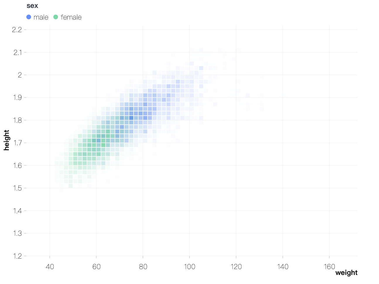
添加 rect 图形。rect 是用于绘制矩形标记的核心图表元素,它通过定义矩形的起点、终点、宽度、高度以及其他图形属性(如颜色、样式),实现不同的可视化需求。
import { Chart } from '@antv/g2';

const chart = new Chart({
  container: 'container',
});

chart.options({
  type: 'rect',
  data: {
    type: 'fetch',
    value: 'data/athletes.csv',
  },
  encode: { x: 'weight', y: 'height', color: 'sex' },
  transform: [{ type: 'bin', opacity: 'count' }],
  style: { inset: 0.5 },
});

chart.render();
view.point()
添加 point 图形。point 图形标记主要用于绘制 散点图,又名点图、散布图。散点图是将所有的数据以点的形式展现在平面直角坐标系上的统计图表。

import { Chart } from '@antv/g2';

const chart = new Chart({
  container: 'container',
});

chart.options({
  type: 'point',
  data: {
    type: 'fetch',
    value: 'https://gw.alipayobjects.com/os/antvdemo/assets/data/bubble.json',
  },
  encode: { x: 'GDP', y: 'LifeExpectancy', size: 'Population', color: 'continent', shape: 'point' },
  scale: { size: { type: 'log', range: [4, 20] } },
  style: { fillOpacity: 0.3, lineWidth: 1 },
});

chart.render();
view.area()
添加 area 图形。area 图形标记大部分场景用来绘制我们常见的面积图,是一种随有序变量的变化,反映数值变化的图形。

import { Chart } from '@antv/g2';

const chart = new Chart({
  container: 'container',
});

chart.options({
  type: 'area',
  data: {
    type: 'fetch',
    value: 'https://assets.antv.antgroup.com/g2/aapl.json',
    transform: [
      {
        type: 'map',
        callback: (d) => ({
          ...d,
          date: new Date(d.date),
        }),
      },
    ],
  },
  encode: { x: 'date', y: 'close' },
});

chart.render();
view.line()
添加 line 图形。line 图形标记根据一系列的点,绘制折线,显示数据在一个具有顺序性的维度上的变化。通常用来绘制折线图,是最常用的 Mark 之一。

import { Chart } from '@antv/g2';

const chart = new Chart({
  container: 'container',
});

chart.options({
  type: 'line',
  data: {
    type: 'fetch',
    value:
      'https://gw.alipayobjects.com/os/bmw-prod/551d80c6-a6be-4f3c-a82a-abd739e12977.csv',
  },
  encode: { x: 'date', y: 'close' },
});

chart.render();
view.vector()
添加 vector 图形。Vector 图形是将数据映射成为箭头的样式去可视化展示,通过控制箭头的位置、大小、颜色、角度等信息,去可视化一些向量场数据。

import { Chart } from '@antv/g2';

const chart = new Chart({
  container: 'container',
});

chart.options({
  type: 'vector',
  data: {
    type: 'fetch',
    value: 'https://gw.alipayobjects.com/os/antfincdn/F5VcgnqRku/wind.json',
  },
  encode: {
    x: 'longitude',
    y: 'latitude',
    rotate: ({ u, v }) => (Math.atan2(v, u) * 180) / Math.PI,
    size: ({ u, v }) => Math.hypot(v, u),
    color: ({ u, v }) => Math.hypot(v, u),
  },
  scale: { size: { range: [6, 20] }, color: { type: 'sequential', palette: 'viridis' } },
  axis: { x: { grid: false }, y: { grid: false } },
  legend: false,
});

chart.render();
view.link()
添加 link 图形。link 图形标记 虽然类似折线图 通过指定 x,y 通道为长度为 2 的字段数组。获取两两对应的 (x,y) 的定位点,并连接对应的定位点,绘制带方向的线段(添加箭头)。

import { Chart } from '@antv/g2';

const chart = new Chart({
  container: 'container',
});

chart.options({
  type: 'link',
  data: {
    type: 'fetch',
    value: 'https://gw.alipayobjects.com/os/antfincdn/SM13%24lHuYH/metros.json',
  },
  encode: { x: ['POP_1980', 'POP_2015'], y: ['R90_10_1980', 'R90_10_2015'], color: (d) => d.R90_10_2015 - d.R90_10_1980 },
  scale: { x: { type: 'log' } },
  style: { arrowSize: 6 },
  axis: { x: { labelFormatter: '~s', label: { autoHide: true } } },
  legend: false,
});

chart.render();
view.polygon()
添加 polygon 图形。polygon 图形标记(多边形),利用一组 (x, y) 数据点,来连接形成一个闭合的图形,一般都是结合社区上的可视化布局算法计算之后的数据进行可视化展示。

import { Chart } from '@antv/g2';
import * as d3 from 'd3-voronoi';

const layout = (data) => {
  return d3
    .voronoi()
    .x((d) => d.x)
    .y((d) => d.y)
    .extent([
      [0, 0],
      [800, 600],
    ])
    .polygons(data)
    .map((p) =>
      Object.assign({}, p, {
        x: p.map((pi) => pi[0]),
        y: p.map((pi) => pi[1]),
      }),
    );
};

const chart = new Chart({
  container: 'container',
  paddingLeft: 0,
  paddingRight: 0,
  paddingTop: 0,
  paddingBottom: 0,
});

chart.options({
  type: 'polygon',
  data: {
    type: 'fetch',
    value: 'https://gw.alipayobjects.com/os/antvdemo/assets/data/voronoi.json',
    transform: [
      {
        type: 'custom',
        callback: layout,
      },
    ],
  },
  encode: { x: 'x', y: 'y', color: (d) => d.data.value },
  scale: { x: { domain: [0, 800] }, y: { domain: [0, 600] } },
  axis: false,
  style: { stroke: '#fff', fillOpacity: 0.65 },
});

chart.render();
view.image()
添加 image 图形。image 图片标记通常不会单独出现,主要在其他的标记基础上进行添加使用,可以增强数据的可视化效果,帮助更直观地传达信息。

import { Chart } from '@antv/g2';

const data = [
  {
    name: 'Internet Explorer',
    value: 26,
    url: 'https://gw.alipayobjects.com/zos/rmsportal/eOYRaLPOmkieVvjyjTzM.png',
  },
  {
    name: 'Chrome',
    value: 40,
    url: 'https://gw.alipayobjects.com/zos/rmsportal/dWJWRLWfpOEbwCyxmZwu.png',
  },
  {
    name: 'Firefox',
    value: 30,
    url: 'https://gw.alipayobjects.com/zos/rmsportal/ZEPeDluKmAoTioCABBTc.png',
  },
  {
    name: 'Safari',
    value: 24,
    url: 'https://gw.alipayobjects.com/zos/rmsportal/eZYhlLzqWLAYwOHQAXmc.png',
  },
  {
    name: 'Opera',
    value: 15,
    url: 'https://gw.alipayobjects.com/zos/rmsportal/vXiGOWCGZNKuVVpVYQAw.png',
  },
  {
    name: 'Undetectable',
    value: 8,
    url: 'https://gw.alipayobjects.com/zos/rmsportal/NjApYXminrnhBgOXyuaK.png',
  },
];

const chart = new Chart({
  container: 'container',
});

chart.options({
  type: 'view',
  data,
  children: [
    {
      type: 'link',
      encode: { x: ['name', 'name'], y: (d) => [0, d.value] },
      style: { stroke: '#dfdfdf', lineDash: [2, 2] },
    },
    {
      type: 'line',
      encode: { x: 'name', y: 'value', shape: 'smooth' },
      scale: { x: { type: 'band' }, y: { domain: [0, 50] } },
      style: { opacity: 0.5 },
    },
    {
      type: 'image',
      encode: { x: 'name', y: 'value', src: 'url' },
      scale: { x: { type: 'band' }, y: { domain: [0, 50] } },
    },
  ],
});

chart.render();
view.text()
添加 text 图形。text 是一种用于在图表中绘制文本标记的图形元素。它允许用户直接在图表上添加文字注释、标签或其他说明性内容,从而增强数据可视化的效果和可读性。

import { Chart } from '@antv/g2';

const chart = new Chart({
  container: 'container',
});

chart.options({
  type: 'view',
  data: {
    type: 'fetch',
    value:
      'https://gw.alipayobjects.com/os/bmw-prod/fb9db6b7-23a5-4c23-bbef-c54a55fee580.csv',
  },
  children: [
    {
      type: 'interval',
      encode: { x: 'letter', y: 'frequency' },
      axis: { y: { labelFormatter: '.0%' } },
    },
    {
      type: 'text',
      encode: { x: 'letter', y: 'frequency', text: 'frequency' },
      style: { fill: 'black', textAlign: 'center', dy: -5 },
    },
  ],
});

chart.render();
view.lineX()
添加 lineX 图形。lineX 图形标记用于绘制垂直于 x 轴的辅助线,常用于绘制平均值或其他聚合数据辅助线。

import { Chart } from '@antv/g2';

const chart = new Chart({
  container: 'container',
  paddingLeft: 50,
});

chart.data({
  type: 'fetch',
  value: 'https://assets.antv.antgroup.com/g2/movies.json',
  transform: [{
    type: 'filter',
    callback: (d) => d[IMDB Rating] > 0,
  }],
});

chart
  .rect()
  .transform({ type: 'binX', y: 'count', thresholds: 9 })
  .encode('x', 'IMDB Rating')
  .scale('y', { domainMax: 1000 })
  .style('inset', 1);

chart
  .lineX()
  .transform({ type: 'groupColor', y: 'mean' })
  .encode('x', 'IMDB Rating')
  .style('stroke', '#F4664A')
  .style('strokeOpacity', 1)
  .style('lineWidth', 5);

chart.render();
view.lineY()
添加 lineY 图形。lineY 图形标记用于绘制垂直于 y 轴的辅助线,常用于绘制平均值或其他聚合数据辅助线。

import { Chart } from '@antv/g2';

const chart = new Chart({
  container: 'container',
});

chart.data({
  type: 'fetch',
  value: 'https://assets.antv.antgroup.com/g2/seattle-weather.json',
});

chart
  .interval()
  .transform({ type: 'groupX', y: 'mean' })
  .encode('x', (d) => new Date(d.date).getUTCMonth())
  .encode('y', 'precipitation')
  .scale('y', { tickCount: 5, domainMax: 6 });

chart
  .lineY()
  .transform({ type: 'groupX', y: 'mean' })
  .encode('y', 'precipitation')
  .style('stroke', '#F4664A')
  .style('strokeOpacity', 1)
  .style('lineWidth', 2);

chart.render();
view.range()
添加 range 图形。range 是用来定义一个矩形区域的工具。这个矩形的位置和大小可以通过两组数字来确定:一组用于水平方向(x1, x2),另一组用于垂直方向(y1, y2)。它常用于绘制辅助背景区域或标记某个区域。

import { Chart } from '@antv/g2';

const chart = new Chart({ container: 'container' });

chart.data({
  type: 'fetch',
  value:
    'https://gw.alipayobjects.com/os/bmw-prod/0b37279d-1674-42b4-b285-29683747ad9a.json',
});

chart.options({
  type: 'view',
  children: [
    { type: 'lineX', data: [0] },
    { type: 'lineY', data: [0] },
    {
      type: 'range',
      data: [
        { x: [-25, 0], y: [-30, 0], region: '1' },
        { x: [-25, 0], y: [0, 20], region: '2' },
        { x: [0, 5], y: [-30, 0], region: '2' },
        { x: [0, 5], y: [0, 20], region: '1' },
      ],
      encode: { x: 'x', y: 'y', color: 'region' },
      scale: {
        color: { range: ['#d8d0c0', '#a3dda1'], independent: true, guide: null },
      },
      style: { fillOpacity: 0.2 },
    },
    {
      type: 'point',
      encode: {
        x: 'change in female rate',
        y: 'change in male rate',
        size: 'pop',
        color: 'continent',
        shape: 'point',
      },
      scale: {
        color: { range: ['#ffd500', '#82cab2', '#193442', '#d18768', '#7e827a'] },
        x: { domain: [-25, 5] },
        y: { domain: [-30, 20] },
        size: { range: [4, 30] },
      },
      axis: { x: { title: false }, y: { title: false } },
      style: { stroke: '#bbb', fillOpacity: 0.8 },
    },
  ],
});

chart.render();
view.rangeX()
添加 rangeX 图形。rangeX 使用一组 x(x1, x2) 来定位一个绘制于 x 轴的矩形区域,常用于对特定区域进行高亮显示。

import { Chart } from '@antv/g2';

const chart = new Chart({
  container: 'container',
  height: 360,
  paddingLeft: 60,
});

chart.data({
  type: 'fetch',
  value: 'https://assets.antv.antgroup.com/g2/year-population.json',
});

chart.options({
  type: 'view',
  children: [
    {
      type: 'rangeX',
      data: [
        { year: [new Date('1933'), new Date('1945')], event: 'Nazi Rule' },
        { year: [new Date('1948'), new Date('1989')], event: 'GDR (East Germany)' },
      ],
      encode: { x: 'year', color: 'event' },
      scale: { color: { independent: true, range: ['#FAAD14', '#30BF78'] } },
      style: { fillOpacity: 0.75 },
    },
    {
      type: 'line',
      encode: { x: (d) => new Date(d.year), y: 'population', color: '#333' },
    },
    {
      type: 'point',
      encode: { x: (d) => new Date(d.year), y: 'population', color: '#333' },
      style: { lineWidth: 1.5 },
    },
  ],
});

chart.render();
此外,rangeX 还提供了简便写法:
chart
  .rangeX()
  .data([[new Date('2010'), new Date('2011')]])
  .encode('x', (d) => d);

// it can be simplified as follows:
chart.rangeX().data([new Date('2010'), new Date('2011')]);
view.rangeY()
添加 rangeY 图形。rangeY 使用一组 y(y1, y2) 来定位一个绘制于 y 轴的矩形区域,常用于对特定区域进行高亮显示。

import { Chart } from '@antv/g2';

const chart = new Chart({
  container: 'container',
});

chart.options({
  type: 'view',
  children: [
    {
      type: 'point',
      data: {
        type: 'fetch',
        value:
          'https://gw.alipayobjects.com/os/basement_prod/6b4aa721-b039-49b9-99d8-540b3f87d339.json',
      },
      encode: { x: 'height', y: 'weight', color: 'gender' },
    },
    {
      type: 'rangeY',
      data: [{ y: [54, 72] }],
      encode: { y: 'y' },
    },
  ],
});

chart.render();
此外,rangeY 还提供了简便写法:
chart
  .rangeY()
  .data([
    [54, 60],
    [65, 72],
  ])
  .encode('y', (d) => d);

// it can be simplified as follows:
chart.rangeY().data([
  [54, 60],
  [65, 72],
]);
view.connector()
添加 connector 图形。connector 用于在两个元素之间绘制辅助连接线。

import { Chart } from '@antv/g2';

const chart = new Chart({
  container: 'container',
  autoFit: true,
  insetTop: 30,
});

chart
  .data([
    { x: 'Net Sales', value: 5085000, start: 0, end: 5085000 },
    { x: 'Cost of Sales', value: -1250450, start: 5085000, end: 3834550 },
    { x: 'Operating Expenses', value: -2350050, start: 3834550, end: 1484500 },
    { x: 'Other Income', value: 750000, start: 1484500, end: 2234500 },
    { x: 'Extraordinary Gain', value: -230050, start: 2234500, end: 2004450 },
    { x: 'Interest Expense', value: -500000, start: 2004450, end: 1504450 },
    { x: 'Taxis', value: 490000, start: 1504450, end: 1994450 },
    { x: 'Net Income', isTotal: true, value: 1994450, start: 0, end: 1994450 },
  ])
  .axis('x', { title: false, labelTransform: 'rotate(-90)' })
  .axis('y', { labelFormatter: '~s' })
  .legend(null);

chart
  .link()
  .data({ transform: [{ type: 'custom', callback: linkData }] })
  .encode('x', ['x1', 'x2'])
  .encode('y', 'value')
  .style('stroke', '#697474')
  .style('lineDash', [4, 2])
  .tooltip(false);

chart
  .connector()
  .data({ transform: [{ type: 'custom', callback: connectorData }] })
  .encode('x', ['x1', 'x2'])
  .encode('y', ['y1', 'y2'])
  .label({
    text: (d) => `${d.y2 - d.y1}`,
    formatter: '~s',
    fontSize: 10,
    dy: 2,
  })
  .style({ stroke: '#697474', offset: 16 })
  .tooltip(false);

chart
  .interval()
  .encode('x', 'x')
  .encode('y', ['start', 'end'])
  .encode('color', (d, idx) =>
    idx === 0 || d.isTotal ? 'D' : d.value > 0 ? 'P' : 'N',
  )
  .scale('color', {
    domain: ['P', 'N', 'D'],
    range: ['#64b5f6', '#ef6c00', '#96a6a6'],
  })
  .encode('size', 24)
  .style('stroke', '#697474')
  .label({
    text: 'value',
    formatter: '~s',
    position: (d) => (d.value > 0 ? 'top' : 'bottom'),
    textBaseline: (d) => (d.value > 0 ? 'bottom' : 'top'),
    fontSize: 10,
    dy: (d) => (d.value > 0 ? -4 : 4),
  })
  .tooltip({ channel: 'y', valueFormatter: '~s' })
  .tooltip({ channel: 'y1', valueFormatter: '~s' });

chart.render();

// Process data.
function linkData(data) {
  return data.reduce((r, d, idx) => {
    if (idx > 0) {
      return r.concat({
        x1: data[idx - 1].x,
        x2: d.x,
        value: d.isTotal ? d.end : d.start,
      });
    }
    return r;
  }, []);
}

function connectorData(data) {
  return [
    {
      x1: data[0].x,
      y1: data[0].end,
      x2: data[data.length - 1].x,
      y2: data[data.length - 1].end,
    },
  ];
}
view.sankey()
添加 sankey 图形。桑基图 (Sankey Diagram),是一种特定类型的流图,用于描述一组值到另一组值的流向。

import { Chart } from '@antv/g2';

const chart = new Chart({
  container: 'container',
  padding: 10,
});

chart
  .sankey()
  .data({
    type: 'fetch',
    value: 'https://assets.antv.antgroup.com/g2/energy.json',
    transform: [
      {
        type: 'custom',
        callback: (data) => ({ links: data }),
      },
    ],
  })
  .layout({
    nodeAlign: 'center',
    nodePadding: 0.03,
  })
  .scale('color', { range: schemeTableau10 })
  .style('labelSpacing', 3)
  .style('labelFontWeight', 'bold')
  .style('nodeStrokeWidth', 1.2)
  .style('linkFillOpacity', 0.4);

chart.render();
view.treemap()
添加 treemap 图形。矩形树图根据每个节点的关联值递归地将空间划分为矩形,适用于展示带权的树形数据。 矩形树图适合展现具有层级关系的数据,能够直观体现同级之间的比较。

import { Chart } from '@antv/g2';
import { schemeTableau10 } from 'd3-scale-chromatic';

const chart = new Chart({
  container: 'container',
});

chart
  .treemap()
  .data({
    type: 'fetch',
    value: 'https://assets.antv.antgroup.com/g2/flare-treemap.json',
  })
  .layout({
    path: (d) => d.name.replace(/\./g, '/'),
    tile: 'treemapBinary',
    paddingInner: 1,
  })
  .encode('value', 'size')
  .scale('color', { range: schemeTableau10 })
  .style(
    'labelText',
    (d) =>
      d.data.name
        .split('.')
        .pop()
        .split(/(?=[A-Z][a-z])/g)[0],
  )
  .style('labelFill', '#000')
  .style('labelPosition', 'top-left')
  .style('fillOpacity', 0.5);

chart.render();
view.box()
添加 box 图形。box 图形是用来绘制箱线图(boxplot)又叫盒须图、盒式图,通常用来展示一组数据分布情况的统计图,一般包括几种数据:最小值、下四分位数、中位数、上四分位数、最大值,另外可以结合 point mark 绘制异常点数据。

import { Chart } from '@antv/g2';

const data = [
  { x: 'Oceania', y: [1, 9, 16, 22, 24] },
  { x: 'East Europe', y: [1, 5, 8, 12, 16] },
  { x: 'Australia', y: [1, 8, 12, 19, 26] },
  { x: 'South America', y: [2, 8, 12, 21, 28] },
  { x: 'North Africa', y: [1, 8, 14, 18, 24] },
  { x: 'North America', y: [3, 10, 17, 28, 30] },
  { x: 'West Europe', y: [1, 7, 10, 17, 22] },
  { x: 'West Africa', y: [1, 6, 8, 13, 16] },
];

const chart = new Chart({
  container: 'container',
});

chart
  .box()
  .data(data)
  .encode('x', 'x')
  .encode('y', 'y')
  .encode('color', 'x')
  .scale('x', { paddingInner: 0.6, paddingOuter: 0.3 })
  .scale('y', { zero: true })
  .legend(false)
  .style('stroke', 'black');

chart.render();
view.boxplot()
添加 boxplot 图形。boxplot 和 box 非常相似,都是用来绘制箱线图,不同点在于:boxplot 是高阶 mark,自带数据分组和数据统计聚合,box 是原子 mark,需要开发者手动指定 5 个点的数据。所以 boxplot 更适合用于前端数据的探索和分析过程,而 box 更适用于后端对超大数据进行计算和统计之后,可视化展示。

import { Chart } from '@antv/g2';

const chart = new Chart({
  container: 'container',
  paddingLeft: 60,
  inset: 6,
});

chart
  .boxplot()
  .data({
    type: 'fetch',
    value: 'https://assets.antv.antgroup.com/g2/morley.json',
  })
  .encode('x', 'Expt')
  .encode('y', 'Speed');

chart.render();
view.density()
添加 density 图形。density 是一种用于可视化连续变量分布概率密度的图表类型,通过核密度估计(Kernel Density Estimation, KDE) 将离散数据点转化为平滑的连续概率密度曲线,直观反映数据的集中趋势、分布形态及异常值。

import { Chart } from '@antv/g2';

const chart = new Chart({
  container: 'container',
  autoFit: true,
});

chart.data({
  type: 'fetch',
  value: 'https://assets.antv.antgroup.com/g2/species.json',
  transform: [
    {
      type: 'kde',
      field: 'y',
      groupBy: ['x'],
      size: 20,
    },
  ],
});

chart
  .density()
  .encode('x', 'x')
  .encode('y', 'y')
  .encode('color', 'x')
  .encode('size', 'size')
  .tooltip(false);

chart.render();
view.heatmap()
添加 heatmap 图形。heatmap 又叫热力图,是一种通过颜色强度映射二维数据密度或数值大小的可视化图表,擅长揭示数据分布规律、聚类特征及异常点。

import { Chart } from '@antv/g2';

const chart = new Chart({
  container: 'container',
  autoFit: true,
  padding: 0,
});

chart.axis(false);

chart
  .image()
  .style(
    'src',
    'https://gw.alipayobjects.com/zos/rmsportal/NeUTMwKtPcPxIFNTWZOZ.png',
  )
  .style('x', '50%')
  .style('y', '50%')
  .style('width', '100%')
  .style('height', '100%')
  .tooltip(false);

chart
  .heatmap()
  .data({
    type: 'fetch',
    value: 'https://assets.antv.antgroup.com/g2/heatmap.json',
  })
  .encode('x', 'g')
  .encode('y', 'l')
  .encode('color', 'tmp')
  .style('opacity', 0)
  .tooltip(false);

chart.render();
view.shape()
添加 自定义 图形。shape 图形标记是 G2 中一种特殊的 Mark 类型,通常用来在图表上绘制静态的自定义图形,具有较高的灵活性和自由度,可以用于添加自定义注解、水印、徽章等场景,是实现图表个性化的重要工具。

上图中的「数据保密」的徽章图案就是使用 shape 绘制。在绘制图形时,可以从图表上下文中获取 document 对象,随后使用 document.createElement 创建基础图形。在下面的示例中我们创建了一个 Circle。
import { Chart } from '@antv/g2';

function point(style) {
  const { x, y, fill } = style;

  const {
    canvas: { document },
  } = chart.getContext();

  return document.createElement('circle', {
    style: {
      cx: x,
      cy: y,
      fill,
    },
  });
}

chart.options({
  type: 'shape',
  style: {
    x: '50%',
    y: '50%',
    fill: 'red',
    render: point,
  },
});

chart.render();
view.pack()
添加 pack 图形。打包图 (Circle Packing) 是树形结构图的变体,使用圆形(而非矩形)一层又一层地代表整个层次结构。常用于描述数据间的包含关系。

import { Chart } from '@antv/g2';
import { interpolateHcl } from 'd3-interpolate';

const chart = new Chart({
  container: 'container',
  padding: 20,
});

chart
  .pack()
  .data({
    type: 'fetch',
    value: 'https://assets.antv.antgroup.com/g2/flare.json',
  })
  .layout({
    padding: 5,
  })
  .encode('value', 'value')
  .encode('color', 'depth')
  .scale('color', {
    domain: [0, 5],
    range: ['hsl(152,80%,80%)', 'hsl(228,30%,40%)'],
    interpolate: interpolateHcl,
  })
  .style('labelText', (d) =>
    d.r >= 10 && d.height === 0 ? `${d.data.name}` : '',
  )
  .axis(false)
  .legend(false);

chart.render();
view.forceGraph()
添加 forceGraph 图形。力导布局图是一种用来呈现复杂关系网络的图表。在力导布局图中,系统中的每个节点都可以看成是一个放电粒子,粒子间存在某种斥力。同时,这些粒子间被它们之间的“边”所牵连,从而产生引力。

import { Chart } from '@antv/g2';
import { schemeTableau10 } from 'd3-scale-chromatic';

const chart = new Chart({
  container: 'container',
});

chart
  .forceGraph()
  .data({
    type: 'fetch',
    value: 'https://assets.antv.antgroup.com/g2/miserable.json',
  })
  .scale('color', { range: schemeTableau10 });

chart.render();
view.tree()
添加 tree 图形。树图 (Tree) 能将事物或现象分解成树枝状,又称树型图或系统图。在树形结构中,树根结点没有前驱结点,其余每个结点有且只有一个前驱结点。叶子结点没有后续结点,其余每个结点的后续节点数可以是一个也可以是多个。

import { Chart } from '@antv/g2';

const chart = new Chart({
  container: 'container',
  height: 1500,
  width: 800,
});

chart
  .tree()
  .coordinate({ transform: [{ type: 'transpose' }] })
  .data({
    type: 'fetch',
    value: 'https://assets.antv.antgroup.com/g2/flare.json',
  })
  .layout({
    sortBy: (a, b) => a.value - b.value,
  })
  .style('nodeFill', (d) => (d.height === 0 ? '#999' : '#000'))
  .style('linkStroke', '#999')
  .style('labelText', (d) => d.data.name || '-')
  .style('labelFontSize', (d) => (d.height === 0 ? 7 : 12))
  .style('labelTextAlign', (d) => (d.height === 0 ? 'start' : 'end'))
  .style('labelPosition', (d) => (d.height !== 0 ? 'left' : 'right'))
  .style('labelDx', (d) => (d.height === 0 ? 5 : -5))
  .style('labelBackground', true)
  .style('labelBackgroundFill', '#fff');

chart.render();
view.wordCloud()
添加 wordCloud 图形。wordCloud 是一种专门用于生成词云图的标记。词云图是一种直观展示文本数据中关键词频次的可视化形式,通过不同大小、颜色和位置的文字来反映词语的重要性或权重。

import { Chart } from '@antv/g2';

const chart = new Chart({
  container: 'container',
  padding: 0,
});

chart
  .wordCloud()
  .data({
    type: 'fetch',
    value: 'https://assets.antv.antgroup.com/g2/philosophy-word.json',
  })
  .layout({
    spiral: 'rectangular',
  })
  .encode('color', 'text')
  .axis(false);

chart.render();
view.gauge()
添加 gauge 图形。gauge 用于创建仪表盘,它是一种常见的可视化图表,用于展示数据的进度、比例或比较情况。

import { Chart } from '@antv/g2';

const chart = new Chart({
  container: 'container',
  autoFit: true,
});

chart
  .gauge()
  .data({
    value: {
      target: 120,
      total: 400,
      name: 'score',
    },
  })
  .legend(false);

chart.render();
view.geoPath()
添加 geoPath 图形。geoPath 可以用来结合 geojson 绘制地图。

import { Chart } from '@antv/g2';
import { feature } from 'topojson-client';

Promise.all([
  fetch('https://assets.antv.antgroup.com/g2/us-10m.json').then((res) =>
    res.json(),
  ),
  fetch('https://assets.antv.antgroup.com/g2/unemployment2.json').then((res) =>
    res.json(),
  ),
]).then((values) => {
  const [us, unemployment] = values;
  const counties = feature(us, us.objects.counties).features;

  const chart = new Chart({
    container: 'container',
  });

  chart
    .geoPath()
    .projection({ type: 'albersUsa' })
    .data({
      value: counties,
      transform: [
        {
          type: 'join',
          join: unemployment,
          on: ['id', 'id'],
          select: ['rate'],
        },
      ],
    })
    .scale('color', {
      type: 'sequential',
      palette: 'ylGnBu',
      unknown: '#fff',
    })
    .encode('color', 'rate');

  chart.render();
});
view.point3D()
添加 point3D 图形。point3D 主要用于绘制 3D 散点图,利用点的粒度来分析数据的分布情况。

import { CameraType } from '@antv/g';
import { Renderer as WebGLRenderer } from '@antv/g-webgl';
import { Plugin as ThreeDPlugin, DirectionalLight } from '@antv/g-plugin-3d';
import { Plugin as ControlPlugin } from '@antv/g-plugin-control';
import { Runtime, corelib, extend } from '@antv/g2';
import { threedlib } from '@antv/g2-extension-3d';

// Create a WebGL renderer.
const renderer = new WebGLRenderer();
renderer.registerPlugin(new ThreeDPlugin());
renderer.registerPlugin(new ControlPlugin());

// Customize our own Chart with threedlib.
const Chart = extend(Runtime, { ...corelib(), ...threedlib() });
const chart = new Chart({
  container: 'container',
  renderer,
  depth: 400, // Define the depth of chart.
});

chart
  .point3D()
  .data({
    type: 'fetch',
    value:
      'https://gw.alipayobjects.com/os/bmw-prod/2c813e2d-2276-40b9-a9af-cf0a0fb7e942.csv',
  })
  .encode('x', 'Horsepower')
  .encode('y', 'Miles_per_Gallon')
  .encode('z', 'Weight_in_lbs')
  .encode('color', 'Origin')
  .encode('shape', 'cube')
  .coordinate({ type: 'cartesian3D' })
  .scale('x', { nice: true })
  .scale('y', { nice: true })
  .scale('z', { nice: true })
  .legend(false)
  .axis('x', { gridLineWidth: 2 })
  .axis('y', { gridLineWidth: 2, titleBillboardRotation: -Math.PI / 2 })
  .axis('z', { gridLineWidth: 2 });

chart.render().then(() => {
  const { canvas } = chart.getContext();
  const camera = canvas.getCamera();
  camera.setType(CameraType.ORBITING);

  // Add a directional light into scene.
  const light = new DirectionalLight({
    style: {
      intensity: 3,
      fill: 'white',
      direction: [-1, 0, 1],
    },
  });
  canvas.appendChild(light);
});
view.line3D()
添加 line3D 图形。line3D 主要用于绘制 3D 折线图。

import { CameraType } from '@antv/g';
import { Renderer as WebGLRenderer } from '@antv/g-webgl';
import { Plugin as ThreeDPlugin } from '@antv/g-plugin-3d';
import { Plugin as ControlPlugin } from '@antv/g-plugin-control';
import { Runtime, corelib, extend } from '@antv/g2';
import { threedlib } from '@antv/g2-extension-3d';

// Create a WebGL renderer.
const renderer = new WebGLRenderer();
renderer.registerPlugin(new ThreeDPlugin());
renderer.registerPlugin(new ControlPlugin());

// Customize our own Chart with threedlib.
const Chart = extend(Runtime, { ...corelib(), ...threedlib() });
const chart = new Chart({
  container: 'container',
  renderer,
  depth: 400, // Define the depth of chart.
});

/**
 * 3D Line
 * @see https://plotly.com/javascript/3d-line-plots/
 */
const pointCount = 31;
let r;
const data = [];

for (let i = 0; i < pointCount; i++) {
  r = 10 * Math.cos(i / 10);
  data.push({
    x: r * Math.cos(i),
    y: r * Math.sin(i),
    z: i,
  });
}

chart
  .line3D()
  .data(data)
  .encode('x', 'x')
  .encode('y', 'y')
  .encode('z', 'z')
  .encode('size', 4)
  .coordinate({ type: 'cartesian3D' })
  .scale('x', { nice: true })
  .scale('y', { nice: true })
  .scale('z', { nice: true })
  .legend(false)
  .axis('x', { gridLineWidth: 2 })
  .axis('y', { gridLineWidth: 2, titleBillboardRotation: -Math.PI / 2 })
  .axis('z', { gridLineWidth: 2 });

chart.render().then(() => {
  const { canvas } = chart.getContext();
  const camera = canvas.getCamera();
  // Use perspective projection mode.
  camera.setPerspective(0.1, 5000, 45, 640 / 480);
  camera.setType(CameraType.ORBITING);
});
view.interval3D()
添加 interval3D 图形。interval3D 主要用于绘制 3D 条形图。

import { CameraType } from '@antv/g';
import { Renderer as WebGLRenderer } from '@antv/g-webgl';
import { Plugin as ThreeDPlugin, DirectionalLight } from '@antv/g-plugin-3d';
import { Plugin as ControlPlugin } from '@antv/g-plugin-control';
import { Runtime, corelib, extend } from '@antv/g2';
import { threedlib } from '@antv/g2-extension-3d';

// Create a WebGL renderer.
const renderer = new WebGLRenderer();
renderer.registerPlugin(new ThreeDPlugin());
renderer.registerPlugin(new ControlPlugin());

// Customize our own Chart with threedlib.
const Chart = extend(Runtime, { ...corelib(), ...threedlib() });
const chart = new Chart({
  container: 'container',
  renderer,
  depth: 400, // Define the depth of chart.
});
const data: { x: string; z: string; y: number; color: number }[] = [];
for (let x = 0; x < 5; ++x) {
  for (let z = 0; z < 5; ++z) {
    data.push({
      x: `x-${x}`,
      z: `z-${z}`,
      y: 10 - x - z,
      color: Math.random() < 0.33 ? 0 : Math.random() < 0.67 ? 1 : 2,
    });
  }
}

chart
  .interval3D()
  .data({
    type: 'inline',
    value: data,
  })
  .encode('x', 'x')
  .encode('y', 'y')
  .encode('z', 'z')
  .encode('color', 'color')
  .encode('shape', 'cube')
  .coordinate({ type: 'cartesian3D' })
  .scale('x', { nice: true })
  .scale('y', { nice: true })
  .scale('z', { nice: true })
  .legend(false)
  .axis('x', { gridLineWidth: 2 })
  .axis('y', { gridLineWidth: 2, titleBillboardRotation: -Math.PI / 2 })
  .axis('z', { gridLineWidth: 2 })
  .style('opacity', 0.7);

chart.render().then(() => {
  const { canvas } = chart.getContext();
  const camera = canvas.getCamera();
  // Use perspective projection mode.
  camera.setPerspective(0.1, 5000, 45, 640 / 480);
  camera.rotate(-40, 30, 0);
  camera.dolly(70);
  camera.setType(CameraType.ORBITING);

  // Add a directional light into scene.
  const light = new DirectionalLight({
    style: {
      intensity: 2.5,
      fill: 'white',
      direction: [-1, 0, 1],
    },
  });
  canvas.appendChild(light);
});
view.surface3D()
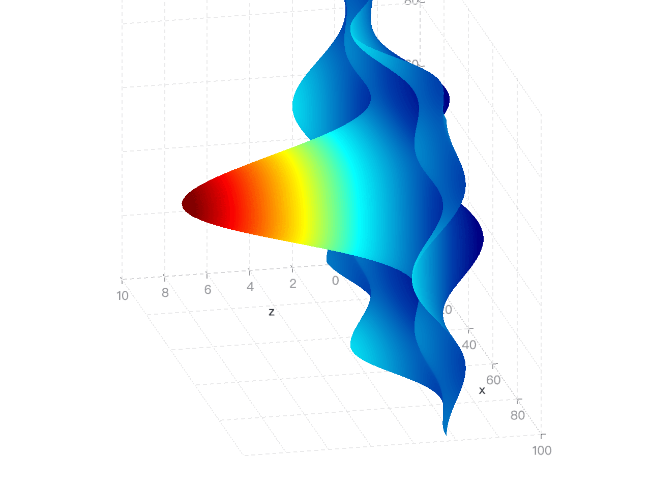
添加 surface3D 图形。surface3D 主要用于绘制 3D 曲面图。
import { CameraType } from '@antv/g';
import { Renderer as WebGLRenderer } from '@antv/g-webgl';
import { Plugin as ThreeDPlugin } from '@antv/g-plugin-3d';
import { Plugin as ControlPlugin } from '@antv/g-plugin-control';
import { Runtime, corelib, extend } from '@antv/g2';
import { threedlib } from '@antv/g2-extension-3d';
import diric from 'dirichlet';

// We set the width/height to 100;
const size = 100;
const points: { x: number; y: number; z: number }[] = [];
for (let i = 0; i < size + 1; i++) {
  for (let j = 0; j < size + 1; j++) {
    points.push({
      x: i,
      y: j,
      z:
        0.1 *
        size *
        diric(5, (5.0 * (i - size / 2)) / size) *
        diric(5, (5.0 * (j - size / 2)) / size),
    });
  }
}

// Create a WebGL renderer.
const renderer = new WebGLRenderer();
renderer.registerPlugin(new ThreeDPlugin());
renderer.registerPlugin(new ControlPlugin());

// Customize our own Chart with threedlib.
const Chart = extend(Runtime, { ...corelib(), ...threedlib() });
const chart = new Chart({
  container: 'container',
  renderer,
  width: 600,
  height: 600,
  depth: 300, // Define the depth of chart.
});

chart
  .surface3D()
  .data(points)
  .encode('x', 'x')
  .encode('y', 'y')
  .encode('z', 'z')
  .coordinate({ type: 'cartesian3D' })
  .scale('x', { nice: true })
  .scale('y', { nice: true })
  .scale('z', { nice: true })
  .legend(false)
  .axis('x', { gridLineWidth: 1 })
  .axis('y', { gridLineWidth: 1, titleBillboardRotation: -Math.PI / 2 })
  .axis('z', { gridLineWidth: 1 });

chart.render().then(() => {
  const { canvas } = chart.getContext();
  const camera = canvas.getCamera();
  // Use perspective projection mode.
  camera.setPerspective(0.1, 3000, 45, 600 / 600);
  camera.rotate(30, 30, 0);
  camera.dolly(60);
  camera.setType(CameraType.ORBITING);
});
设置属性
attr()
获取或设置图表的配置项。以下是支持配置的属性:
| 属性 | 描述 | 类型 |
|---|---|---|
| class | CSS 类名 | string |
| x | 横坐标位置,一般用于在复合视图中调整某个图的位置 | number |
| y | 纵坐标位置,一般用于在复合视图中调整某个图的位置 | number |
| width | 元素宽度 | number |
| height | 元素高度 | number |
| paddingLeft | 左内边距 | Padding |
| paddingRight | 右内边距 | Padding |
| paddingBottom | 下内边距 | Padding |
| paddingTop | 上内边距 | Padding |
| padding | 复合内边距 | Padding |
| inset | 整体呼吸区域宽度 | number |
| insetLeft | 左侧呼吸区域宽度 | number |
| insetBottom | 底部呼吸区域宽度 | number |
| insetTop | 顶部呼吸区域宽度 | number |
| insetRight | 右侧呼吸区域宽度 | number |
| margin | 复合外边距 | number |
| marginLeft | 左外边距 | number |
| marginBottom | 底外边距 | number |
| marginTop | 顶外边距 | number |
| marginRight | 右外边距 | number |
| frame | 是否显示边框 | boolean |
| zIndex | 层叠顺序 | number |
| clip | 是否裁剪溢出内容 | boolean |
// 获取配置项
const point = chart.point();
console.log(point.attr());

// 设置配置项
point.attr('padding', 0);
data()
设置图形的数据,支持多种数据来源和数据变换,具体见 data。
chart.data({
  type: 'fetch',
  value: 'https://assets.antv.antgroup.com/g2/athletes.json',
});

chart.interval().data([
  { genre: 'Sports', sold: 275 },
  { genre: 'Strategy', sold: 115 },
  { genre: 'Action', sold: 120 },
  { genre: 'Shooter', sold: 350 },
  { genre: 'Other', sold: 150 },
]);
encode()
设置图形每个通道的编码,具体见 encode。
chart
  .interval()
  .encode('x', 'civilization')
  .encode('y', ['start', 'end'])
  .encode('color', 'region');

chart.facetCircle().encode('position', 'month');

chart.encode('x', 'year').encode('y', 'value');
scale()
设置图形每个通道的比例尺,具体见 scale。
chart.scale('color', { type: 'ordinal', range: ['#ca8861', '#675193'] });

chart.line().scale('y', {
  domain: [0, 1],
});
legend()
设置图形的图例,具体见 legend。
// 关闭 color 通道图例
chart.legend('color', false);

chart
  .interval()
  .legend('color', { labelFormatter: (d) => (d === 1 ? 'Male' : 'Female') });
tooltip()
设置图形的提示,具体见 tooltip。
chart.interval().tooltip({ channel: 'y', valueFormatter: '.0%' });

// 关闭 link 标记的 tooltip
chart.link().tooltip(false);
axis()
设置图形的坐标轴,具体见 axis。
chart
  .interval()
  .axis('y', { labelFormatter: '~s' })
  .axis('x', { labelTransform: 'rotate(90)' });

chart.axis('y', { title: false });
slider()
设置图形的缩略轴,具体见 slider。
chart
  .point()
  .slider('x', { labelFormatter: (d) => d.toFixed(1) })
  .slider('y', { labelFormatter: (d) => d.toFixed(1) });

chart.slider('y', true).slider('x', true);
label()
设置图形的标签,具体见 label。
chart
  .interval()
  .label({
    text: (d, i) => (i !== 0 ? '转换率' : ''),
    position: 'top-right',
    textAlign: 'left',
    textBaseline: 'middle',
    fill: '#aaa',
    dx: 60,
  })
  .label({
    text: (d, i, data) =>
      i !== 0 ? r(data[i - 1]['value'], data[i]['value']) : '',
    position: 'top-right',
    textAlign: 'left',
    textBaseline: 'middle',
    dx: 60,
    dy: 15,
  });

chart.interval().label({
  text: 'id',
  position: 'spider',
  connectorDistance: 0,
  fontWeight: 'bold',
  textBaseline: 'bottom',
  textAlign: (d) => (['c', 'sass'].includes(d.id) ? 'end' : 'start'),
  dy: -4,
});
labelTransform()
设置图形的标签转换,具体见 label。
chart
  .labelTransform({ type: 'overlapHide' })
  .labelTransform({ type: 'contrastReverse' });

chart.labelTransform([{ type: 'overlapHide' }, { type: 'contrastReverse' }]);
style()
设置图形的样式,具体见 style。
chart.rect().style('inset', 0.5);

chart.liquid().data(0.3).style({
  outlineBorder: 4,
  outlineDistance: 8,
  waveLength: 128,
});
viewStyle()
设置视图模型的样式,具体见 图表布局。
facetRect
  .point()
  .attr('inset', 10)
  .encode('x', 'x')
  .encode('y', 'y')
  .style('stroke', '#000')
  .attr('frame', false) // Hide the default frame.
  .viewStyle('plotStroke', 'red') // Customize the plot area to mock a frame.
  .viewStyle('plotLineWidth', 2)
  .viewStyle('plotOpacity', 0.5);
theme()
设置图形的主题,具体见 theme。
chart.theme({ type: 'academy' });

chart.theme({
  type: 'classicDark',
  view: {
    viewFill: '#141414',
  },
}); // Apply dark theme.
interaction()
设置图形的交互,具体见 theme。
// 禁用 legendFilter 交互
chart.interaction('legendFilter', false);

chart.line().interaction('tooltip', {
  render: (event, { items }) => {
    const target = event.target;
    const format = (item) => `${item.name}: ${item.value}`;
    if (target.className === 'g2-tooltip-marker') {
      const color = target.style.fill;
      const item = items.find((i) => i.color === color);
      return format(item);
    }
    return items.map(format).join('<br>');
  },
});
animate()
设置图形的动画,具体见 animation。
chart
  .interval()
  .animate('enter', { type: 'fadeIn', duration: 1000 })
  .animate('exit', { type: 'fadeOut', duration: 2000 });

// 禁用动画
chart.animate(false);
scrollbar()
设置图形的滚动条,具体见 scrollbar。
chart.line().scrollbar('x', {}).scrollbar('y', { value: 0.2 });title()
设置图形的标题,具体见 title。
chart.title({
  align: 'right',
  title: 'Sold by genre, sorted by sold',
  titleFontSize: 15,
  subtitle: 'It shows the sales volume of genre, sored by sold.',
  subtitleFill: 'red',
  subtitleFontSize: 12,
  subtitleShadowColor: 'yellow',
  subtitleShadowBlur: 5,
  subtitleFontStyle: 'italic',
});

chart.title('Pareto Chart of Customer Complaints');
state()
设置图形的状态样式,具体见 state。
chart
  .interval()
  .state('selected', { fill: '#1783FF', stroke: 'black', strokeWidth: 1 })
  .state('unselected', { fill: '#ccc' });

chart.sunburst().state({
  active: { zIndex: 2, stroke: 'red' },
  inactive: { zIndex: 1, stroke: '#fff' },
});
transform()
设置图形的转换,具体见 transform。
chart
  .interval()
  .data({
    type: 'fetch',
    value: 'https://assets.antv.antgroup.com/g2/world-history.json',
  })
  .transform({ type: 'sortX', by: 'y' })
  .transform({ type: 'sortColor', by: 'y', reducer: 'min' });

chart.area().transform([{ type: 'stackY' }, { type: 'normalizeY' }]);
渲染图表
chart.render()
调用图表的渲染方法。
render(): void;chart.destroy()
销毁图表容器和 Canvas 画布,同时解绑事件。
destroy(): void;chart.clear()
清空图表上所有的绘制内容,但是不销毁图表,chart 仍可使用。
clear(): void;chart.show()
显示当前节点渲染的图形。
show(): void;chart.hide()
隐藏当前节点渲染的图形。
hide(): void;chart.changeData()
更改图形的数据来源并重新渲染整个图表。
changeData(data: any): void;chart.changeSize()
改变图表的宽高,并重新渲染。
changeSize(width: number, height: number): void;chart.forceFit()
自动根据外部 DOM 容器大小调整画布并重新渲染。
forceFit(): void;mark.changeData()
更改图形的数据来源并重新渲染整个图表。
changeData(data: any): void;获取实例
chart.getContainer()
获取图表的 HTML 容器。
getContainer(): HTMLElement;chart.getContext()
返回 chart 的 context 信息。
getContext(): G2Context;可以通过 getContext() 获取图表的 document,添加定制化的交互。
chart.on('afterrender', () => {
  const { canvas } = chart.getContext();
  const { document } = canvas;
  // https://github.com/antvis/G2/blob/v5/src/interaction/legendFilter.ts
  const items = document.getElementsByClassName('items-item');
  const datum = items.map((item) => item.__data__);
  items.forEach((item, index) => {
    item.addEventListener('click', (ev) => {
      console.log(datum[index]);
    });
  });
});
chart.getDataByXY(point, options)
返回对应坐标点的 tooltip 数据。
使用示例:
chart.getDataByXY({x: 200, y: 100}, { shared: true })参数配置:
type Point = {
  x: number;
  y: number;
}

type Options = {
  /**
   * 相同 x 的元素是否共享 tooltip
   * @default false
  */
  shared?: boolean;
}
chart.getView()
返回 chart 渲染时的 view 实例。
getView(): G2ViewDescriptor;chart.getCoordinate()
返回 chart 渲染时的 coordinate 实例。
getCoordinate(): Coordinate;chart.getTheme()
返回 chart 渲染时的 theme 实例。
getTheme(): G2Theme;chart.getGroup()
返回 chart 渲染时的 canvas group 实例。
getGroup(): DisplayObject;chart.getScale()
返回 chart 渲染时所有的 scale 实例。
getScale(): Record<string, Scale>;chart.getScaleByChannel()
通过通道名称查找返回 chart 渲染时对应的 scale 实例。
getScaleByChannel(channel: string): Scale;view.getView()
返回 view 渲染时的 view 实例。
getView(): G2ViewDescriptor;view.getCoordinate()
返回 view 渲染时的 coordinate 实例。
getCoordinate(): Coordinate;view.getTheme()
返回 view 渲染时的 theme 实例。
getTheme(): G2Theme;view.getGroup()
返回 view 渲染时的 canvas group 实例。
getGroup(): DisplayObject;view.getScale()
返回 view 渲染时所有的 scale 实例。
getScale(): Record<string, Scale>;view.getScaleByChannel()
通过通道名称查找返回 view 渲染时对应的 scale 实例。
getScaleByChannel(channel: string): Scale;mark.getGroup()
返回 mark 渲染时的 canvas group 实例。
getGroup(): DisplayObject;mark.getScale()
返回 mark 渲染时所有的 scale 实例。
getScale(): Record<string, Scale>;mark.getScaleByChannel()
通过通道名称查找返回 mark 渲染时对应的 scale 实例。
getScaleByChannel(channel: string): Scale;节点操作
所有继承自 Node 类型的节点都可以应用节点操作的相关方法,例如 getNodeByKey() 方法的返回值。
node.getNodesByType()
通过 type 查找所有的 node 子节点。
getNodesByType(type: string): Node[];以下是找到第一个 rect 图形的示例:
chart.getNodesByType('rect')[0].changeData(data);node.getNodeByKey()
通过 key 找到当前 node 的子节点。
getNodeByKey(key: string): Node;node.append()
创建一个新的 Node 并添加在 chart 的子节点上。
append(Ctor: new (value: Record<string, any>) => Node<ChildValue, Value>): Node<ChildValue, Value>;node.remove()
从父节点上移除当前节点。
remove(): Node;node.call()
将指定的回调函数应用于节点值。
call(callback: (node: this, ...params: any[]) => any, ...params: any[]): this;监听和触发事件
chart.on()
监听 chart 上的事件。
on(event: string, callback: (...args: any[]) => any, once?: boolean): this;生命周期事件
| 事件 | 描述 |
|---|---|
beforerender |
图表渲染前执行该事件 |
afterrender |
图表渲染后执行该事件 |
beforepaint |
图表布局计算后,绘制前执行该事件 |
afterpaint |
图表绘制后执行该事件 |
beforechangedata |
图表更新数据前执行该事件 |
afterchangedata |
图表更新数据后执行该事件 |
beforechangesize |
图表更新尺寸前执行该事件 |
afterchangesize |
图表更新尺寸后执行该事件 |
beforedestroy |
图表销毁前执行该事件 |
afterdestroy |
图表销毁后执行该事件 |
通过 chart.on() 来申明生命周期事件。例如:
chart.on('afterrender', (e) => {
  console.log('Chart has been rendered!');
});
chart.once()
监听 chart 上的事件,仅触发一次。
once(event: string, callback: (...args: any[]) => any): this;chart.emit()
触发 chart 上的事件。
emit(event: string, ...args: any[]): this;chart.off()
卸载 chart 上的监听事件。
off(event?: string, callback?: (...args: any[]) => any): void;关于 G2 中 事件的详细介绍见 事件。
自定义拓展
extend()
引入拓展的图表库。
extend(Runtime: new (options: RuntimeOptions) => Runtime<Spec>, library: Library): Chart;当前为了 G2 整体包大小,部分拓展类图表没有放在主包里,在 G2 中可以通过 extend 引入拓展图表库和 3d 图表库,实现更多的图表功能。
import { plotlib } from '@antv/g2-extension-plot';
import { Runtime, corelib, extend } from '@antv/g2';

const Chart = extend(Runtime, { ...corelib(), ...plotlib() });

const chart = new Chart({
  container: 'container',
  autoFit: true,
});

chart
  .sunburst()
  .data({
    type: 'fetch',
    value: 'https://gw.alipayobjects.com/os/antvdemo/assets/data/sunburst.json',
  })
  .encode('value', 'sum')
  .encode('color', 'label');

chart.render();
import { CameraType } from '@antv/g';
import { Renderer as WebGLRenderer } from '@antv/g-webgl';
import { Plugin as ThreeDPlugin, DirectionalLight } from '@antv/g-plugin-3d';
import { Plugin as ControlPlugin } from '@antv/g-plugin-control';
import { Runtime, corelib, extend } from '@antv/g2';
import { threedlib } from '@antv/g2-extension-3d';
// Create a WebGL renderer.
const renderer = new WebGLRenderer();
renderer.registerPlugin(new ThreeDPlugin());
renderer.registerPlugin(new ControlPlugin());
// Customize our own Chart with threedlib.
const Chart = extend(Runtime, { ...corelib(), ...threedlib() });
const chart = new Chart({
container: 'container',
renderer,
depth: 400, // Define the depth of chart.
});
chart
.point3D()
.data({
type: 'fetch',
value:
'https://gw.alipayobjects.com/os/bmw-prod/2c813e2d-2276-40b9-a9af-cf0a0fb7e942.csv',
})
.encode('x', 'Horsepower')
.encode('y', 'Miles_per_Gallon')
.encode('z', 'Weight_in_lbs')
.encode('color', 'Origin')
.encode('size', 'Cylinders')
.encode('shape', 'sphere')
.coordinate({ type: 'cartesian3D' })
.scale('x', { nice: true })
.scale('y', { nice: true })
.scale('z', { nice: true })
.legend(false)
.axis('x', { gridLineWidth: 2 })
.axis('y', { gridLineWidth: 2, titleBillboardRotation: -Math.PI / 2 })
.axis('z', { gridLineWidth: 2 });
chart.render().then(() => {
const { canvas } = chart.getContext();
const camera = canvas.getCamera();
camera.setPerspective(0.1, 5000, 45, 640 / 480);
camera.setType(CameraType.ORBITING);
// Add a directional light into scene.
const light = new DirectionalLight({
style: {
intensity: 3,
fill: 'white',
direction: [-1, 0, 1],
},
});
canvas.appendChild(light);
});register()
引入拓展的图表库。
register(key: `${G2ComponentNamespaces | 'symbol'}.${any}`, component: G2Component | SymbolFactor): void;G2 有很强的扩展性:几乎所有的可视化组件都可以通过自定义的,前提是先通过 register 对可视化组件进行注册。
下面的例子展示了如何自定义一个图例项图标:
import { Chart, register, type SymbolFactor } from '@antv/g2';

const customSquare = Object.assign<SymbolFactor, Partial<SymbolFactor>>(
  (x, y, r) => {
    const radius = r / 2;

    return [
      ['M', x + radius, y - r],
      ['L', x - radius, y - r],
      ['A', radius, radius, 0, 0, 0, x - r, y - radius],
      ['L', x - r, y + radius],
      ['A', radius, radius, 0, 0, 0, x - radius, y + r],
      ['L', x + radius, y + r],
      ['A', radius, radius, 0, 0, 0, x + r, y + radius],
      ['L', x + r, y - radius],
      ['A', radius, radius, 0, 0, 0, x + radius, y - r],
      ['Z'],
    ];
  },
  {
    // 空心请设置为 ['stroke', 'lineWidth']
    style: ['fill'],
  },
);

register('symbol.customSquare', customSquare);

const chart = new Chart({
  container: 'container',
});

const data = [
  { genre: 'Sports', sold: 275 },
  { genre: 'Strategy', sold: 115 },
  { genre: 'Action', sold: 120 },
  { genre: 'Shooter', sold: 350 },
  { genre: 'Other', sold: 150 },
];

const colorField = 'genre';

chart
  .interval()
  .data(data)
  .encode('x', 'genre')
  .encode('y', 'sold')
  .encode('color', colorField)
  .legend({
    color: {
      itemMarker: 'customSquare',
    },
  });

chart.render();
也可以自定义独特的条形图形状:
import { Chart, register } from '@antv/g2';

register('shape.interval.column25d', myColumn);

const data = [
  { year: '1951 年', sales: 38 },
  { year: '1952 年', sales: 52 },
  { year: '1956 年', sales: 61 },
  { year: '1957 年', sales: 145 },
  { year: '1958 年', sales: 48 },
  { year: '1959 年', sales: 38 },
  { year: '1960 年', sales: 38 },
  { year: '1962 年', sales: 38 },
  { year: '1963 年', sales: 65 },
  { year: '1964 年', sales: 122 },
  { year: '1967 年', sales: 132 },
  { year: '1968 年', sales: 144 },
];

const chart = new Chart({
  container: 'container',
  autoFit: true,
});

chart.data(data);

chart
  .interval()
  .encode('x', 'year')
  .encode('y', 'sales')
  .style('shape', 'column25d')
  .scale('x', { padding: 0.3 });

chart.legend('year', {
  width: 10,
});

chart.render();

/**
 * Draw 2.5d column shape.
 */
function myColumn({ fill, stroke }, context) {
  return (points) => {
    const x3 = points[1][0] - points[0][0];
    const x4 = x3 / 2 + points[0][0];
    const { document } = context;
    const g = document.createElement('g', {});

    const r = document.createElement('polygon', {
      style: {
        points: [
          [points[0][0], points[0][1]],
          [x4, points[1][1] + 8],
          [x4, points[3][1] + 8],
          [points[3][0], points[3][1]],
        ],
        fill: 'rgba(114, 177, 207, 0.5)',
        stroke: 'rgba(0,0,0,0.1)',
        strokeOpacity: 0.1,
        inset: 30,
      },
    });

    const p = document.createElement('polygon', {
      style: {
        points: [
          [x4, points[1][1] + 8],
          [points[1][0], points[1][1]],
          [points[2][0], points[2][1]],
          [x4, points[2][1] + 8],
        ],
        fill: 'rgba(126, 212, 236, 0.5)',
        stroke: 'rgba(0,0,0,0.3)',
        strokeOpacity: 0.1,
      },
    });

    const t = document.createElement('polygon', {
      style: {
        points: [
          [points[0][0], points[0][1]],
          [x4, points[1][1] - 8],
          [points[1][0], points[1][1]],
          [x4, points[1][1] + 8],
        ],
        fill: 'rgba(173, 240, 255, 0.65)',
      },
    });

    g.appendChild(r);
    g.appendChild(p);
    g.appendChild(t);

    return g;
  };
}