
Encode
Previous
sortBy
Next
Overview
Loading...
The core content of data visualization is visual encoding, which is the technology of mapping data information into visual elements. Just like data contains attributes and values, visual encoding also consists of two parts: Marks and Visual Channels.
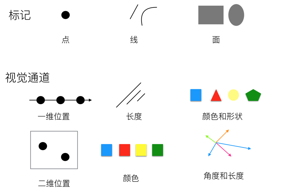
Visual channels can also be called chart attributes. The mapping relationship between raw data and visual channels enables us to quickly obtain information. So we can think of charts as a combination of graphic marks that carry some information, which we call encoded information. When people read information from these symbols, we call it decoding information.
Human recognition of visual channels has two basic perception modes. The first perception mode obtains information about the characteristics and positions of objects themselves, corresponding to the qualitative and categorical properties of visual channels; the second perception mode obtains information about the numerical magnitude of a certain attribute of objects, corresponding to the quantitative or ordinal properties of visual channels. Therefore, we divide visual channels into two major categories:
However, the two categories are not absolute. For example, position information can both distinguish different categories and differentiate continuous data.
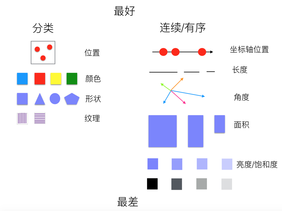
When performing visual encoding, we need to consider the expressiveness and effectiveness of different visual channels, mainly reflected in the following aspects:
The following is a diagram showing the expressiveness of visual channels from best to worst:
Corresponding to visual channels in visual encoding, visual channels in G2 can be divided into the following five graphic attributes:

| Visual Channel | Description |
|---|---|
| x | Defines the position of elements in the horizontal direction |
| y | Defines the position of elements in the vertical direction |
| z | Defines the depth position of elements in three-dimensional space |
| x1 | Defines the end position of elements in the horizontal direction |
| y1 | Defines the end position of elements in the vertical direction; stacked bar charts internally calculate y1 channel values |
| series | Distinguishes different data series through spatial position |
| position | Custom composite chart display position, used for parallel coordinates and circular facet charts, etc. |
| position${number} | Custom composite chart display position, used for parallel coordinates and circular facet charts, etc. |


| Visual Channel | Description |
|---|---|
| color | Maps data categorical attributes through hue |
| opacity | Controls element transparency, commonly used to highlight focus or express numerical intensity (such as gradient transparency in heatmaps) |

| Visual Channel | Description |
|---|---|
| shape | Distinguishes data categories through geometric forms, suitable for categorical data encoding |

| Visual Channel | Description |
|---|---|
| size | Controls element physical dimensions (point radius/line width/bar width), suitable for encoding quantitative data |

| Visual Channel | Description |
|---|---|
| key | Unique identifier for animation elements, used for data updates |
| groupKey | Animation group identifier, used for data updates |
| enterType | Animation type for element entry into scene (such as scale/fade in) |
| enterEasing | Easing function for enter animation |
| enterDuration | Duration of enter animation |
| enterDelay | Delay time for enter animation |
| updateType | Transition animation type for data updates |
| updateEasing | Easing function for update animation |
| updateDuration | Duration of update animation |
| updateDelay | Delay time for update animation |
| exitType | Animation type for element exit from scene (such as slide out) |
| exitEasing | Easing function for exit animation |
| exitDuration | Duration of exit animation |
| exitDelay | Delay time for exit animation |
To control the style of marks, we often bind a column of data to one of its visual channels.
Here is a set of event planning timeline data:
table([{ name: 'Event Planning', startTime: 1, endTime: 4 },{ name: 'Venue Logistics Planning', startTime: 3, endTime: 13 },{ name: 'Select Suppliers', startTime: 5, endTime: 8 },{ name: 'Rent Venue', startTime: 9, endTime: 13 },{ name: 'Book Catering Services', startTime: 10, endTime: 14 },{ name: 'Rent Event Decoration Team', startTime: 12, endTime: 17 },{ name: 'Rehearsal', startTime: 14, endTime: 16 },{ name: 'Event Celebration', startTime: 17, endTime: 18 },]);
In the following example, we bind the name column in the data to the x channel, and bind the value of endTime column minus startTime column to the y channel. This binding process is called Encode. We often say that a certain visual attribute of a graphic encodes a column of data, and this data-driven attribute is called a Channel. For example, the x and y channels of the interval mark below encode the corresponding column data respectively, clearly showing the relationship between different tasks and time consumption.
import { Chart } from '@antv/g2';const chart = new Chart({container: 'container',});chart.options({type: 'interval',autoFit: true,data: [{ name: 'Event Planning', startTime: 1, endTime: 4 },{ name: 'Venue Logistics Planning', startTime: 3, endTime: 13 },{ name: 'Select Suppliers', startTime: 5, endTime: 8 },{ name: 'Rent Venue', startTime: 9, endTime: 13 },{ name: 'Book Catering Services', startTime: 10, endTime: 14 },{ name: 'Rent Event Decoration Team', startTime: 12, endTime: 17 },{ name: 'Rehearsal', startTime: 14, endTime: 16 },{ name: 'Event Celebration', startTime: 17, endTime: 18 },],encode: {x: 'name', // Map task name field to X-axis positiony: (datum) => datum.endTime - datum.startTime, // Map end time minus start time to Y-axis position},coordinate: { transform: [{ type: 'transpose' }] },axis: {x: {title: 'Task',},y: {title: 'Time Consumed',},},});chart.render();
When we want to further analyze the temporal relationships of tasks, we need to leverage other visual channels.
In the following example, we bind the startTime column in the data to the y channel, and bind the endTime column to the y1 channel (of course, you can also bind [startTime, endTime] to the y channel, see Array Channels for details). Through this data encoding method, we achieve a Gantt chart effect. To better distinguish different tasks, in addition to encoding the name column data to the x channel, we also bind the name column data to the color channel. This way, through different colors and different x-axis positions, we can better distinguish different tasks.
import { Chart } from '@antv/g2';const chart = new Chart({container: 'container',});chart.options({type: 'interval',autoFit: true,data: [{ name: 'Event Planning', startTime: 1, endTime: 4 },{ name: 'Venue Logistics Planning', startTime: 3, endTime: 13 },{ name: 'Select Suppliers', startTime: 5, endTime: 8 },{ name: 'Rent Venue', startTime: 9, endTime: 13 },{ name: 'Book Catering Services', startTime: 10, endTime: 14 },{ name: 'Rent Event Decoration Team', startTime: 12, endTime: 17 },{ name: 'Rehearsal', startTime: 14, endTime: 16 },{ name: 'Event Celebration', startTime: 17, endTime: 18 },],encode: {x: 'name', // Map task name field to X-axis positiony: 'startTime', // Map task start time field to y positiony1: 'endTime', // Map task end time field to y1 axis positioncolor: 'name', // Map task name field to color},coordinate: { transform: [{ type: 'transpose' }] },axis: {x: {title: 'Task',},y: {title: 'Time',},},});chart.render();
This is already a relatively complete Gantt chart. If you want to emphasize the time sequence, you can use animation-related visual channels in G2 to achieve temporal animation effects. The following example encodes the enterDuration and enterDelay channels, making the enter animation delay time and duration of marks corresponding to different tasks correlate with the start time and end time in the data.
import { Chart } from '@antv/g2';const chart = new Chart({container: 'container',});chart.options({type: 'interval',autoFit: true,data: [{ name: 'Event Planning', startTime: 1, endTime: 4 },{ name: 'Venue Logistics Planning', startTime: 3, endTime: 13 },{ name: 'Select Suppliers', startTime: 5, endTime: 8 },{ name: 'Rent Venue', startTime: 9, endTime: 13 },{ name: 'Book Catering Services', startTime: 10, endTime: 14 },{ name: 'Rent Event Decoration Team', startTime: 12, endTime: 17 },{ name: 'Rehearsal', startTime: 14, endTime: 16 },{ name: 'Event Celebration', startTime: 17, endTime: 18 },],encode: {x: 'name', // Map task name field to X-axis positiony: 'startTime', // Map task start time field to y positiony1: 'endTime', // Map task end time field to y1 axis positioncolor: 'name', // Map task name field to colorenterDuration: (datum) => datum.endTime - datum.startTime, // Map task end time minus start time to enter animation durationenterDelay: 'startTime', // Map task start time to enter animation delay time},scale: { enterDuration: { zero: true, range: [0, 3000] } },coordinate: { transform: [{ type: 'transpose' }] },axis: {x: {title: 'Task',},y: {title: 'Time',},},});chart.render();
Encode in G2 is mainly used to specify the relationship between visual element attributes and data. You can specify encoding at the Mark level:
({type: 'interval',encode: {x: 'name',y: 'value',},});
// API// First methodchart.interval().encode('x', 'name').encode('y', 'value');// Second methodchart.interval().encode({ x: 'name', y: 'value' });
You can also specify encoding at the View level:
({type: 'view',encode: {x: 'name',y: 'value',},});
// API// First methodchart.encode('x', 'name').encode('y', 'value');// Second methodchart.encode({ x: 'name', y: 'value' });
Channel encoding has transitivity. View encoding will be passed to marks specified by children. If the mark doesn't have encoding for the corresponding channel, it will be set; otherwise, nothing will be done. For example, drawing a point-line chart:
import { Chart } from '@antv/g2';const chart = new Chart({container: 'container',});chart.options({type: 'view',data: [{ year: '1991', value: 3 },{ year: '1992', value: 4 },{ year: '1993', value: 3.5 },{ year: '1994', value: 5 },{ year: '1995', value: 4.9 },{ year: '1996', value: 6 },{ year: '1997', value: 7 },{ year: '1998', value: 9 },{ year: '1999', value: 13 },],encode: { x: 'year', y: 'value' }, // View-level encodingchildren: [{ type: 'line' },{ type: 'point' },],});chart.render();
A complete encoding consists of encode.type and encode.value.
After encoding, an array will be generated under the specified channel according to the encoding method.
| Encoding Method | type | value | Description |
|---|---|---|---|
| Field Encoding | field | string | Field name of a data column |
| Function Encoding | transform | (value, index, array) => number | string | boolean | Date | Specify channel binding through callback function |
| Constant Encoding | constant | any | Specify channel value as constant |
| Data Encoding | column | number[] | string[] | boolean[] | Date[] | Specify channel value as an array |
G2 provides syntactic sugar, and in most cases encode.type can be omitted.
({type: 'point',encode: {x: { type: 'field', value: 'weight' },y: { type: 'field', value: 'height' },color: { type: 'field', value: 'gender' },},});
You can also use syntactic sugar to simplify the writing:
// Syntactic sugar({type: 'point',encode: {x: 'weight',y: 'height',color: 'gender',},});
Specify channel binding to a certain column of data:
(data) => data.map((d) => d[value]);
({type: 'interval',encode: { x: { type: 'field', value: 'name' } },});
// Syntactic sugar({type: 'interval',encode: { x: 'name' },});
Specify channel binding to newly generated data:
(data) => data.map(value);
({type: 'interval',encode: {color: {type: 'transform',value: (d) => (d.value > 100 ? 'high' : 'low'),},},});
// Syntactic sugar({type: 'interval',encode: {color: (d) => (d.value > 100 ? 'high' : 'low'),},});
You can also generate corresponding channel legends in multi-axis charts through function encoding.
import { Chart } from '@antv/g2';const chart = new Chart({container: 'container',});chart.options({type: 'view',autoFit: true,data: [{ time: '10:10', call: 4, waiting: 2, people: 2 },{ time: '10:15', call: 2, waiting: 6, people: 3 },{ time: '10:20', call: 13, waiting: 2, people: 5 },{ time: '10:25', call: 9, waiting: 9, people: 1 },{ time: '10:30', call: 5, waiting: 2, people: 3 },{ time: '10:35', call: 8, waiting: 2, people: 1 },{ time: '10:40', call: 13, waiting: 1, people: 2 },],children: [{type: 'interval',encode: {x: 'time',y: 'waiting',color: () => 'waiting',series: () => 'waiting',},scale: { y: { nice: true } },axis: { y: { title: 'Waiting' } },},{type: 'interval',encode: {x: 'time',y: 'people',color: () => 'people',series: () => 'people',},scale: { y: { independent: true } },axis: { y: { position: 'right', grid: null, title: 'People' } },},{type: 'line',encode: { x: 'time', y: 'call', color: () => 'call' },scale: { series: { independent: true } },},],});chart.render();
Function encoding can also disable certain channels in some cases. In G2, when the series channel is not defined and the color channel is already defined, a copy of values will be made to the series channel to achieve categorization effects. In the following example, the color channel is mapped to a continuous field. If the series is also mapped to a continuous field, it will affect the display of gradient lines, so you need to disable it with series: () => undefined.
import { Chart } from '@antv/g2';const chart = new Chart({container: 'container',});chart.options({type: 'area',autoFit: true,data: {type: 'fetch',value: 'https://assets.antv.antgroup.com/g2/temperatures3.json',},encode: {x: (d) => new Date(d.date),y: ['low', 'high'],color: (d) => d.high - d.low,series: () => undefined,},scale: { color: { palette: 'reds' } },style: { gradient: 'x' },axis: { x: { title: 'date' } },});chart.render();
Specify channel value as a constant, often used to specify color channels or size channels, setting marks to a certain color or size. This encoding method will not generate legends for the corresponding channels.
(data) => data.map(() => value);
({type: 'point',encode: {color: { type: 'constant', value: 'steelblue' },size: { type: 'constant', value: 10 },},});
// Syntactic sugar({type: 'interval',encode: {color: 'steelblue',size: 10,},});
Specify the value of a certain channel as an array.
() => value;
({type: 'line',encode: {x: { type: 'column', value: [0, 1, , 2, 3] },},});
For some big data scenarios, using array columns would be more suitable. Here's a simple example.
import { Chart } from '@antv/g2';const I = [0, 1, 2, 3, 4];const X = I.map((i) => ((i - 2) * Math.PI) / 2);const Y = X.map((x) => Math.sin(x));const chart = new Chart({container: 'container',});chart.options({type: 'line',data: I,encode: {x: {type: 'column',value: X,},y: {type: 'column',value: Y,},shape: 'smooth',},});chart.render();
Of course, for position-related visual channels: such as x and y channels, often more than one column of data is needed. For example, in a waterfall chart, you can specify multiple columns for one channel through an array.
import { Chart } from '@antv/g2';const chart = new Chart({container: 'container',});chart.options({type: 'interval',data: [{ month: 'Jan.', profit: 387264, start: 0, end: 387264 },{ month: 'Feb.', profit: 772096, start: 387264, end: 1159360 },{ month: 'Mar.', profit: 638075, start: 1159360, end: 1797435 },{ month: 'Apr.', profit: -211386, start: 1797435, end: 1586049 },{ month: 'May', profit: -138135, start: 1586049, end: 1447914 },{ month: 'Jun', profit: -267238, start: 1447914, end: 1180676 },{ month: 'Jul.', profit: 431406, start: 1180676, end: 1612082 },{ month: 'Aug.', profit: 363018, start: 1612082, end: 1975100 },{ month: 'Sep.', profit: -224638, start: 1975100, end: 1750462 },{ month: 'Oct.', profit: -299867, start: 1750462, end: 1450595 },{ month: 'Nov.', profit: 607365, start: 1450595, end: 2057960 },{ month: 'Dec.', profit: 1106986, start: 2057960, end: 3164946 },{ month: 'Total', start: 0, end: 3164946 },],encode: {x: 'month',y: ['end', 'start'], // Equivalent to y:'end', y1:'start'color: (d) =>d.month === 'Total' ? 'Total' : d.profit > 0 ? 'Increase' : 'Decrease',},axis: { y: { labelFormatter: '~s' } },});chart.render();
You can also specify them separately using the ${channel}${index} format:
// Equivalent to the above formchart.encode('y', 'end').encode('y1', 'start');